Quantcast
Channel: ggplot2 – DataScience+
Viewing all 47 articles
Browse latest View live

Analysing Longitudinal Data: Multilevel Growth Models (I)

$
0
0

Last time we discussed the conversion of longitudinal data between wide and long formats and visualised individual growth trajectories using a sample randomised controlled trial dataset. But could we take this a step farther and predict the trajectory of the outcomes over time?

Yes, of course! We could estimate that using multilevel growth models (also known as hierarchical models or mixed models).

Generate a longitudinal dataset and convert it into long format

Let’s start by remaking the dataset from my previous post:

library(MASS)

dat.tx.a <- mvrnorm(n=250, mu=c(30, 20, 28), 
                    Sigma=matrix(c(25.0, 17.5, 12.3, 
                                   17.5, 25.0, 17.5, 
                                   12.3, 17.5, 25.0), nrow=3, byrow=TRUE))

dat.tx.b <- mvrnorm(n=250, mu=c(30, 20, 22), 
                    Sigma=matrix(c(25.0, 17.5, 12.3, 
                                   17.5, 25.0, 17.5, 
                                   12.3, 17.5, 25.0), nrow=3, byrow=TRUE))

dat <- data.frame(rbind(dat.tx.a, dat.tx.b))
names(dat) <- c('measure.1', 'measure.2', 'measure.3')

dat <- data.frame(subject.id = factor(1:500), tx = rep(c('A', 'B'), each = 250), dat)

rm(dat.tx.a, dat.tx.b)

dat <- reshape(dat, varying = c('measure.1', 'measure.2', 'measure.3'), 
               idvar = 'subject.id', direction = 'long')

Multilevel growth models

There are many R packages to help your to do multilevel analysis, but I find lme4 to be one of the best because of its simplicity and ability to fit generalised models (e.g. for binary and count outcomes). A popular alternative is the nlme package, which should provide similar results for continuous outcomes (with a normal/Gaussian distribution). So let’s start analysing the overall trend of the depression score.

# install.packages('lme4')
library(lme4)
m <- lmer(measure ~ time + (1 | subject.id), data = dat)

You should be very familiar with the syntax if you have done a linear regression before. Basically it’s just the lm() function with the additional random effect part in the formula.

Random effects, if you aren’t familiar with them, are basically any variation in our data that are outside of the experimenter’s control. So for instance, the treatment that a participant receives is a fixed effect because we as experimenters determine which patients receive treatment A and which receive treatment B. However, the baseline depression score at the start of treatment is likely going to vary from individual to individual: some will be more depressed; others less depressed. Since that’s out of our control, we’ll consider that a random effect.

Specifically, these differences in baseline depression scores represents a random intercept (i.e., different participants start off at different levels of depression). We can also have models with random slopes: for instance, if we have reason to believe that some participants might respond really well to treatment and others might only see a small benefit, despite coming in with similar levels of depression.

Using lmer‘s syntax, we specify a random intercept using the syntax DV ~ IV + (1 | rand.int) where DV is your outcome variable, IV represents your independent variables, 1 represents the coefficients (or slope) of your independent variables, and rand.int is the variable acting as a random intercept. Usually this will be a column of participant IDs.

Likewise, a random slopes model is specified using the syntax DV ~ IV + (rand.slope | rand.int).

Here are the results of the multilevel model using the summary() function:

summary(m)

Linear mixed model fit by REML ['lmerMod']
Formula: measure ~ time + (1 | subject.id)
   Data: dat

REML criterion at convergence: 9639.6

Scaled residuals: 
     Min       1Q   Median       3Q      Max 
-2.45027 -0.70596  0.00832  0.65951  2.78759 

Random effects:
 Groups     Name        Variance Std.Dev.
 subject.id (Intercept)  9.289   3.048   
 Residual               28.860   5.372   
Number of obs: 1500, groups:  subject.id, 500

Fixed effects:
            Estimate Std. Error t value
(Intercept)  29.8508     0.3915   76.25
time         -2.2420     0.1699  -13.20

Correlation of Fixed Effects:
     (Intr)
time -0.868

(The REML criterion is an indicator for estimation convergence. Normally speaking you don’t need to be too worried about this because if there’s potential convergence problem in estimation, the lmer() will give you some warnings. )

The Random effects section of the results state the variance structure of the data. There are two sources of variance in this model: the residual (the usual one as in linear models) and the interpersonal difference (i.e. subject.id). One common way to quantify the strength of interpersonal difference is the intraclass correlation coefficient (ICC). It is possible to compute the ICC from the multilevel model and it is just \(\frac{9.289}{9.289 + 28.860} = 0.243\), which means 24.3% of the variation in depression score could be explained by interpersonal difference.

Let’s move to the Fixed effects section. Hmmm… Where are the p-values? Well, although SAS and other statistical software do provide p-values for fixed effects in multilevel models, their calculations are not a consensus among statisticians. To put it simplly, the degrees of freedom associated with these t-statistics are not well understood and without the degrees of freedom, we don’t know the exact distribution of the t-statistics and thus we don’t know the p-values. SAS and other programs have a workaround using approximation, which the developer of the lme4 package doesn’t feel very comfortable with. As a result, the lmer package intentionally does not report p-values in the results. (So don’t be afraid not to include them! There are other and arguably better measures of your model’s significance that we can use.)

That said, if p-values are absolutely required, we can approximate them with the lmerTest package which builds on top of lme4.

Multilevel growth models with approximate p-values

The code here is largely the same as above, except we’re now using the lmerTest package.

# install.packages('lme4')
# Please note the explanation and limitations: 
# https://stat.ethz.ch/pipermail/r-help/2006-May/094765.html
library(lmerTest)
m <- lmer(measure ~ time + (1 | subject.id), data = dat)

The results are very similar, but now we got the approximate degrees of freedom and p-values. So we’re now confident in saying that the average participant of the RCT are now having decreasing depression score over time. The decrement is about 2.24 points for one time point.

summary(m)

Linear mixed model fit by REML t-tests 
use Satterthwaite approximations to 
degrees of freedom [merModLmerTest]
Formula: measure ~ time + (1 | subject.id)
   Data: dat

REML criterion at convergence: 9639.6

Scaled residuals: 
     Min       1Q   Median       3Q      Max 
-2.45027 -0.70596  0.00832  0.65951  2.78759 

Random effects:
 Groups     Name        Variance Std.Dev.
 subject.id (Intercept)  9.289   3.048   
 Residual               28.860   5.372   
Number of obs: 1500, groups:  subject.id, 500

Fixed effects:
             Estimate Std. Error        df t value Pr(>|t|)    
(Intercept)   29.8508     0.3915 1449.4000   76.25   <2e-16 ***
time          -2.2420     0.1699  999.0000  -13.20   <2e-16 ***
---
Signif. codes:  0 ‘***’ 0.001 ‘**’ 0.01 ‘*’ 0.05 ‘.’ 0.1 ‘ ’ 1

Correlation of Fixed Effects:
     (Intr)
time -0.868

Calculating 95% CI and PI

Sometimes we want to plot the average value on top of the individual trajectories. To show the uncertainty associated with the averages, we’d need to use the fitted model to calculate the fitted values, the 95% confidence intervals (CI), the 95% prediction intervals (PI).

# See for details: http://glmm.wikidot.com/faq
dat.new <- data.frame(time = 1:3)
dat.new$measure <- predict(m, dat.new, re.form = NA)

m.mat <- model.matrix(terms(m), dat.new)

dat.new$var <- diag(m.mat %*% vcov(m) %*% t(m.mat)) + VarCorr(m)$subject.id[1]
dat.new$pvar <- dat.new$var + sigma(m)^2
dat.new$ci.lb <- with(dat.new, measure - 1.96 * sqrt(var))
dat.new$ci.ub <- with(dat.new, measure + 1.96 * sqrt(var))
dat.new$pi.lb <- with(dat.new, measure - 1.96 * sqrt(pvar))
dat.new$pi.ub <- with(dat.new, measure + 1.96 * sqrt(pvar))

The first line of the code specifies the time points that we want the average values, which are simply time 1, 2, and 3 in our case. The second line uses the predict() function to get the average values from the model ignoring the conditional random effects (re.form = NA). Lines 3 and 4 calculate the variances of the average values: it’s basically the matrix cross-products plus the variance of the random intercept. Line 5 calculates the variances of a single observation, which is the variance of the average values plus the residual variance. Lines 6 to 9 are just the standard calculation of 95% CIs and PIs assuming normal distribution. This ends up giving us data to plot that look like:

dat.new

time  measure      var     pvar    ci.lb    ci.ub     pi.lb    pi.ub
   1 27.72421 10.85669 43.04054 21.26611 34.18231 14.865574 40.58285
   2 25.22342 10.82451 43.00835 18.77490 31.67194 12.369592 38.07725
   3 22.72263 10.85669 43.04054 16.26453 29.18073  9.863993 35.58127

Plot the average values

Finally, let’s plot the averages with 95% CIs and PIs. Notice that the PIs are much wider than the CIs. That means we’re much more confident in predicting the average than a single value.

ggplot(data = dat.new, aes(x = time, y = measure)) + 
  geom_line(data = dat, alpha = .02, aes(group = subject.id)) + 
  geom_errorbar(width = .02, colour = 'red', 
                aes(x = time - .02, ymax = ci.ub, ymin = ci.lb)) +
  geom_line(colour = 'red', linetype = 'dashed', aes(x = time-.02)) + 
  geom_point(size = 3.5, colour = 'red', fill = 'white', aes(x = time - .02)) +   
  geom_errorbar(width = .02, colour = 'blue', 
                aes(x = time + .02, ymax = pi.ub, ymin = pi.lb)) +
  geom_line(colour = 'blue', linetype = 'dashed', aes(x = time + .02)) + 
  geom_point(size = 3.5, colour = 'blue', fill = 'white', aes(x = time + .02)) + 
  theme_bw()

2-simple_growth_models

If you’re as data-sensitive as me, you should have probably noticed the fitted values aren’t quite fit to the actual data. This happens because the model is not specified well. Thereare at least two ways to specify the models better which we’ll talk about in upcoming posts. Stay tuned.

    Related Post

    1. Predicting wine quality using Random Forests
    2. Bayesian regression with STAN Part 2: Beyond normality
    3. Hierarchical Clustering in R
    4. Bayesian regression with STAN: Part 1 normal regression
    5. K Means Clustering in R

    Using the ggplot2 library in R

    $
    0
    0

    In this article, I will show you how to use the ggplot2 plotting library in R. It was written by Hadley Wickham. If you don’t have already have it, install it and load it up:

    install.packages('ggplot2')
    library(ggplot2)
    

    qplot

    qplot is the quickest way to get off the ground running. For this demonstration, we will use the mtcars dataset from the datasets package.

    library(datasets)
    qplot(mpg, disp, data = mtcars)

    will give the following plot:

    We can also color the datapoints based on the number of cylinders that each car has as follows:

    mtcars$cyl <- as.factor(mtcars$cyl)
    qplot(mpg, disp, data = mtcars, color = cyl)

    which will give the following plot:

    You can also plot a histogram:

    qplot(mtcars$mpg, fill = mtcars$cyl, binwidth = 2)
    

    which will give the following plot:

    Another thing you may notice is that instead of specifying data = mtcars, I just used mtcars$mpg and mtcars$cyl here. Both are acceptable ways, and you are free to use whichever you prefer.

    You can also split the plot using facets.

    qplot(mpg, disp, data = mtcars, facets = cyl ~ .)
    

    which gives the following plot:

    You can also split along both the x axes and y axes as follows:

    mtcars$gear <- as.factor(mtcars$gear)
    qplot(mpg, disp, data - mtcars, facets = cyl ~ gear)
    

    ggplot

    While qplot is a great way to get off the ground running, it does not provide the same level of customization as ggplot. All the above plots can be reproduced using ggplot as follows:

    ggplot(mtcars, aes(mpg, disp)) + geom_point()
    ggplot(mtcars, aes(mpg, disp)) + geom_point(aes(color = cyl))
    ggplot(mtcars, aes(mpg)) + geom_bar(aes(fill = cyl), binwidth = 2)
    ggplot(mtcars, aes(mpg, disp)) + geom_point() + facet_grid(cyl ~ .)
    ggplot(mtcars, aes(mpg, disp)) + geom_point() + facet_grid(cyl ~ gear)
    

    Customization

    There are a variety of options available for customization. I will describe a few here.

    For example, for the points, we can specify size, color and alpha. Alpha determines how opaque each point is, with 0 being the lowest, and 1 being the highest value it can take.

    We can specify the labels for the x axis and y axis using xlab and ylab respectively, and the title using ggtitle.

    There are a variety of options for modifying the legend title, text, colors, order, position, etc.

    You can also select a theme for the plot. Use ?ggtheme to see all the options that are available.

    Here is an example:

    ggplot(mtcars, aes(mpg, disp)) +
    geom_point(aes(color = carb), size = 2.5, alpha = 0.8) +
    facet_grid(cyl ~ gear) +
    xlab('Miles per US gallon') +
    ylab('Displacement in cubic inches') +
    ggtitle('Fuel consumption vs displacement') +
    theme(legend.background = element_rect(color = 'orange', fill = 'purple', size = 1.2, linetype = 'dotted'), legend.key = element_rect(fill = 'pink'), legend.position = 'top')
    

    which gives the following plot:
    graph6.png

    The above plot is only for demonstration purposes, and it shows some of the many customization options available in the ggplot2 library. For more options, please refer to the ggplot2 documentation.

    If you have any questions, please feel free to leave a comment or reach out to me on Twitter.

      Related Post

      1. Mastering R plot – Part 3: Outer margins
      2. Interactive plotting with rbokeh
      3. Mastering R plot – Part 2: Axis
      4. How to create a Twitter Sentiment Analysis using R and Shiny
      5. Visualizing MLS Player Salaries with ggplot2

      Visualizing MLS Player Salaries with ggplot2

      $
      0
      0

      Recently, I came across this great visualization of MLS Player salaries. I tried to do something similar with ggplot2, and while I was unable to replicate the interactivity or the tree-map nature of the graph, the graph still looks pretty cool.

      Data

      The data is contained in this pdf file. I obtained a CSV file extracted from the PDF file by using PDFtables.com. The data can be downloaded here.

      Exploratory Analysis

      We will need the plyr and ggplot2 libraries for this. Let’s load them up and read in the data. To learn more about ggplot2 read my previous tutorial.

      library(plyr)
      library(ggplot2)
      
      salary <- read.csv('September 15 2015 Salary Information - Alphabetical.csv', na.strings = '')
      head(salary)
      
        Club    Last.Name First.Name Pos X Base.Salary X.1 Compensation
      1   NY        Abang    Anatole   F $   50,000.00   $    50,000.00
      2   KC Abdul-Salaam       Saad   D $   60,000.00   $    73,750.00
      3  CHI        Accam      David   F $  650,000.00   $   720,937.50
      4  DAL       Acosta     Kellyn   M $   60,000.00   $    84,000.00
      5  VAN     Adekugbe     Samuel   D $   60,000.00   $    65,000.00
      6  POR          Adi    Fanendo   F $  651,500.00   $   664,000.00

      The X and X.1 columns have nothing but the $ sign, so we can remove them. Also, the base salary is stored as factor. To convert to numeric, first we have to remove the commas in the data. We can use the gsub function for this. Next, we need to convert it to numeric. However, we cannot directly convert from factor to numeric, because R assigns a factor level to each data variable and if you convert it directly, it will just return that number. The way to convert it without losing information is to first convert it to character and then to numeric.

      salary$X <- NULL
      salary$X.1 <- NULL
      
      salary$Base.Salary <- gsub(',', '', salary$Base.Salary)
      salary$Base.Salary <- as.numeric(as.character(salary$Base.Salary))
      salary$Base.Salary <- salary$Base.Salary / 1000000

      I decided to divide the salary by a million so that everyone’s salary is displayed in units of millions of dollars.

      Plotting the data

      Now, for plotting the data, we will use ggplot2. We want the names of players to be displayed in the bars that correspond to their salaries. Normally, text is displayed at the top of each section of the bar. This can cause problems and mess up the way the graph looks. To avoid this, we need to calculate the mid point of each section of the bars and displaying the name at the midpoint. This can be done as follows (as explained in this StackOverflow thread:

      salary <- ddply(salary, .(Club), transform, pos = cumsum(Base.Salary) - (0.5 * Base.Salary))

      Basically, this splits the data frame by the Club variable, and then calculates the cumulative sum of salaries for that bar minus half the base salary of that specific section of the bar to find its midpoint.

      Okay, now, let’s plot the data.

      ggplot(salary, aes(x = Club, y = Base.Salary, fill = Base.Salary)) +
        geom_bar(stat = 'identity') +
        labs(y = 'Base Salary in millions of dollars', x = '') + 
        coord_flip() + 
        geom_text(data = subset(salary, Base.Salary > 2), aes(label = Last.Name, y = pos)) +
        scale_fill_gradient(low = 'springgreen4', high = 'springgreen')

      which gives us the following plot:
      MLS Player Salaries

      • labs is used to specify the labels for the axes.
      • coord_flip is used to flip the axes so that we get a horizontal bar chart instead of a vertical one.
      • geom_text is used to specify the text to include in the chart. Since some of the sections of the chart are very small and cannot fit a players name inside them, I decided to only display the name of all players whose salary is more than 2 million dollars. The position of the players’ name is determined by pos as calculated earlier.
      • scale_fill_gradient is used to specify the color gradient of the chart. The default color gradient is dark blue to blue. The full list of color names in R can be found here.

      That brings us to the end of this article. I hope you found it useful! As always, if you have any questions or feedback, leave a comment or reach out to me on Twitter.

      Edit: Updated dataset as pointed out by James Marquardt in the comments. If you would want to order the bar chart based on total salaries paid by the clubs, you can use this (as explained by Jeff Hamilton in the comments):

      salary <- ddply(salary, .(Club), transform, Clubcost = sum(Base.Salary))
      salary$Club <- factor(salary$Club, levels = unique(salary$Club[order(salary$Clubcost)]))
      

        Related Post

        1. Mastering R plot – Part 3: Outer margins
        2. Interactive plotting with rbokeh
        3. Mastering R plot – Part 2: Axis
        4. How to create a Twitter Sentiment Analysis using R and Shiny
        5. Building Interactive Maps with Leaflet

        Google scholar scraping with rvest package

        $
        0
        0

        In this post, I will show how to scrape google scholar. Particularly, we will use the 'rvest' R package to scrape the google scholar account of my PhD advisor. We will see his coauthors, how many times they have been cited and their affiliations. “rvest, inspired by libraries like beautiful soup, makes it easy to scrape (or harvest) data from html web pages”, wrote Hadley Wickham on RStudio Blog. Since it is designed to work with magrittr, we can express complex operations as elegant pipelines composed of simple and easily understood pieces of code.

        Load required libraries:

        We will use ggplot2 to create plots.

        library(rvest)
        library(ggplot2)
        

        How many times have his papers been cited

        Let’s use SelectorGadget to find out which css selector matches the “cited by” column.

        page <- read_html("https://scholar.google.com/citations?user=sTR9SIQAAAAJ&hl=en&oi=ao")
        

        Specify the css selector in html_nodes() and extract the text with html_text(). Finally, change the string to numeric using as.numeric().

        citations <- page %>% html_nodes ("#gsc_a_b .gsc_a_c") %>% html_text()%>%as.numeric()
        

        See the number of citations:

        citations 
        148 96 79 64 57 57 57 55 52 50 48 37 34 33 30 28 26 25 23 22 

        Create a barplot of the number of citation:

        barplot(citations, main="How many times has each paper been cited?", ylab='Number of citations', col="skyblue", xlab="")

        Here is the plot:
        barplot-gscholar

        Coauthors, thier affilations and how many times they have been cited

        My PhD advisor, Ben Zaitchik, is a really smart scientist. He not only has the skills to create network and cooperate with other scientists, but also intelligence and patience.
        Next, let’s see his coauthors, their affiliations and how many times they have been cited.
        Similarly, we will use SelectorGadget to find out which css selector matches the Co-authors.

        page <- read_html("https://scholar.google.com/citations?view_op=list_colleagues&hl=en&user=sTR9SIQAAAAJ")
        Coauthors = page%>% html_nodes(css=".gsc_1usr_name a") %>% html_text()
        Coauthors = as.data.frame(Coauthors)
        names(Coauthors)='Coauthors'
        

        Now let’s exploring Coauthors

        head(Coauthors) 
                          Coauthors
        1               Jason Evans
        2             Mutlu Ozdogan
        3            Rasmus Houborg
        4          M. Tugrul Yilmaz
        5 Joseph A. Santanello, Jr.
        6              Seth Guikema
        
        dim(Coauthors) 
        [1] 27  1
        

        As of today, he has published with 27 people.

        How many times have his coauthors been cited?

        page <- read_html("https://scholar.google.com/citations?view_op=list_colleagues&hl=en&user=sTR9SIQAAAAJ")
        citations = page%>% html_nodes(css = ".gsc_1usr_cby")%>%html_text()
        
        citations 
         [1] "Cited by 2231"  "Cited by 1273"  "Cited by 816"   "Cited by 395"   "Cited by 652"   "Cited by 1531" 
         [7] "Cited by 674"   "Cited by 467"   "Cited by 7967"  "Cited by 3968"  "Cited by 2603"  "Cited by 3468" 
        [13] "Cited by 3175"  "Cited by 121"   "Cited by 32"    "Cited by 469"   "Cited by 50"    "Cited by 11"   
        [19] "Cited by 1187"  "Cited by 1450"  "Cited by 12407" "Cited by 1939"  "Cited by 9"     "Cited by 706"  
        [25] "Cited by 336"   "Cited by 186"   "Cited by 192" 
        

        Let’s extract the numeric characters only using global substitute.

        citations = gsub('Cited by','', citations)
        
        citations
         [1] " 2231"  " 1273"  " 816"   " 395"   " 652"   " 1531"  " 674"   " 467"   " 7967"  " 3968"  " 2603"  " 3468"  " 3175" 
        [14] " 121"   " 32"    " 469"   " 50"    " 11"    " 1187"  " 1450"  " 12407" " 1939"  " 9"     " 706"   " 336"   " 186"  
        [27] " 192"  
        

        Change string to numeric and then to data frame to make it easy to use with ggplot2

        citations = as.numeric(citations)
        citations = as.data.frame(citations)
        

        Affilation of coauthors

        page <- read_html("https://scholar.google.com/citations?view_op=list_colleagues&hl=en&user=sTR9SIQAAAAJ")
        affilation = page %>% html_nodes(css = ".gsc_1usr_aff")%>%html_text()
        affilation = as.data.frame(affilation)
        names(affilation)='Affilation'
        

        Now, let’s create a data frame that consists of coauthors, citations and affilations

        cauthors=cbind(Coauthors, citations, affilation)
        
        cauthors 
                                     Coauthors citations                                                                                  Affilation
        1                          Jason Evans      2231                                                               University of New South Wales
        2                        Mutlu Ozdogan      1273    Assistant Professor of Environmental Science and Forest Ecology, University of Wisconsin
        3                       Rasmus Houborg       816                    Research Scientist at King Abdullah University of Science and Technology
        4                     M. Tugrul Yilmaz       395 Assistant Professor, Civil Engineering Department, Middle East Technical University, Turkey
        5            Joseph A. Santanello, Jr.       652                                                  NASA-GSFC Hydrological Sciences Laboratory
        .....
        

        Re-order coauthors based on their citations

        Let’s re-order coauthors based on their citations so as to make our plot in a decreasing order.

        cauthors$Coauthors <- factor(cauthors$Coauthors, levels = cauthors$Coauthors[order(cauthors$citations, decreasing=F)])
        
        ggplot(cauthors,aes(Coauthors,citations))+geom_bar(stat="identity", fill="#ff8c1a",size=5)+
        theme(axis.title.y   = element_blank())+ylab("# of citations")+
        theme(plot.title=element_text(size = 18,colour="blue"), axis.text.y = element_text(colour="grey20",size=12))+
                      ggtitle('Citations of his coauthors')+coord_flip()
        

        Here is the plot:
        citation-gscholar-authors

        He has published with scientists who have been cited more than 12000 times and with students like me who are just toddling.

        Summary

        In this post, we saw how to scrape Google Scholar. We scraped the account of my advisor and got data on the citations of his papers and his coauthors with thier affilations and how many times they have been cited.

        As we have seen in this post, it is easy to scrape an html page using the rvest R package. It is also important to note that SelectorGadget is useful to find out which css selector matches the data of our interest.

        Update: My advisor told me that Google Scholar picks up a minority of his co-authors. Some of the scientists who published with him and who my advisor would expect to be the most cited don’t show up. Further, the results for some others are counterintuitive (e.g., seniors who have more publications, have less Google Scholar citations than their juniors). So, Google Scholar data should be used with caution.

        If you have any question feel free to post a comment below.

          Related Post

          1. Strategies to Speedup R Code
          2. Sentiment analysis with machine learning in R
          3. Sentiment Analysis on Donald Trump using R and Tableau
          4. PubMed search Shiny App using RISmed
          5. Lessons Learned from Developing a Data Product

          Sentiment Analysis on Donald Trump using R and Tableau

          $
          0
          0

          Recently, the presidential candidate Donal Trump has become controversial. Particularly, associated with his provocative call to temporarily bar Muslims from entering the US, he has faced strong criticism.
          Some of the many uses of social media analytics is sentiment analysis where we evaluate whether posts on a specific issue are positive or negative.
          We can integrate R and Tableau for text data mining in social media analytics, machine learning, predictive modeling, etc., by taking advantage of the numerous R packages and compelling Tableau visualizations.

          In this post, let’s mine tweets and analyze their sentiment using R. We will use Tableau to visualize our results. We will see spatial-temporal distribution of tweets, cities and states with top number of tweets and we will also map the sentiment of the tweets. This will help us to see in which areas his comments are accepted as positive and where they are perceived as negative.

          Load required packages:

          library(twitteR)
          library(ROAuth)
          require(RCurl)
          library(stringr)
          library(tm)
          library(ggmap)
          library(dplyr)
          library(plyr)
          library(tm)
          library(wordcloud)

          Get Twitter authentication

          All information below is obtained from twitter developer account. We will set working directory to save our authentication.

          key="hidden"
          secret="hidden"
          setwd("/text_mining_and_web_scraping")
          
          download.file(url="http://curl.haxx.se/ca/cacert.pem",
                        destfile="/text_mining_and_web_scraping/cacert.pem",
                        method="auto")
          authenticate <- OAuthFactory$new(consumerKey=key,
                                           consumerSecret=secret,
                                           requestURL="https://api.twitter.com/oauth/request_token",
                                           accessURL="https://api.twitter.com/oauth/access_token",
                                           authURL="https://api.twitter.com/oauth/authorize")
          setup_twitter_oauth(key, secret)
          save(authenticate, file="twitter authentication.Rdata")

          Get sample tweets from various cities

          Let’s scrape most recent tweets from various cities across the US. Let’s request 2000 tweets from each city. We will need the latitude and longitude of each city.

          N=2000  # tweets to request from each query
          S=200  # radius in miles
          lats=c(38.9,40.7,37.8,39,37.4,28,30,42.4,48,36,32.3,33.5,34.7,33.8,37.2,41.2,46.8,
                 46.6,37.2,43,42.7,40.8,36.2,38.6,35.8,40.3,43.6,40.8,44.9,44.9)
          
          lons=c(-77,-74,-122,-105.5,-122,-82.5,-98,-71,-122,-115,-86.3,-112,-92.3,-84.4,-93.3,
                 -104.8,-100.8,-112, -93.3,-89,-84.5,-111.8,-86.8,-92.2,-78.6,-76.8,-116.2,-98.7,-123,-93)
          
          #cities=DC,New York,San Fransisco,Colorado,Mountainview,Tampa,Austin,Boston,
          #       Seatle,Vegas,Montgomery,Phoenix,Little Rock,Atlanta,Springfield,
          #       Cheyenne,Bisruk,Helena,Springfield,Madison,Lansing,Salt Lake City,Nashville
          #       Jefferson City,Raleigh,Harrisburg,Boise,Lincoln,Salem,St. Paul
          
          donald=do.call(rbind,lapply(1:length(lats), function(i) searchTwitter('Donald+Trump',
                        lang="en",n=N,resultType="recent",
                        geocode=paste(lats[i],lons[i],paste0(S,"mi"),sep=","))))

          Let’s get the latitude and longitude of each tweet, the tweet itself, how many times it was re-twitted and favorited, the date and time it was twitted, etc.

          donaldlat=sapply(donald, function(x) as.numeric(x$getLatitude()))
          donaldlat=sapply(donaldlat, function(z) ifelse(length(z)==0,NA,z))  
          
          donaldlon=sapply(donald, function(x) as.numeric(x$getLongitude()))
          donaldlon=sapply(donaldlon, function(z) ifelse(length(z)==0,NA,z))  
          
          donalddate=lapply(donald, function(x) x$getCreated())
          donalddate=sapply(donalddate,function(x) strftime(x, format="%Y-%m-%d %H:%M:%S",tz = "UTC"))
          
          donaldtext=sapply(donald, function(x) x$getText())
          donaldtext=unlist(donaldtext)
          
          isretweet=sapply(donald, function(x) x$getIsRetweet())
          retweeted=sapply(donald, function(x) x$getRetweeted())
          retweetcount=sapply(donald, function(x) x$getRetweetCount())
          
          favoritecount=sapply(donald, function(x) x$getFavoriteCount())
          favorited=sapply(donald, function(x) x$getFavorited())
          
          data=as.data.frame(cbind(tweet=donaldtext,date=donalddate,lat=donaldlat,lon=donaldlon,
                                     isretweet=isretweet,retweeted=retweeted, retweetcount=retweetcount,favoritecount=favoritecount,favorited=favorited))

          First, let’s create a word cloud of the tweets. A word cloud helps us to visualize the most common words in the tweets and have a general feeling of the tweets.

          # Create corpus
          corpus=Corpus(VectorSource(data$tweet))
          
          # Convert to lower-case
          corpus=tm_map(corpus,tolower)
          
          # Remove stopwords
          corpus=tm_map(corpus,function(x) removeWords(x,stopwords()))
          
          # convert corpus to a Plain Text Document
          corpus=tm_map(corpus,PlainTextDocument)
          
          col=brewer.pal(6,"Dark2")
          wordcloud(corpus, min.freq=25, scale=c(5,2),rot.per = 0.25,
                    random.color=T, max.word=45, random.order=F,colors=col)

          Here is the word cloud:
          wordcloud_donald

          We see from the word cloud that among the most frequent words in the tweets are ‘muslim’, ‘muslims’, ‘ban’. This suggests that most tweets were on Trump’s recent idea of temporarily banning Muslims from entering the US.

          The dashboard below shows time series of the number of tweets scraped. We can change the time unit between hour and day and the dashboard will change based on the selected time unit. Pattern of number of tweets over time helps us to drill in and see how each activities/campaigns are being perceived.

          Here is the screenshot. (View it live in this link)
          tableau-screenshot1

          Getting address of tweets

          Since some tweets do not have lat/lon values, we will remove them because we want geographic information to show the tweets and their attributes by state, city and zip code.

          data=filter(data, !is.na(lat),!is.na(lon))
          lonlat=select(data,lon,lat)
          

          Let’s get full address of each tweet location using the google maps API. The ggmaps package is what enables us to get the street address, city, zipcode and state of the tweets using the longitude and latitude of the tweets. Since the google maps API does not allow more than 2500 queries per day, I used a couple of machines to reverse geocode the latitude/longitude information in a full address. However, I was not lucky enough to reverse geocode all of the tweets I scraped. So, in the following visualizations, I am showing only some percentage of the tweets I scraped that I was able to reverse geocode.

          result <- do.call(rbind, lapply(1:nrow(lonlat),
                               function(i) revgeocode(as.numeric(lonlat[i,1:2]))))
          

          If we see some of the values of result, we see that it contains the full address of the locations where the tweets were posted.

          result[1:5,]
               [,1]                                              
          [1,] "1778 Woodglo Dr, Asheboro, NC 27205, USA"        
          [2,] "1550 Missouri Valley Rd, Riverton, WY 82501, USA"
          [3,] "118 S Main St, Ann Arbor, MI 48104, USA"         
          [4,] "322 W 101st St, New York, NY 10025, USA"         
          [5,] "322 W 101st St, New York, NY 10025, USA"

          So, we will apply some regular expression and string manipulation to separate the city, zip code and state into different columns.

          data2=lapply(result,  function(x) unlist(strsplit(x,",")))
          address=sapply(data2,function(x) paste(x[1:3],collapse=''))
          city=sapply(data2,function(x) x[2])
          stzip=sapply(data2,function(x) x[3])
          zipcode = as.numeric(str_extract(stzip,"[0-9]{5}"))   
          state=str_extract(stzip,"[:alpha:]{2}")
          data2=as.data.frame(list(address=address,city=city,zipcode=zipcode,state=state))
          

          Concatenate data2 to data:

          data=cbind(data,data2)
          

          Some text cleaning:

          tweet=data$tweet
          tweet_list=lapply(tweet, function(x) iconv(x, "latin1", "ASCII", sub=""))
          tweet_list=lapply(tweet_list, function(x) gsub("htt.*",' ',x))
          tweet=unlist(tweet_list)
          data$tweet=tweet
          

          We will use lexicon based sentiment analysis. A list of positive and negative opinion words or sentiment words for English was downloaded from here.

          positives= readLines("positivewords.txt")
          negatives = readLines("negativewords.txt")
          

          First, let’s have a wrapper function that calculates sentiment scores.

          sentiment_scores = function(tweets, positive_words, negative_words, .progress='none'){
            scores = laply(tweets,
                           function(tweet, positive_words, negative_words){
                           tweet = gsub("[[:punct:]]", "", tweet)    # remove punctuation
                           tweet = gsub("[[:cntrl:]]", "", tweet)   # remove control characters
                           tweet = gsub('\\d+', '', tweet)          # remove digits
                          
                           # Let's have error handling function when trying tolower
                           tryTolower = function(x){
                               # create missing value
                               y = NA
                               # tryCatch error
                               try_error = tryCatch(tolower(x), error=function(e) e)
                               # if not an error
                               if (!inherits(try_error, "error"))
                                 y = tolower(x)
                               # result
                               return(y)
                             }
                             # use tryTolower with sapply
                             tweet = sapply(tweet, tryTolower)
                             # split sentence into words with str_split function from stringr package
                             word_list = str_split(tweet, "\\s+")
                             words = unlist(word_list)
                             # compare words to the dictionaries of positive & negative terms
                             positive_matches = match(words, positive_words)
                             negative_matches = match(words, negative_words)
                             # get the position of the matched term or NA
                             # we just want a TRUE/FALSE
                             positive_matches = !is.na(positive_matches)
                             negative_matches = !is.na(negative_matches)
                             # final score
                             score = sum(positive_matches) - sum(negative_matches)
                             return(score)
                           }, positive_matches, negative_matches, .progress=.progress )
            return(scores)
          }
          
          score = sentiment_scores(tweet, positives, negatives, .progress='text')
          data$score=score
          

          Let’s plot a histogram of the sentiment score:

          hist(score,xlab=" ",main="Sentiment of sample tweets\n that have Donald Trump in them ",
               border="black",col="skyblue")
          

          Here is the plot:
          hist1_2_16

          We see from the histogram that the sentiment is slightly positive. Using Tableau, we will see the spatial distribution of the sentiment scores.

          Save the data as csv file and import it to Tableau

          The map below shows the tweets that I was able to reverse geocode. The size is proportional to the number of favorites each tweet got. In the interactive map, we can hover over each circle and read the tweet, the address it was tweeted from, and the date and time it was posted.

          Here is the screenshot (View it live in this link)
          by_retweets

          Similarly, the dashboard below shows the tweets and the size is proportional to the number of times each tweet was retweeted.
          Here is the screenshot (View it live in this link)
          by_retweets

          In the following three visualizations, top zip codes, cities and states by the number of tweets are shown. In the interactive map, we can change the number of zip codes, cities and states to display by using the scrollbars shown in each viz. These visualizations help us to see the distribution of the tweets by zip code, city and state.

          By zip code
          Here is the screenshot (View it live in this link)
          top10zip

          By city
          Here is the screenshot (View it live in this link)
          top15cities

          By state
          Here is the screenshot (View it live in this link)
          top15zip

          Sentiment of tweets

          Sentiment analysis has myriads of uses. For example, a company may investigate what customers like most about the company’s product, and what are the issues the customers are not satisfied with? When a company releases a new product, has the product been perceived positively or negatively? How does the sentiment of the customers vary across space and time? In this post, we are evaluating, the sentiment of tweets that we scraped on Donald Trump.

          The viz below shows the sentiment score of the reverse geocoded tweets by state. We see that the tweets have highest positive sentiment in NY, NC and Tx.
          Here is the screenshot (View it live in this link)
          by_sentiment

          Summary

          In this post, we saw how to integrate R and Tableau for text mining, sentiment analysis and visualization. Using these tools together enables us to answer detailed questions.

          We used a sample from the most recent tweets that contain Donald Trump and since I was not able to reverse geocode all the tweets I scraped because of the constraint imposed by google maps API, we just used about 6000 tweets. The average sentiment is slightly above zero. Some states show strong positive sentiment. However, statistically speaking, to make robust conclusions, mining ample size sample data is important.

          The accuracy of our sentiment analysis depends on how fully the words in the the tweets are included in the lexicon. Moreover, since tweets may contain slang, jargon and collequial words which may not be included in the lexicon, sentiment analysis needs careful evaluation.

          This is enough for today. I hope you enjoyed it! If you have any questions or feedback, feel free to leave a comment.

            Related Post

            1. Strategies to Speedup R Code
            2. Sentiment analysis with machine learning in R
            3. Google scholar scraping with rvest package
            4. PubMed search Shiny App using RISmed
            5. Lessons Learned from Developing a Data Product

            Hierarchical Clustering in R

            $
            0
            0

            Hello everyone! In this post, I will show you how to do hierarchical clustering in R. We will use the iris dataset again, like we did for K means clustering.

            What is hierarchical clustering?

            If you recall from the post about k means clustering, it requires us to specify the number of clusters, and finding the optimal number of clusters can often be hard. Hierarchical clustering is an alternative approach which builds a hierarchy from the bottom-up, and doesn’t require us to specify the number of clusters beforehand.

            The algorithm works as follows:

            • Put each data point in its own cluster.
            • Identify the closest two clusters and combine them into one cluster.
            • Repeat the above step till all the data points are in a single cluster.

            Once this is done, it is usually represented by a dendrogram like structure.

            There are a few ways to determine how close two clusters are:

            • Complete linkage clustering: Find the maximum possible distance between points belonging to two different clusters.
            • Single linkage clustering: Find the minimum possible distance between points belonging to two different clusters.
            • Mean linkage clustering: Find all possible pairwise distances for points belonging to two different clusters and then calculate the average.
            • Centroid linkage clustering: Find the centroid of each cluster and calculate the distance between centroids of two clusters.

            Complete linkage and mean linkage clustering are the ones used most often.

            Clustering

            In my post on K Means Clustering, we saw that there were 3 different species of flowers.

            Let us see how well the hierarchical clustering algorithm can do. We can use hclust for this. hclust requires us to provide the data in the form of a distance matrix. We can do this by using dist. By default, the complete linkage method is used.

            clusters <- hclust(dist(iris[, 3:4]))
            plot(clusters)

            which generates the following dendrogram:
            hclust

            We can see from the figure that the best choices for total number of clusters are either 3 or 4:
            hclust2

            To do this, we can cut off the tree at the desired number of clusters using cutree.

            clusterCut <- cutree(clusters, 3)

            Now, let us compare it with the original species.

            table(clusterCut, iris$Species)
            clusterCut setosa versicolor virginica
                     1     50          0         0
                     2      0         21        50
                     3      0         29         0

            It looks like the algorithm successfully classified all the flowers of species setosa into cluster 1, and virginica into cluster 2, but had trouble with versicolor. If you look at the original plot showing the different species, you can understand why:plot1

            Let us see if we can better by using a different linkage method. This time, we will use the mean linkage method:

            clusters <- hclust(dist(iris[, 3:4]), method = 'average')
            plot(clusters)

            which gives us the following dendrogram:
            hclust3

            We can see that the two best choices for number of clusters are either 3 or 5. Let us use cutree to bring it down to 3 clusters.

            clusterCut <- cutree(clusters, 3)
            table(clusterCut, iris$Species)
            clusterCut setosa versicolor virginica
                     1     50          0         0
                     2      0         45         1
                     3      0          5        49

            We can see that this time, the algorithm did a much better job of clustering the data, only going wrong with 6 of the data points.

            We can plot it as follows to compare it with the original data:

            ggplot(iris, aes(Petal.Length, Petal.Width, color = iris$Species)) + 
              geom_point(alpha = 0.4, size = 3.5) + geom_point(col = clusterCut) + 
              scale_color_manual(values = c('black', 'red', 'green'))

            which gives us the following graph:
            hclust4
            All the points where the inner color doesn’t match the outer color are the ones which were clustered incorrectly.

            That brings us to the end of this article. If you have any questions or feedback, feel free to leave a comment or reach out to me on Twitter.

              Related Post

              1. Predicting wine quality using Random Forests
              2. Bayesian regression with STAN Part 2: Beyond normality
              3. Bayesian regression with STAN: Part 1 normal regression
              4. K Means Clustering in R
              5. Using Decision Trees to predict infant birth weights

              Interactive Performance Evaluation of Binary Classifiers

              $
              0
              0

              Through this post I would like to describe a package that I recently developed and published on CRAN. The package titled IMP (Interactive Model Performance) enables interactive performance evaluation & comparison of (binary) classification models.

              There are a variety of different techniques available to assess model fit and to evaluate the performance of binary classifiers. As we would expect, there are multiple packages available in R that could be used for this purpose. For instance, the ROCR package is an excellent choice for computing and plotting a range of different performance measures for classification models. The general purpose caret package also provides various options for assessing model fit and evaluating model performance.

              While I continue to use these packages, the idea behind trying to create something on my own was triggered by the following considerations:

              • Accelerate the model building and evaluation process – Partially automate some of the iterative, manual steps involved in performance evaluation and model fine-tuning by creating small, interactive apps that could be launched as functions (The time saved can then be more effectively utilized elsewhere in the model building process)
              • Enable simultaneous comparison of multiple models – Performance evaluation almost always entails comparing the performance of multiple candidate models in an attempt to select a “best” model (basis some definition of what qualifies as “best”). The intent was to write functions that are inherently designed to take multiple model output as arguments, and perform model evaluations simultaneously on them.
              • Visualization (using ggplot2) – Related to the point above; Functions were designed to generate visualizations enabling quick performance comparison of multiple models

              Let us now look at some of the key functions from the package and few of the functionalities that it provides:

              Analyze Confusion Matrix interactively

              Creating a confusion matrix is a common technique to assess the performance of a classification model. The basic idea behind confusion matrix is fairly straightforward – Choose a probability threshold to convert raw probability scores into classes. Comparing the predicted classes with actuals results in 4 possible scenarios (for binary models) which can be represented by a “2 by 2” matrix. This matrix can then be used to compute various measures of performance such as True Positive Rate, False Positive Rate, Precision etc.
              (For the purpose of this article, we will assume that you are acquainted with these performance measures. If not, there is a ton of material available online on these topics, which you can read up on)

              As is obvious, all these measures depend on the probability threshold chosen. Typically, we are interested in computing these measures for a range of different probability values (for e.g. to decide on an optimal cut-off – in situations, where such a cut-off is required) .

              Rather than manually invoking a function multiple times (using any one of the many packages that provides an implementation of confusion matrix), it would be easier if we could just invoke a function, which will launch a simple app with probability threshold as a slider input. We could then vary the threshold by adjusting the slider and assess the impact that it has on the confusion matrix and the derived performance measures.

              And you could do just that with the interConfMatrix function in the IMP package. Before I provide a demo on how to use this function, let’s broaden the scope of our use case.

              Comparing multiple models

              As previously highlighted, often times, we have more than one candidate model and we would like to simultaneously evaluate and compare the performance of these models. For e.g. consider we have 2 candidate models and we would like to simultaneously evaluate the impact to confusion matrix (and the derived performance measures) as the probability threshold is varied.

              Let us now see how we can use the interConfMatrix function for this:

              We will start off by setting up some sample data:

              # Let's use the diamonds dataset from the ggplot2 package; Type ?diamonds to read this dataset's documentation
              # As an illustrative example, let's try to model the price of the diamond as a function of other attributes
              # Price variable is numeric - To convert this into a classification problem lets create a modified variable price_category containing 2 levels - "Above Median"(coded as 1), "Below Median"(coded as 0)
              
              library(ggplot2)
              
              # Lets extract a small subset of the diamonds dataset for our example
              diamonds_subset <- diamonds[sample(1:nrow(diamonds), size=1000),]
              
              # Create the price_category variable
              diamonds_subset$price_category <- ifelse(diamonds_subset$price > median(diamonds_subset$price),1,0))
              

              Now that we have set up some sample data let’s quickly build 2 simple logistic regression models

              # Let's model price as a function of clarity and cut
              model_1 <- glm(price_category ~ clarity + cut, data = diamonds_subset, family = binomial())
              
              # Let's update this model by including an additional variable - color
              model_2 <- update(model_1, . ~ . + color)
              
              # Now lets use the 'interConfMatrix' function to evaluate confusion matrix for both these models simultaneously
              # As you can read from the documentation, this function takes a list of datasets as argument, with each dataframe comprising of 2 columns
              # The first column should indicate the class labels (0 or 1) and the second column should provide the raw predicted probabilities
              
              # Lets create these 2 datasets
              
              model1_output <- data.frame(Obs = model_1$y, Pred = fitted(model_1))
              model2_output <- data.frame(Obs = model_2$y, Pred = fitted(model_2))
              
              # Lets invoke the interConfMatrix function now - We will put both these dataframes in a list and pass the list as an argument
              interConfMatrix(list(model1_output,model2_output))
              

              To see a demo of the app that invoking this function will launch, click here.

              Updating models interactively

              Now let’s increase the interactivity by a notch.

              In the previous example, we generated 1 additional candidate model by updating an original model. This is a fairly common procedure as we test out different hypothesis by altering/updating our models (Models can be updated by either dropping some variables, adding new ones, adding interaction effects, non-linear terms etc)

              The update function in base R can be used to update an existing model. However, this process can be accelerated if we could do this in an automated & interactive manner.

              To do this using the interConfMatrix function we need to do the following: Instead of passing a list of dataframes as an argument, we need to pass 3 different arguments – A model function for generating the model interactively, the dataset name and the y-variable (Dependent Variable) name)

              Let us see how:

              # The key step here is to define a model function which will take a formula as an argument
              # And specify what model should be built and return a dataset as an output 
              # As before, the dataset should include 2 columns - one for observed values and the other column for predicted raw probability scores
              
              # For the diamonds example described before, we will define a function as follows
              glm_model <- function(formula) {
                glm_model <- glm(formula, data = diamonds_subset, family = "binomial")
                out <- data.frame(glm_model$y, fitted(glm_model))
                out }
              
              # Now lets invoke the function - We also need to provide the dataset name and the y variable name
              interConfMatrix(model_function = glm_model, data = diamonds_subset, y = "price_category")
              

              To see a demo of this function, click here.

              Other model fit & performance measures

              Finally, the package has one other function interPerfMeasures which provides few other model fit and performance evaluation measures. The following tests and performance measures are provided – Hosmer Lemeshow Goodness of Fit test, Concordance-Discordance Measures, Calibration Plots & Lift Index & Gain Charts.
              (This function works very similarly to the interConfMatrix described above)

              You can see a demo of this function here.

              Invoking the functions statically

              Both these have functions have a static version too – staticConfMatrix and the staticPerfMeasures function. Rather than launch an interactive app, these functions return a list object, when invoked. You can read more about these functions in the package documentation. If you find this useful, do give the package a try!

              Hope you found this post useful. If you have any queries or questions, please feel free to comment below or on my github account.

                Related Post

                1. Predicting wine quality using Random Forests
                2. Bayesian regression with STAN Part 2: Beyond normality
                3. Hierarchical Clustering in R
                4. Bayesian regression with STAN: Part 1 normal regression
                5. K Means Clustering in R

                Plotting App for ggplot2

                $
                0
                0

                Through this post, I would like to share an update to my RTutoR package. The first version of this package included an R Basics Tutorial App which I published earlier at DataScience+

                The updated version of this package, which is now on CRAN, includes a plotting app. This app provides an automated interface for generating plots using the ggplot2 package. Current version of the app supports 10 different plot types along with options to manipulate specific aesthetics and controls related to each plot type. The app also displays the underlying code which generates the plot and this feature would hopefully be useful for people trying to learn ggplot2. The app also utilizes the plotly package for generating interactive plots which is especially suited for performing exploratory analysis.

                A video demo on how to use the app is provided at the end of the post. The app is also hosted Shinyapps.io. However, unlike the package version, you would not be able to use your own dataset. Instead, the app provides a small set of pre-defined datasets to choose from.

                High level overview of ggplot2

                For people who are completely new to gglot2, or have just started working on it, I provide below a quick, concise overview of the ggplot2 package. This is not meant to be comprehensive, but just covers some key aspects so that it’s easier to understand how the app is structured and to make the most of it. You also can read a published tutorial in DataScience+ for ggplot2.

                The template for generating a basic plot using ggplot2 is as follows:

                ggplot(data_set) + plot_type(aes(x_variable,y_variable)) #For univariate analysis, you can specify just one variable

                plot_type specifies the type of plot that should be constructed. There are more than 35 different plot types in ggplot2. (The current version of the app, however, supports only 10 different plot types)

                ggplot2 provides an extensive set of options to manipulate different aesthetics of a plot. Aesthetics can be manipulated in one of two ways:

                • Manually setting the aesthetic
                • Mapping the aesthetic to a variable

                To manually set the aesthetic, include the code outside the aes call. For example, the code below generates a scatter plot and colors the point red, using the color aesthetic

                ggplot(iris) + geom_point(aes(Sepal.Length,Sepal.Width), color = "red") 

                To map the aesthetic to a variable, include the code inside the aes call. For example to color the scatter plot as per the Species type we will the modify the code above as follows:

                ggplot(iris) + geom_point(aes(Sepal.Length,Sepal.Width,color = Species)) 

                Not all aesthetics are applicable to all plot types. For e.g. the linetype aesthetic (which controls the line format), is not applicable to geom_point for instance (The app only displays those aesthetics which are applicable to the selected plot type)

                A plot may also include controls specific to that plot type. Smoothing curve(geom_smooth), for example, provides a “method” argument to control the smoothing function that is used for fitting the curve. ggplot2 provides an extensive set of options for different plot types (A good reference to read about the various options is ggplot2’s documentation here) The app does not include all the various options that are available, but tries to incorporate few of the most commonly used ones.

                Multiple layers can be added to a plot. For example, the code below plots a scatter plot and fits a smoothing line as well:

                ggplot(mtcars,aes(mpg,hp)) + geom_point() + geom_smooth() 

                Note: The way the app is coded, we need to specify the aesthetics for each plot separately, even if the aesthetics are same for each plot. Hence, if we construct this plot using the app, the underlying code that is displayed,would read:

                ggplot(mtcars) + geom_point(aes(mpg,hp)) + geom_smooth(aes(mpg,hp)) 

                Related Post

                1. Performing SQL selects on R data frames
                2. Developing an R Tutorial shiny dashboard app
                3. Strategies to Speedup R Code
                4. Sentiment analysis with machine learning in R
                5. Sentiment Analysis on Donald Trump using R and Tableau

                Plotting App for ggplot2 – Part 2

                $
                0
                0

                Through this post, I would like to provide an update to my plotting app, which I first blogged about here.
                The app is available as part of my package RtutoR, which is published on CRAN.(The app is also hosted at shinyapps.io. However, unlike the package version, you would not be able to use your own dataset with this hosted version)

                The plotting app was developed to provide an automated interface for generating plots using the ggplot2 package. At the end of this post, is a video demo on how to use the app, with the demo specifically focusing on the new features and functionalities that have been added to this version of the app.

                I also provide below a brief overview of these new functionalities:

                Faceting

                Faceting is a very useful feature in ggplot which allows us to split our data by one or more variables, and generate a plot on each subset of the data.
                For e.g, the code below will generate a scatter plot depicting the relationship between the price of the diamond and it’s carat for each cut of the diamond

                 ggplot(diamonds) + geom_point(aes(x=price,y=carat)) + facet_wrap(~cut) 

                Note that facet_grid does something very similar; It primarily differs in the way the resulting plots are laid out and arranged on the grid (with a few other subtle differences, for e.g. refer to the Stack Overflow discussion here)

                Currently, the plotting app only supports facet_wrap with one variable.

                Color palette

                When a color (or fill) aesthetic is mapped to a variable, ggplot2 uses a default coloring scheme to color the different levels of the variable (in the case of categorical variables) or uses a color gradient scheme to represent the range of values (in case of continuous variables). ggplot2 provides various other color schemes to choose from, if you are not happy with the default coloring scheme.

                For discrete variables, an excellent choice is the brewer scale (which is taken from the RColorBrewer package), which is what the plotting app supports. There are more than 30 different palettes to choose from, divided into 3 color schemes – Sequential, Qualitative and Diverging.

                For continuous variables, scale_color_gradient provides an easy and convenient way to alter the color scheme. For e.g, the code below plots the relationship between price and carat, however, instead of using the default coloring scheme for price, the price is now colored from yellow (for low values) to red (high values)

                 ggplot(diamonds) + geom_point(aes(price,carat,col=price)) + scale_color_gradient(low="yellow",high="red") 

                Axis range control

                Allowing the users to manually alter the axis range is another enhancement in this version of the plotting app. This feature can be used, for instance, to remove outliers from your plot or to help you zoom in on a specific section of the plot.

                For e.g. let’s generate a box plot depicting the price distribution for each cut of the diamond:

                 ggplot(diamonds) + geom_box(aes(x=cut,y=price)) 

                If you are really interested in just analyzing the Inter Quartile distribution for different cuts, you can limit the length of the tail as follows:

                 ggplot(diamonds) + geom_boxplot(aes(x=cut,y=price)) + ylim(c(0,10000)) 

                By limiting the length of the tails, the plot zooms out providing a better comparison of the price distribution for different cuts.

                (The plotting app provides a slider input for manually adjusting the axis ranges – The slider ranges are dynamic and is based on the minimum and maximum values for the selected variable)

                Update: As one of the readers (Heather Turner) has pointed out in her comment below, zooming the plot using scales results in points outside the range to be converted to NA (ggplot2 gives a warning indicating that these NAs have been removed from the plot). If you would like to retain all the data points you can use coord_cartesian instead (though the current version of the app does not support it). You can read more about it here.

                Color Picker

                Previous version of the app provided a color drop-down for selecting colors, for manually setting the color/fill aesthetic. The dropdown had more than 600 different colors to choose from (generated using the colors() function in R)
                However, the new version of the app, replaces the color dropdown with a color picker (available as part of the shinyjs package). Color picker provides a far more more intuitive and convenient way to choose a color of your choice (The underlying code which is displayed on the app, will also provide the hex code for the selected color).

                Hope you find this useful and check my github account.

                Related Post

                1. Mastering R plot – Part 3: Outer margins
                2. Interactive plotting with rbokeh
                3. Mastering R plot – Part 2: Axis
                4. How to create a Twitter Sentiment Analysis using R and Shiny
                5. Visualizing MLS Player Salaries with ggplot2

                R for Publication by Page Piccinini: Lesson 0 – Introduction and Set-up

                $
                0
                0

                The pre-first lesson focuses on setting you up with RStudio and Git. As a reminder, there are some steps you should have done before starting this lesson:

                • Install R. If you already have R installed, be sure it is the newest version.
                • Install RStudio.
                • Make sure that (e.g. LaTeX) is installed.
                • Set up Git on your local computer.
                • Make a Bitbucket account.

                There is a video in end of this post which provides an overview of the course and explains the initial set-up steps. Feel free to pause the video as needed and read the more detailed instructions below. A PDF of the slides can be downloaded here.

                Configuring Git

                If you are on Unix-like machine (Mac or Linux) follow the instructions here, otherwise skip down to the section on how to configure Git for Windows.

                Unix-like Instructions

                Open the Terminal and type:

                git --version

                As is displayed in the example image below.
                terminal_git_version

                You should see a version of Git available (e.g. here “git version 2.5.4 (Apple Git-61)”). If you do not see a version listed it means you do not have Git installed. There are several useful sources on the internet for how to install Git for Unix-like systems.

                Assuming you see a version listed, we can configure your Git to include your information.
                To check first if you’ve already configured Git type:

                git config --list

                If nothing comes up it means nothing is configured. The only two things you really need to set are your name and email address. These can be set with the following Terminal commands, note replace YOUR NAME and YOUR EMAIL with the correct information:

                git config --global user.name "YOUR NAME"
                git config --global user.email "YOUR EMAIL"
                git config --list

                Now you should see your name and email as in the example image below.
                terminal_git_config

                Congratulations! Git is now installed and configured on your computer.

                Windows Instructions

                You should have downloaded Git and have it installed in a folder. Navigate to wherever you installed Git, it will probably be in the “Program Files” or somewhere similar.

                Open the executable “git-bash” and type:

                git --version

                As is displayed in the example image below.
                terminal_git_version_windows

                Assuming you see a version listed, we can configure your Git to include your information.
                To check first if you’ve already configured Git type:

                git config --list

                If your name is not in the “user.name”  line it means Git is not configured. The only two things you really need to set are your name and email address. These can be set with the following Terminal commands, note replace YOUR NAME and YOUR EMAIL with the correct information:

                git config --global user.name "YOUR NAME"
                git config --global user.email "YOUR EMAIL"
                git config --list

                Now you should see your name and email as in the example image below (note, the email address here as been redacted but you should see one in your list).
                terminal_git_config_windows
                Congratulations! Git is now installed and configured on your computer.

                Linking Git to RStudio

                The next step is to be sure RStudio is recognizing that you have Git installed. Open RStudio and come to the screen in the image below with the following steps in the menu:

                Unix-like: RStudio → Preferences → Git/SVN
                Windows: Tools → Global Options… → Git/SVN

                You should see roughly the following (this screen shot is from a Mac version of RStudio, yours may be slightly different).
                rstudio_git

                There two things you should double check here: 1) the box next to “Enable version control Interface for RStudio projects” should be checked, it may say something slightly different and be in a slightly different place if you’re not on a Mac, 2) make sure a path is present in the box for “Git executable”, for example mine is “/usr/bin/git”.

                If the path is not set click the “Browse…” button and navigate to where you have Git installed on your computer. If you are a Windows user this will be almost the same folder as where you found the “git-bash” executable. It should be in the “bin” folder and called “git.exe”. If you are a Unix-like user it is probably in your user bin folder like mine above.

                Great! You can now commit to Git right from within RStudio.

                Getting an SSH RSA Key in RStudio

                Also in the previous image you’ll notice that there is an area “SSH RSA Key”. This is how RStudio can communicate with online Git websites like Bitbucket and GitHub. If there is no file path set (unlike in the image above). Click “Create RSA Key…”. You will be given the option to create a passphrase for extra security, this is optional. You should now see a path similar to the one in the image above.

                If using the “Create RSA Key…” button did not work for you you’ll need to create your RSA key directly in the Terminal. This is likely the case if are working on a Windows machine. If you are on a Unix-like machine go to the Terminal, if you are an Windows machine go back to the “git-bash” window that you have open from earlier when you configured Git. In the command line type:

                ssh-keygen -t rsa -b 4096 -C "your_email@example.com"

                You will be asked where to save the file, just press enter. You will then be prompted to create a passphrase, this is optional. It should look something like the image below (courtesy of Generating a new ssh key).
                terminal_ssh

                Go back to RStudio. If you still have the “Options” menu open close it by clicking “OK”. If you navigate back to the “Git/SVN” tab in the “Options” menu you should now see a path for your SSH RSA key. Now we need to actually use this key to talk to Bitbucket!

                Getting Your SSH RSA Key on Bitbucket

                The (almost) final step for this set-up is to move your newly made RSA key to Bitbucket. This will allow your computer and Bitbucket to directly talk to each other through RStudio without having to enter any usernames or passwords in the future. Let’s start by coming back to our familiar RStudio Git/SVN preferences, as shown below.
                rstudio_git

                Click on “View public key”. A box should pop-up with a long string of letters and numbers. Copy all of the text in the box. It should look like the image below.
                rstudio_rsa_key

                Now we’ll logon to Bitbucket. On the homepage click on the icon of you, or of a faceless person, in the top right hand corner. From the drop down menu choose “Bitbucket settings”. On the left hand side look for the menu section “SECURITY” and click on “SSH keys”. Finally, click on “Add key”. A window will pop up for you to fill out. For “Label” you can put anything you want, e.g. “home”, “work”, “MacBook Pro”, etc. In the box for “Key” paste the RSA key that you copied earlier. The webpage with the window popped up should look like the screenshot below.
                bitbucket

                You’ve now linked RStudio and Bitbucket so you’re ready to start pushing your code up to the internet!

                Installing Packages in RStudio

                The final part of the set-up is be sure you can install packages in R, and more specifically RStudio. There’s two packages in particular that we’ll be using right off the bat, dplyr and ggplot. Go back to RStudio and in the Console type the following:

                install.packages("dplyr")

                If you have never installed a package you will be asked to choose a mirror. Any is fine, but it’s best to pick one near you. R should then begin the installation process. You’ll know that it’s done when the > symbol reappears as the only thing on a line in the Console. When it is done installing, type the following in the Console to be sure it installed properly and load the package:

                library(dplyr)

                If you get no messages, or just a message about the package’s configuration, you’re in the clear. Your console should look something like the image below.
                rstudio_installdplyr

                If it says the package does not exist you have a problem. There are a couple common problems people have when installing packages. One, some packages are not supported by older versions of R. Try updating to the newest version of R and restarting RStudio (RStudio will detect automatically that you’ve updated). Then try and install and load the package again. If you’re still getting an error it may have to do with the permissions on your computer for writing packages to a given folder. This is a problem I’ve seen a few times on Windows machines. To fix this you’ll need to change some permission settings. Google your specific error message and you should find a solution.

                Once you have dplyr installed and loaded, do the same for ggplot2:

                install.packages("ggplot2")
                library(ggplot2)

                Your console should now look like the following image.
                rstudio_installggplot2

                And that’s it! You’re finally done!

                Conclusion and Next Steps

                This first pre-lesson lesson focused on getting you up and running with Git in RStudio and Bitbucket and made sure you are able to install and load packages in RStudio. In the next session we’ll start doing some actual R coding including, reading in and manipulating data, making figures, committing to Git, and creating an R Markdown document to summarize our work.

                Related Post

                1. R for Publication by Page Piccinini: Lesson 1 – R Basics
                2. How to export Regression results from R to MS Word
                3. Learn R by Intensive Practice
                4. Learn R from the Ground Up
                5. Table 1 and the Characteristics of Study Population

                R for Publication by Page Piccinini: Lesson 1 – R Basics

                $
                0
                0

                Before starting this lesson you should have completed all of the steps in Lesson 0. If you have not, go back and do the lesson now.

                By the end of this lesson you will be able to:

                • Make an R Project.
                • Commit to Git.
                • Push to Bitbucket.
                • Read in and manipulate data.
                • Make a figure and save it to PDF.
                • Create an R Markdown document.

                Introduction

                There is a video in end of this post which provides an overview of the lesson and some more detailed explanation of the R code we’ll write below. A PDF of the slides can be downloaded here. Before beginning please download this text file, it is the data we will use for the lesson. We’ll be using some fake picture naming reaction time data from bilinguals and monolinguals. All of the data and completed code for the lesson can be found here.

                Make an R Project

                An R Project is a powerful way to have a self-contained environment for each of your projects. Using Projects also allows us to commit to Git which is a useful method of version control. Before we make a Project though we’re going to start by making our directory that will store everything we’re going to do in RStudio. I’m going to create a folder called “rcourse_lesson1” and then inside of it four folders: 1) “data”, 2) “figures”, 3) “scripts”, and 4) “write_up”. See the example folder below.

                screen-shot-2016-02-11-at-2-49-33-pm

                I’m also going to put my data file (“rcourse_lesson1_data.txt”) into my “data” folder so that it looks like below.
                rcourse1-screenshot2

                Okay, we’re now ready to make a Project. To make a new Project, go to the top right hand corner of RStudio and click on where it says “Project: (None)” and then choose “New Project…”. An example screen shot is provided below. I want to quickly note that your RStudio may not look exactly the same as mine. For example, you may have the console in the bottom left hand corner instead of the top right. If you want to change the arrangement of your panes go to “Preferences” → “Pane Layout”.

                rcourse-lesson1-screenshot3

                You will be asked if you want to save the current workspace. If you have something important there click “Save”, if you’re not sure click “Save”, otherwise feel free to click “Don’t Save”. A window will then popup asking you how you would like to create your project: 1) “New Directory”, 2) “Existing Directory”, or 3) “Version Control”. See below for an example of what the window should look like.

                rcourse-lesson1-screenshot4

                Since we just created our folder structure choose “Existing Directory”. Then use the “Browse…” button to find our root folder. The file path to mine is “~/Desktop/rcourse_lesson1”, as displayed below, since I created my folders on the Desktop. Note, DO NOT browse into one of the sub folders we created (e.g. “data”), be sure to only browse into the main root directory.

                rcourse-lesson1-screenshot5

                When you’ve navigated to your folder click “Create Project”. You’ve just successfully created a R Project!

                Commit to Git

                Before beginning any coding we’ll want to make sure that our version control (Git) is set up. To do this go to the top right hand corner that you went to originally to make your project. It should now say the name of your project (for example, mine says “rcourse_lesson1”). Click on it and then choose “Project Options…” as shown below.

                rcourse-lesson1-screenshot6

                A window will pop up called “Project Options”. On the left hand side menu choose “Git/SVN” and change the setting of “Version control system” from “(None)” to “Git”. A message will then pop up asking you if you confirm the Git repository, say “Yes”. You will also get a message asking if it is okay to restart RStudio, say “Yes”. You should now see the word “Git” on its side in grey, red, and green in the top menu bar. If you navigate back to the “Git/SVN” page of the “Project Option” it should say “Git”. An example screen shot of the “Project Options” window after you’ve set “Version control system” to “Git” is below.

                rcourse-lesson1-screenshot7

                Now that we have Git enabled for our project we should actually commit something. We don’t have much to commit seeing as we have no scripts or figures, but we do have our initial folder structure and the data. To commit to Git click on the sideways “Git” in the menu bar and choose “Commit…”. An example is given below.

                rcourse-lesson1-screenshot8

                This should give you a pop up window that lists everything new that hasn’t been committed to Git yet. To commit something either click the box under “Staged” or select an item and then click “Stage” in the top menu. Select everything so that all boxes are checked (as shown below). Finally, write a message in the window for “Commit message”. Generally for my first commit I just write “Initial commit.” as is done below. When you’re ready click “Commit”.

                rcourse-lesson1-screenshot9

                You will now see a window that summarizes all of the changes committed to Git, click “Close”. You should notice that the box that previously listed our files is now empty, that’s because you have nothing new to commit. You can now close this window. Good job, you’ve just done your first Git commit!

                Push to Bitbucket

                In addition to committing locally on our personal computer, we’re also going to be pushing our R code up to Bitbucket. When you’re committing to Bitbucket for the first time there are a few steps you need to do. After your first commit though everything will be done directly in RStudio.

                Logon to Bitbucket and on the top menu bar choose “Repositories” and then “Create repository”. See example below.

                rcourse-lesson1-screenshot10

                On the following page type in the name of your repository in “Repository name”, I chose “R Course: Lesson 1”. Leave everything else as is and click “Create repository”.

                rcourse-lesson1-screenshot11

                You should now be on a page like the one below. Under the section for “Command line” click on “I have an existing project”, as we do indeed already have a directory and one initial Git commit. You should see some Terminal code in the box under “Already have a Git repository on your computer? Let’s push it to Bitbucket.” We’ll go through each line now.

                rcourse-lesson1-screenshot12

                The first line of the Terminal code

                cd /path/to/my/repo

                is simply telling you to navigate to your root folder we created earlier. If you are on a Unix-like machine open the Terminal and navigate to the root folder (for me it’s “rcourse_lesson1”). If you are on a Windows machine right click on the folder and choose “Git Bash Here”. Another option is to open the Terminal directly from RStudio, go to the “Git” tab, then “More”, and then choose “Shell…”. This will open a Terminal window already in the folder of your project. This should work fine for Unix-like machines but may be less reliable for Windows machines.

                rcourse-lesson1-screenshot13

                Once you have navigated to the correct folder copy and paste the second line of the code from Bitbucket into the terminal. Remember, the line below is specific to me and my Bitbucket account. Be sure to copy and paste the code that you see in your browser.

                git remote add origin git@bitbucket.org:pagepiccinini/r-course-lesson-1.git

                The code should run very quickly and you won’t produce an kind of messages. Now copy and paste the third line of code. If this is your first time pushing to Bitbucket you will be asked if you can accept their SSH RSA key, say yes. Also, if you created a passphrase you’ll have to type it in now.

                git push -u origin --all # pushes up the repo and its refs for the first time

                This may take a little bit of time depending on your internet connection, you should be given updates about how far into the upload you are. Finally, copy and paste the last line of code.

                git push -u origin --tags # pushes up any tags

                If everything ran correctly after this line you should get a message that says “Everything up-to-date”. An example Mac Terminal is provided below.

                rcourse-lesson1-screenshot14

                You’ve now successfully uploaded your R Project to Bitbucket! To confirm this go back to Bitbucket and refresh the page. The instructions for uploading should now be replaced with a summary of the repository and a history of your past commits on the right hand side. An example screen shot is provided below.

                rcourse-lesson1-screenshot15

                Read in and Manipulate Data

                Now that Git is set up both locally for the project and with Bitbucket we can finally start coding in R. In RStudio go to “File”→ “New File”→ “R Script”. The first thing we’re going to do is read in our data, but even before that we’re going to get ready to read in our data by loading packages. In R the # symbol is used for comments. I generally start all of my code with a comment about loading packages and then load any packages that I need. For this lesson we’ll be using both dplyr and ggplot2 Also, if you end a line with four #s it is a code block, and can be collapsed using the small black arrow if you want to only look at a certain part of your code. Start your script by writing and running the code below. To run a particular line of code from a script make sure the cursor is on the line of code you want to run and press Command+Enter on a Mac or Ctrl+Enter on a Linux or Windows machine. To run several lines of code, highlight all the lines you want to run and then press Command+Enter or Ctrl+Enter. You can also click the “Run” button in the top right hand corner of the script. Remember, all of the code fully commented can be found at the link at the top of the lesson.

                ## LOAD PACKAGES ####
                library(dplyr)
                library(ggplot2)

                We can now read in our data. Again I’ll start with a section header comment to note what I’ll be doing in this section and then a sub comment with more specific information about this call. Write the following code and then run it.

                ## READ IN DATA AND ORGANIZE ####
                # Read in data
                data = read.table("data/rcourse_lesson1_data.txt", header = T, sep = "\t")

                To read in data we use the read.table() call. For R Projects the working directory is always set to the root folder, so in order to load our data into R we need to first go into the “data” folder and then call the text file, thus our call is “data/rcourse_lesson1_data.txt”. The header = T part of the code let’s R know that the first row of our file includes our variable names, so it should be treated as a header not as a row of data. Finally the sep command is used to tell R what format the data is in. This is a tab delineated file so we set sep to "\t".

                Now that we have the data loaded we can look at it. Below are some calls to examine our data such as dim() (which tells us the number of rows and columns), head() (which prints the first six rows), and tail() (which prints the last six rows). I’ve also included an xtabs() call, which is a way to see how many data points are in a given level of a variable. For example, the call here sees how many data points we have in the two levels of “group”, “bilingual” and “monolingual”. Write and run the code below.

                # Look at data
                dim(data)
                head(data)
                tail(data)
                xtabs(~group, data)

                So far all of this has been basic R code, but now we’re going to use some dplyr code for the first time. Let’s say we want to create a new data frame with only data from our bilinguals. To do this we need to subset out, or filter, “data” to only include bilingual data. We’ll save this to a new data frame called “data_bl”. The code for how to do this is below. For more information on what each part of the code means watch the video or look at the slides at the top of the lesson. Remember, this code will only run if you loaded the dplyr package earlier.

                # Subset out bilinguals
                data_bl = data %>%
                          filter(group == "bilingual")

                The main thing that may seem strange to you is the %>% code. This is called a “pipe” in dplyr terminology or an infix operator in more general R terminology. It is a way to letting R know that you’re not done writing code. So, R will not execute the code until it gets a line that doesn’t end in %>%. As a result you can stack several dplyr calls in different lines which gives you cleaner, easier to read code. See the video and slides above for an example of adding another filter() call.

                We can now look at our new data frame “data_bl” just like we did for “data”. We can see that it has half as many rows as “data” with dim(). Using xtabs() we also see that there are no data points for “group” “monolingual”, which is good since that was our goal with the filter() call. I’ve also added another xtabs() call on the variable “type”. We see that bilinguals are split into two types, “high” and “low”.

                # Look at bilingual data
                dim(data_bl)
                head(data_bl)
                tail(data_bl)
                xtabs(~group, data_bl)
                xtabs(~type, data_bl)

                Now that we’ve done a fair amount of coding it’s a good idea to save our script. Be sure to save the script in the “scripts” folder as shown below. Here I named my script “rcourse_lesson1”.

                rcourse-lesson1-screenshot16

                Since we saved our script we’ll also want to commit it to Git. To do this go back to the “Git” menu at the top and choose “Commit…” just like we did for our initial commit. Once again check all of the boxes of changed files and write a message in the “Commit message” window, I wrote “Made script.”. When you are ready click “Commit”.

                rcourse-lesson1-screenshot17

                Click “Close” on the message window but don’t close out of the Git window just yet. We’ve committed to Git locally but we haven’t pushed that commit up to Bitbucket. To do that all you have to do is click the button in the top right hand corner that says “Push” with an upwards pointing arrow. You will get a message about the commit. When it is done click “Close” and then close out of the Git window. To confirm that your push to Bitbucket did indeed take place go back to Bitbucket in your browser and refresh the page. You should now see your newest commit with its message in the right hand side of the page as shown below.

                rcourse-lesson1-screenshot18

                See how easy that was! All future commits and pushes can also happen directly within RStudio, letting you have both a local and online record of all of your work.

                Make a Figure

                We’ve now gotten some experience with dplyr but none yet with ggplot2, specifically making a figure. We’ll start by making a boxplot of reaction times separated by our two groups. To do this type in and run the code below. Again, I’ve started with a section header and then another sub comment about the plot itself.

                ## MAKE FIGURES ####
                # By group
                data.plot = ggplot(data, aes(x = group, y = rt)) +
                            geom_boxplot()
                data.plot

                See the video and slides for details of each part of the code. The key features to note are that every plot in ggplot2 is initiated with the call ggplot(). We then give it our data frame and set the aesthetics (aes()). On the second line we say what type of plot we’ll be making, in this case a boxplot. Most ggplot2 specific plots are made with geom_ and then the type of plot to make, in this case boxplot. Also note that for ggplot2, to connect lines of code we use the + operator not the %>% operator. All of this is assigned to “data.plot” and then we call “data.plot” to see the figure.

                Right now we only have our plot locally in RStudio. Presumably you’ll want to get a file version of the plot to include in papers or presentations. Below is an updated version of the code to print the plot to a PDF. The first line calls the call pdf(). Note, I want my figure to go into my “figures” folder, so when I give the file path to pdf() I start with figures/ before naming the plot “data.pdf”. I then have my plot call and end with dev.off() to close the graphics device pdf(). If you look in the “figures” folder you should now find a PDF of the figure you saw in RStudio.

                ## MAKE FIGURES ####
                # By group
                data.plot = ggplot(data, aes(x = group, y = rt)) +
                            geom_boxplot()
                pdf("figures/data.pdf")
                data.plot
                dev.off()

                Once again we need to commit our updates to Git and then push to Bitbucket. Go to “Git” in the top menu, “Commit…”, select all modified files, write a commit message (e.g. “Made figure.”), and then click “Commit”. Before closing the window be sure to click “Push” to send it up to Bitbucket. Now when you refresh Bitbucket in your browser you should see your most recent commit.

                rcourse-lesson1-screenshot19

                You have successful made a figure, saved it to a PDF, committed your work to Git, and pushed that commit up to Bitbucket. Congrats!

                Create an R Markdown Document

                The final thing we’ll be doing today is creating an R Markdown document to showcase all of our amazing work. The first thing we need to do is save our environment, which has our data, our subsetted data, and our figure. To save the environment be sure you are in the “Environment” tab in RStudio, then click on the figure of the floppy disk to save it. See the screen shot below. A red arrow is pointing to where you should see the floppy disk. Remember though, the “Environment” tap may be in a different pane on your screen.

                rcourse-lesson1-screenshot20

                Choose your “write_up” folder for where to save the environment and give it a name like I did below such as “rcourse_lesson1_environment”. Press save when ready.

                rcourse-lesson1-screenshot22

                Now with our environment saved we can start writing up our results. To make an R Markdown document go to “File” → “New File” → “R Markdown…”. Either now or in a moment you may be asked to install some packages. These are required to create our documents, agree to any package installs. A window will pop up asking for more information. Make sure “Document” is chosen from the right hand side bar (it should be automatically). In “Title” write whatever you want, I’ve chosen “R Course: Lesson 1”. For “Author” it should be your name by default, if not fill in your name. For “Default Output Format” choose “HTML” if it is not already selected. When you’re ready click “OK”.

                rcourse-lesson1-screenshot23

                The file will by default have some text pre-added that give examples of how to use R Markdown documents. Feel free to read through it, but when you’re ready delete everything below the following code

                ---
                title: 'R Course: Lesson 1'
                author: "Page Piccinini"
                date: "February 11, 2016"
                output: html_document
                ---

                and on the first line below the second set of “—“s type

                ```{r}
                load("rcourse_lesson1_environment.RData")
                ```

                The use of the ```{r} and final  ``` let’s RStudio know that this part should be read as R code, not as normal text. Any time you type text not inside those commands it well be printed the same way it would be in text file and not read as code. The load() call tells RStudio to read in that environment file we saved earlier. Note, up until now all file paths have been based on the root directory, so why don’t we write write_up/rcourse_lesson1_environment.RData? It’s because RMarkdown documents are special, and their directory is based on where the R Markdown document itself is saved, so we can just directly type the name of the environment file since it will be in the same folder as our R Markdown document.

                On the next line we can start writing up our document. Type in the text below:

                # Data
                Here is a look at our two data frames. First is the one we read in, the second is our subset of just the bilinguals' data.
                # Figure
                Here's a figure of the bilinguals compared to the monolinguals.

                Note, that this is just regular text, and is not enclosed it our command to be run as R code. Also, while in R scripts the # is used for commenting in Markdown # is used to mark formatting, specifically sections, # is the highest section ## a subsection and so forth.

                We’re not going to want to just write about our data and figure though, we’re going to want to actually see them. I’ve updated the code to now include two chunks of R code, the first will  display the first few rows of both of our data frames and the second will print our figure. I’ve also added the fig.align='center' call to make sure our figure is centered.

                # Data
                Here is a look at our two data frames. First is the one we read in, the second is our subset of just the bilinguals' data.
                ```{r}
                head(data)
                head(data_bl)
                ```
                # Figure
                Here's a figure of the bilinguals compared to the monolinguals.
                ```{r, fig.align='center'}
                data.plot
                ```

                When you have all of this typed into your R Markdown document click the button that says “Knit HTML”. You will be asked to save the R Markdown document before continuing. Navigate to the “write_up” folder, name your file, and save it. See example below.

                rcourse-lesson1-screenshot24

                Press “Save” when ready and it will create your document. You show now have a document something like the one below that.

                rcourse-lesson1-screenshot25

                If you want to make a PDF instead of an HTML file simply go back to your R Markdown document and next to where you clicked “Knit HTML” there should be a downward pointing black arrow, click it and choose “Knit PDF”. You can switch back and forth between HTML and PDF as much as you like. Note, if you do not have some kind of Tex installed this will not work. RStudio’s PDF compiler is based on Tex. This should give you a PDF like the one below.

                rcourse-lesson1-screenshot26

                As always we’re going to want to commit these changes to Git and then push up to Bitbucket. Go to “Git” in the top menu, “Commit…”, select all modified files, write a commit message (e.g. “Made write-up.”), and then click “Commit”. Before closing the window be sure to click “Push” to send it up to Bitbucket. Now when you refresh Bitbucket in your browser you should see your most recent commit.

                If you are done with the lesson you can also close the project. It’s important to close projects, otherwise you might start working on a new analysis in an unrelated R Project. To close your project go to the dropdown menu where your project name is written and click “Close Project”. An example screen shot is provided below.

                rcourse-lesson1-screenshot27

                Conclusion and Next Steps

                We got through a lot today, congrats! You can now do a lot of basic functions in R in a very sophisticated way, and you can summarize you work in a nice document to share with the world. If you want to keep going with this Project look at my full script linked to at the top of the lesson. You’ll see I made a second figure with just the bilinguals and a third figure with a different way to visualize the original data. I also computed some descriptive statistics using dplyr‘s group_by() and summarise() calls. We’ll be using more dplyr code throughout the course, but if you’d like a jump start I highly recommend Hadley Wickham’s tutorial at useR 2014. Happy coding!

                Related Post

                1. R for Publication by Page Piccinini: Lesson 0 – Introduction and Set-up
                2. How to export Regression results from R to MS Word
                3. Learn R by Intensive Practice
                4. Learn R from the Ground Up
                5. Table 1 and the Characteristics of Study Population

                R for Publication by Page Piccinini: Lesson 2 – Linear Regression

                $
                0
                0

                This is our first lesson where we actually learn and use a new statistic in R. For today’s lesson we’ll be focusing on linear regression. I’ll be taking for granted some of the set-up steps from Lesson 1, so if you haven’t done that yet be sure to go back and do it.

                By the end of this lesson you will:

                • Have learned the math of linear regression.
                • Be able to make figures to present data for a linear regression.
                • Be able to run a linear regression and interpret the results.
                • Have an R Markdown document to summarize the lesson.

                There is a video in end of this post which provides the background on the math of linear regression and introduces the data set we’ll be using today. For all of the coding please see the text below. A PDF of the slides can be downloaded here. Before beginning please download this text file, it is the data we will use for the lesson. We’ll be using data from the United States of America Social Security Administration on baby names acquired from the R package babynames. All of the data and completed code for the lesson can be found on my github account.

                Lab Problem

                As mentioned, the lab portion of the lesson uses data from the USA Social Security Administration on baby names. We’ll be testing two questions using linear regression, one with a continuous predictor and one with a categorical predictor. Continuous Predictor: Does your name get more or less popular between the years of 1901 and 2000? Categorical Predictor: Is your name more or less popular with females or males?

                Setting up Your Work Space

                As we did for Lesson 1 complete the following steps to create your work space. If you want more details on how to do this refer back to Lesson 1:

                • Make your directory (e.g. “rcourse_lesson2”) with folders inside (e.g. “data”, “figures”, “scripts”, “write_up”).
                • Put the data file for this lesson in your “data” folder.
                • Make an R Project based in your main directory folder (e.g. “rcourse_lesson2”).
                • Commit to Git.
                • Create the repository on Bitbucket and push your initial commit to Bitbucket.

                Okay you’re all ready to get started!

                Cleaning Script

                One thing I find to be very useful is to have separate scripts for each part of my coding in R. I’ve distilled this down to three scripts: 1) cleaning, 2) figures, and 3) statistics. For most projects these are the only scripts I need. We’ll use that system today and we’ll start with the basis of it all, the cleaning script.

                Make a new script from the menu. We start the same way we did last time, by having a header line talking about loading any necessary packages. This time though we’ll only be loading dplyr, not ggplot2 (that will come in later during our figures script). Copy the code below and run it.

                ## LOAD PACKAGES ####
                library(dplyr)

                Also like last time we’ll read in our data from our data folder. This call is the same as Lesson 1, just calling in a different file. Copy the code below and run it.

                ## READ IN DATA ####
                data = read.table("data/rcourse_lesson2_data.txt", header=T, sep="\t")

                If you want to double check that everything read in correctly take a dim() or a head() of the data frame. You should have 1,792,091 rows and 5 columns. This is all of the baby names with at least five appearances in a year for girls and boys from 1880 to 2013. Today we’ll be focusing on one specific name, yours. For the lesson I’ll be using my name but feel free to use your own. To focus on just one name we’ll need to do a filter() call. This is where my data cleaning begins. In the code below I filter the data frame to only include my name “Page”. Copy the code below and run it with your own name.

                ## CLEAN DATA ####
                data_clean = data %>%
                             filter(name == "Page")

                To double check that worked call a head() on “data_clean”.

                head(data_clean)

                If it worked you should see only your name in the “name” column. If you see other names it means something is wrong, and you should double check the code. If you see nothing except for the column names it means your name does not exist in the data set. Pick a different name to use for the lesson and run the code again. When you find a name that works move to the next step.

                Another way to check if you only have one name in “data_clean” is to call an xtabs() call like the one below. In theory all the data points should be in one cell, in my case the cell for “Page”.

                xtabs(~name, data_clean)

                You may notice though that R stops printing out all of the empty cells after a while, for me even before getting to “Page”. This is because even when you filter out a level of a variable the data frame still remembers it used to be there, and notes that there are currently 0 instances of it. To get rid of this we’re going to add a second line to our “data_clean” chuck using a new dplyr verb, mutate(). Copy and run the updated code below.

                data_clean = data %>%
                             filter(name == "Page") %>%
                             mutate(name = factor(name))

                The mutate() verb is used to make a new column or change an existing one. In our case we’re changing the existing column “name” to have it recreate the levels to only include the ones after our filter() call, that’s what the factor() function does for us here. Now if you call the xtabs() call from above you should only see one cell, your name, with the number of data points in “data_clean”.

                We have two more updates we’re going to make to “data_clean” before we finish with our cleaning script (for now at least). Instead of looking at all years we’re only going to look at the years between 1901 and 2000. To do this we’ll add two more filter() calls. Copy and run the updated code below.

                data_clean = data %>%
                             filter(name == "Page") %>%
                             mutate(name = factor(name)) %>%
                             filter(year > 1900) %>%
                             filter(year <= 2000)

                The first new filter() call says we only want years greater than 1900 and the second that we only want years less than or equal to 2000, thus giving us our range of 1901 to 2000. We can confirm this by looking at the minimum and maximum years in “data_clean” with the code below.

                min(data_clean$year)
                max(data_clean$year)

                It’s okay if the years aren’t exactly 1901 and 2000 (mine are 1909 and 2000), that just means your name didn’t have at least five occurrences in those particular years. Just confirm that you still have some data points and that the minimum and maximum years are within our range.

                We’re done with our initial cleaning of the data. Save your script in the “scripts” folder and use a name ending in “_cleaning”, for example mine is called “rcourse_lesson2_cleaning”. Once the file is saved commit the change to Git. My commit message will be “Made cleaning script.”. Finally, push the commit up to Bitbucket.

                Figures Script

                Open a new script in RStudio. You can close the cleaning script or leave it open, we’ll come back to it but you don’t need it right now. This new script is going to be our script for making all of our figures. We’ll start with some new code we haven’t used before. Copy the code before, but don’t necessarily run it.

                ## READ IN DATA ####
                source("scripts/rcourse_lesson2_cleaning.R")

                This source() call tells R to run another script. Specifically to run our cleaning script which is saved in the “scripts” folder. Make sure that the name of your script is correct if it’s not the same as mine. In theory we’ve already run this script since we ran each part of the script separately in the previous section, but to be sure the line of code works look for the symbol of a broom on the “Environment” tab and click it. It should be around the same area as the floppy disk you image you clicked to save the environment in the last lesson. See the screen shot below in case you can’t find it.

                lesson2_screenshot1

                After clicking the broom image your “Environment” should now be empty, whereas before it listed both “data” and “data_clean” as shown in the screen shot above. Now run the line of code beginning with source() above. You should see all of your variables reappear as R runs your cleaning script. Having two separate scripts that are connected can be useful to avoid having a single very long script. Also, if someone is interested in your figures script but not your cleaning script you can send them both, but tell them they only need to look at the figures script.

                Now we can load in any packages we didn’t pre-load in our cleaning script. Right now it’s only ggplot2. Copy and run the code below.

                ## LOAD PACKAGES ####
                library(ggplot2)

                Even though our data is cleaned we may still want to change it to a bit for our figures. There’s nothing yet, but it’s still good to make a separate data frame for the figures just in case. Copy and run the code below.

                ## ORGANIZE DATA ####
                data_figs = data_clean

                Now we can start with our figures, but our first figure won’t be looking at either of our questions. Instead we first have to check that our dependent variable (proportion of the population) has a normal distribution, as that is an assumption of linear regression. To do that we’ll start by making a histogram of our data. Copy and run the code below.

                ## MAKE FIGURES ####
                # Histogram of dependent variable (proportion of 'Page's)
                name.plot = ggplot(data_figs, aes(x = prop)) +
                            geom_histogram()
                
                # pdf("figures/name.pdf")
                name.plot
                # dev.off()

                You should now see a histogram in one of your panes. Mine is presented below. To save the figure to a PDF simple delete the # comments before pdf("figures/name.pdf") and dev.off() and rerun those three lines of code. One thing you may notice about this code is how it differs from the boxplots we made in the previous lesson. Whereas in the previous lesson we set both x and y in aes(), for this figure we only set x, since a histogram is only plotting one variable, not two. In this case our x is set to “prop”, which is the proportion of the US population that year given your specific name at birth, separated by sex. Also, you may get an error message about setting bin size, that is simply because you did not tell R how large of bins to make for the histogram. Lacking a specific setting R will pick what it thinks is the best, but you can change this in your code if you want.

                lesson2_screenshot2

                As you can see my distribution is very non-normal, so it can’t be used for a linear regression. Yours may look fine, or yours may have a different distribution entirely. A common way to make data more normal is to take a log transform. To do this in R is very simple, you just use the call log() and put what ever you want the log of inside of your parentheses. It’s important to note though that while most people think of log base 10 as the default, in R the default is log base e. To get log base 10 the call is log10(). We’ll run both of these to see how they are different.

                To get our log transforms of our data, go back to your cleaning script. Copy and run the code below.

                data_clean = data %>%
                            filter(name == "Page") %>%
                            mutate(name = factor(name)) %>%
                            filter(year > 1900) %>%
                            filter(year <= 2000) %>%
                            mutate(prop_loge = log(prop)) %>%
                            mutate(prop_log10 = log10(prop))

                We’ve added two lines of code here. Recall that mutate() is used to make new columns in addition to modifying existing ones. With these lines we make two new columns in our data frame: 1) “prop_loge”, and 2) “prop_log10”. The first column takes our “prop” column and does a log based e transform using the log() call. The second column takes our “prop” column and a log based 10 transform using the log10() call. Save the script.

                To make our figures you can either rerun the block of code we just updated for “data_clean”, or you can rerun the line of code beginning with source() in our figures script. Either way is fine. Once you are done be sure to rerun the line of code to make the “data_figs” data frame.

                Now that we have our log transforms we can look at the distribution of our data again. We’ll make two new figures, one for each of our transforms. For the log base e transform copy and run the code below:

                # Histogram of dependent variable (number of 'Page's) - e based log transform
                name_loge.plot = ggplot(data_figs, aes(x = prop_loge)) +
                                 geom_histogram()
                # pdf("figures/name_loge.pdf")
                name_loge.plot
                # dev.off()

                For the log base 10 transform copy and run the code below:

                # Histogram of dependent variable (number of 'Page's) - 10 based log transform
                name_log10.plot = ggplot(data_figs, aes(x = prop_log10)) +
                                  geom_histogram()
                
                # pdf("figures/name_log10.pdf")
                name_log10.plot
                # dev.off()

                My two figures are presented below.
                lesson2_screenshot3

                lesson2_screenshot4

                As you can tell the two figures look identical. The only difference is the x-axis range, which is a result of the base of the log transform. So, what you use as a base is not important for how it transforms the data, but it is important to know in case anyone wants to back transform your data into the original values. We’ll be continuing with the log 10 transform since that’s what people are more used to, but be sure to always specify the type of transform you used. We also see from these figures that the distribution is more or less normal, so we’re going to continue with our transformed values for our analyses. If your data is still not normal that means you probably should not being doing a linear regression with your data. Continue along for the sake of the exercise, but know that if you are analyzing real data you should probably look for another statistical test to use.

                Let’s now make the figure for our first question about how the popularity of my name, “Page”, changes over time. Once again we have two variables we’re plotting, year and proportion log transformed, so we have two value for aes(). To make the plot a scatterplot we’ll use the geom_point() call. Finally, to add a regression line we use the call geom_smooth() and set method = "lm" to make a linear regression line. Copy the code below to make the plot for your name.

                # Proportion of 'Page's by year (continuous predictor)
                year.plot = ggplot(data_figs, aes(x = year, y = prop_log10)) +
                            geom_point() +
                            geom_smooth(method="lm")
                
                # pdf("figures/year.pdf")
                year.plot
                # dev.off()

                As you can see in the figure below, there is not much of an effect of time on the proportion of the population with the name “Page”. There may be a slightly increase over time but it is very marginal.

                lesson2_plotyear

                The next figure we’ll make is for our second question, seeing if there is a difference by sex in terms of popularity. For this figure we’ll once again make a boxplot. See and run the code below.

                # Proportion of 'Page's by sex (categorical predictor)
                sex.plot = ggplot(data_figs, aes(x = sex, y = prop_log10)) +
                           geom_boxplot()
                
                # pdf("figures/sex.pdf")
                sex.plot
                # dev.off()

                You may notice that the labels are just “F” and “M” in the plot. It’s useful to have the shorthand labels when analyzing the data, but for my figures I want more explicit labels. To do that I’m going to update the code for my “data_figs” data frame at the top of the script. See the updated code below.

                data_figs = data_clean %>%
                            mutate(sex = factor(sex, levels=c("F", "M"), labels=c("female", "male")))

                Once again we’re using a mutate() call to update an existing column, “sex”. We’re also using the factor() call again, but this time we are changing the labels. With this line of code we tell R to set “F” to “female” and “M” to “male”. If you rerun this chunk of code and then rerun the code for the figure you should get the figure below.

                lesson2_boxplotsex

                This is one of the reasons why it’s nice to have separate data frames for different scripts. Later on it will be easier to have short label names, but specifically for my figures I want longer, more expressive label names.

                We’ve successfully made a figure for each of our analyses, one of which was a new type of figure for us, a scatterplot. As for Lesson 1, for code on how to “prettify” the figure see the full code linked to at the top of this lesson.

                We’re done with making our figures. Save your script in the “scripts” folder and use a name ending in “_figures”, for example mine is called “rcourse_lesson2_figures”. Once the file is saved commit the change to Git. My commit message will be “Made figures script. Update cleaning script.” since I also added the log transform columns to my cleaning script. Finally, push the commit up to Bitbucket.

                Statistics Script

                With our figures in place we can finally make our statistics script. Open a new script and on the first line write the following, same as for our figures script.

                ## READ IN DATA ####
                source("scripts/rcourse_lesson2_cleaning.R")

                Next add a place to load packages, such as shown below.

                ## LOAD PACKAGES #####
                # [none currently needed]

                Note, for this script we’re actually not going to load any packages. You may wonder then, why bother making a section for it? Well for one it’s good practice to do this all the time, even when you don’t need it. Two, you may later decide to add a package and it’s good to already have a place for it in your script.

                Also as before we’re going to make a new data frame for our statistics data.

                ## ORGANIZE DATA ####
                data_stats = data_clean

                Be sure to run all of these lines of code before beginning with the modeling. Our first model looks at the effect of year on popularity of your name. Copy the code below to build your model.

                ## BUILD MODEL - PROPORTION OF 'PAGE'S BY YEAR (CONTINUOUS PREDICTOR) ####
                year.lm = lm(prop_log10 ~ year, data = data_stats)

                First I’m going to save my model to the name “year.lm”. Note, as for the use of “.plot” for figures, the use of “.lm” here is not required, it’s simply a convention I use to know what my objects are, in this case a linear model. The call itself (prop_log10 ~ year) is explained in more detail in the video above, and then finally we tell R what data frame to look at to find our variables.

                With our model saved we use the summary() call to look at the actual results of our model. See the code below, once again I’ve opted to save this summary so it can be called on later.

                year.lm_sum = summary(year.lm)
                year.lm_sum

                The summary of the model is provided below. In this particular case the exact numbers of the intercept and the estimate for “year” (the slope) are not very informative, since they are in log transformed values. Importantly for us though we see that there is no effect of year, as our t-value is 1.48 and our p-value is 0.14. So, we can say that the popularity of the name “Page” has not significantly changed over time.

                lesson2_screenshot5

                We can also look at the residuals of our model with the resid() call. I’ve saved them to a new object and then called a head() to look at the first few data points. I haven’t included them here, but you should see them in your Console.

                year.lm_resid = resid(year.lm)
                head(year.lm_resid)

                We can now conduct our second analysis, looking at the categorical variable of sex. The model is almost identical to our model for year, except that we replace “year” with “sex” as shown in the code below.

                ## BUILD MODEL - PROPORTION OF 'PAGE'S BY SEX (CATEGORICAL PREDICTOR) ####
                sex.lm = lm(prop_log10 ~ sex, data = data_stats)
                
                sex.lm_sum = summary(sex.lm)
                sex.lm_sum

                Below is the summary of the model. Here we do get a significant effect of sex (t = -5.68, p < 0.001). To understand the direction of the effect we look at the line that begins with “sexM”. R by default codes variables alphabetically, so our default level is “F” for female. We can also see this by the fact that “sexM” lets you known that “M” is the non-default level. If “F” were the non-default level it would appear as “sexF”. Again, the actual value of our estimate is not very useful due to our log transform, but the direction of it is. Our estimate is -0.23. The fact that it is negative let’s us know that “Page” is significantly less common of a name (lower proportion of the population) for males than females.

                lesson2_screenshot6

                Finally, we can look at the residuals of our model and the first few values.

                sex.lm_resid = resid(sex.lm)
                head(sex.lm_resid)

                You’ve now successfully run two linear regressions in R, one with a continuous predictor and one with a categorical predictor. Save your script in the “scripts” folder and use a name ending in “_statistics”, for example mine is called “rcourse_lesson2_statistics”. Once the file is saved commit the change to Git. My commit message will be “Made statistics script.”. Finally, push the commit up to Bitbucket.

                Write-up

                As always, we’ll end the lesson by writing a summary of our results. First save your current working environment to a file such as “rcourse_lesson2_environment” to your “write_up” folder. If you forgot how to do this go back to Lesson 1. Open a new R Markdown document and follow the steps to get a new script. As before delete everything below the chuck of script enclosed in the two sets of ---. Then on the first line use the following code to load our environment.

                ```{r, echo=FALSE}
                load("rcourse_lesson2_environment.RData")
                ```

                The echo=FALSE setting is new. This simple tells R not to print out the code we ran. That way you can load your environment without necessarily printing that in your write-up. Next we can make our sections for the write-up. I’m going to have three: 1) Introduction, 2) Results, 3) Conclusion, and within Results I have two sections: 1) Prevalence by Year, and 2) Prevalence by Sex. See below for structure.

                # Introduction
                
                # Results
                
                ## Prevalence by Year
                
                ## Prevalence by Sex
                
                # Conclusion

                In each of my sections I can write a little bit for any future readers. For example below is my Introduction.

                # Introduction
                I looked at how common my name, "Page", is in the United States population both by year and sex.

                Turning to the results section. I can include both my figure and my model results. For example, below is the code for my first subsection of Results, Prevalence by Year.

                ## Prevalence by Year
                Below is a plot for how the proportion of people with the name "Page" (log base 10 transformed) has changed over time. Overall the trend is pretty flat, with maybe a slight increase over time.
                ```{r, fig.align='center'}
                year.plot
                ```
                To test if there is a significant effect of year a linear model was built. Proportion of the population log base 10 transformed was the dependent variable and year the independent variable. As shown below, year was not significant, although the coefficients do show a positive slope.
                ```{r}
                year.lm
                ```

                Remember, anything between the three ` ` ` is read as R code.

                Go ahead and fill out the rest of the document as is appropriate for your results, or look at the full version of my write-up with the link provided at the top of the lesson. When you are ready, save the script to your “write_up” folder and compile the HTML or PDF file. Once your write-up is made, commit the change to Git. My commit message will be “Made write-up.”. Finally, push the commit up to Bitbucket. If you are done with the lesson you can go to your Projects menu and click “Close Project”.

                Congrats! You’re all done with the lesson!

                Conclusion and Next Steps

                By now you have learned how to run a new statistic in R. We also made a new kind of figure in ggplot2 (a scatterplot) and used another dplyr verb (mutate()). If you go back to the video you’ll see some “food for thought for a future lesson”. Specifically, what happens when two variables interact. We’ll go over how to deal with this soon, but first we have to discuss logistic regression, that will be our next lesson.

                Related Post

                1. How to detect heteroscedasticity and rectify it?
                2. Using Linear Regression to Predict Energy Output of a Power Plant
                3. How to Perform a Logistic Regression in R
                4. Fitting Polynomial Regression in R
                5. Bivariate Linear Regression

                R for Publication by Page Piccinini: Lesson 3 – Logistic Regression

                $
                0
                0

                Today we’ll be moving from linear regression to logistic regression. This lesson also introduces a lot of new dplyr verbs for data cleaning and summarizing that we haven’t used before. Once again, I’ll be taking for granted some of the set-up steps from Lesson 1, so if you haven’t done that yet be sure to go back and do it.

                By the end of this lesson you will:

                • Have learned the math of logistic regression.
                • Be able to make figures to present data for a logistic regression.
                • Be able to run a logistic regression and interpret the results.
                • Have an R Markdown document to summarise* the lesson.

                There is a video in end of this post which provides the background on the math of logistic regression and introduces the data set we’ll be using today. There is also some extra explanation of some of the new code we’ll be writing. For all of the coding please see the text below. A PDF of the slides can be downloaded here. Before beginning please download these text files, it is the data we will use for the lesson. Only two of the files will be directly used in this lesson, the others are left for you to play with if you so desire. We’ll be using data from the 2010 San Francisco Giants collected from Retrosheet. All of the data and completed code for the lesson can be found here.

                Lab Problem

                As mentioned, the lab portion of the lesson uses data from the 2010 San Francisco Giants. We’ll be testing two questions using logistic regression, one with data from the entire season (all 162 games) and one looking only at games that Buster Posey played in.

                • Full Season: Did the Giants win more games before or after the All-Star break?
                • Buster Posey: Are the Giant’s more likely to win in games where Buster Posey was walked at least once?

                Setting up Your Work Space

                As we did for Lesson 1 complete the following steps to create your work space. If you want more details on how to do this refer back to Lesson 1:

                • Make your directory (e.g. “rcourse_lesson3”) with folders inside (e.g. “data”, “figures”, “scripts”, “write_up”).
                • Put the data files for this lesson in your “data” folder.
                • Make an R Project based in your main directory folder (e.g. “rcourse_lesson3”).
                • Commit to Git.
                • Create the repository on Bitbucket and push your initial commit to Bitbucket.

                Okay you’re all ready to get started!

                Cleaning Script

                Make a new script from the menu. We start the same way we usually do, by having a header line talking about loading any necessary packages and then listing the packages we’ll be using, for the moment just dplyr. As a reminder, since this is our cleaning script we won’t be loading ggplot2 just yet. Copy the code below and run it.

                ## LOAD PACKAGES ####
                library(dplyr)

                Also, as before, we’ll read in our data from our data folder. This call is the same as the previous lessons, but calling in a different file. Also, we’ll be reading in two files today, not just one. Copy the code below and run it. Feel free to look at the data or call head() or dim() if you want to make sure everything looks okay. There should be 162 rows for “data” (for the 162 games in a season) and 108 rows for “data_posey”, since Posey only played in 108 games in 2010.

                ## READ IN DATA ####
                # Read in full season data
                data = read.table("data/rcourse_lesson3_data.txt", header=T, sep="\t")
                
                # Read in player (Buster Posey) specific data
                data_posey = read.table("data/rcourse_lesson3_data_posey.txt", header=T, sep="\t")

                Now we need to clean the data. We’ll start with the full season data. The data as it is currently organized is missing a lot of important information for us to analyze the Giants’ wins and losses. If you look at the data, you’ll notice that all columns are in reference to the “home” or “visitor” team. Instead we want columns to refer to the Giants and their opponents. To do this we’ll start by making a column for whether the Giants were the home or visiting team. This will require a mutate() call and a conditional ifelse() statement where if “home_team” is equal to the Giants (“SFN”), in our new column we write “home”, otherwise we write “visitor”. To better understand the meaning behind each part of the code watch the video. Copy and run the code below.

                ## CLEAN DATA ####
                # Add columns to full season data to make data set specific to the Giants
                data_clean = data %>%
                             mutate(home_visitor = ifelse(home_team == "SFN", "home", "visitor"))

                Since our first question for the analysis focuses around the All-Star break we’ll need to make a column that says whether a given game was before or after the All-Star break. In 2010 the All-Star game was on July 13, 2010. If you look at our “date” column you can see that the date of a game is written “YYYYMMDD”, so July 13, 2010 would be “20100713”. We can use another ifelse() statement in a mutate() call to create our new column. Copy and run the updated code below.

                data_clean = data %>%
                             mutate(home_visitor = ifelse(home_team == "SFN", "home", "visitor")) %>%
                             mutate(allstar_break = ifelse(date < 20100713, "before", "after"))

                There’s one last column we’ll need to make for this data frame. As it stands there is currently no column for wins and losses, which we need as our dependent variable for our logistic regression. To do this we’ll use a series of nested ifelse() statements where we check if: 1) the Giants were the home team or not, and then 2) the home team or the visitor team scored more runs. If the first statement executes as true (the Giants are home and the home team scored more runs than the visitor team) we put a “1” in the column to show the Giants won the game, then we move to our second statement. If the Giants were the visitor team and the home team scored fewer runs than the visitor team we put a “1” in the column. In any other situation we put a “0”, to signify the Giants lost. Copy and run the code below to make our file “data_clean”.

                data_clean = data %>%
                             mutate(home_visitor = ifelse(home_team == "SFN", "home", "visitor")) %>%
                             mutate(allstar_break = ifelse(date < 20100713, "before", "after")) %>%
                             mutate(win = ifelse(home_team == "SFN" & home_score > visitor_score, 1,
                                          ifelse(visitor_team == "SFN" & home_score < visitor_score, 1, 0)))

                There’s two questions that may have come to mind with this code. One, what if there was a tie? Similar to how there’s no crying in baseball, there are also no ties in baseball…well, almost no ties. Very rarely is there a tie, but for this particular data set I know for sure there are no ties. Two, every other time we’ve made a new categorical column we used words, not numbers. While in general it is better to have transparent variable labels, it’s common practice that for logistic regression your dependent variable is made up of “1”s and “0”s, where “1” is “true” or “correct” whereas “0” is “false” or “incorrect”. This can especially be important since R chooses a baseline value alphabetically, but with “1”s and “0”s you can ensure that the correct level is the baseline.

                This is all we’ll be adding to “data_clean” in this lesson, but if you look at the script online you’ll see I added several more columns in case you want to play around with other types of analyses. There are also other ways to construct our ifelse() statements above and get the same result. As an exercise, think of some other ways you could do this and see if it works. As a hint for one method, we only used the == operator but the != operator could be used as well.

                We’ll also need to do some data cleaning on “data_posey”. For example, we’ll need the “win” column to run our regression. Instead of making the column from scratch though, we can combine the “data_posey” data frame with the “data_clean” data frame using the two table verb inner_join(). R will look for all of the matching rows between the two data frames and then copy over the rest of the columns. For a more detailed explanation of what inner_join() does watch the video. Copy and run the code below.

                # Combine full season data with player (Buster Posey) specific data and clean
                data_posey_clean = data_posey %>%
                                   inner_join(data_clean)

                To be sure the inner_join() call worked, look at both “data_posey” and “data_posey_clean”. You should see that “data_posey_clean” includes all of the columns from “data_posey”, but also all of the columns from “data_clean”, including our new “win” column. Finally, call a dim() on both data frames as shown below. You should see that they are the same size in regards to rows (108) but not columns (15 for “data_posey”, 32 for “data_posey_clean”). The only difference between the two is the addition of the columns from “data_clean” in “data_posey_clean”.

                dim(data_posey)
                dim(data_posey_clean)

                There is still one column we need to add for our analysis, a column for whether Posey was walked or not during the game. Currently there does exist a column “walks” that says how many times Posey was walked in a game, but we simply want to know if he was walked at least once or not. To do this we’ll use another ifelse() statement in a mutate() call to make a new column “walked”. Copy and run the code below.

                data_posey_clean = data_posey %>%
                                   inner_join(data_clean) %>%
                                   mutate(walked = ifelse(walks > 0, "yes", "no"))

                Both of our data frames are cleaned and ready to go to make figures! Before we move to our figures script be sure to save your script in the “scripts” folder and use a name ending in “_cleaning”, for example mine is called “rcourse_lesson3_cleaning”. Once the file is saved commit the change to Git. My commit message will be “Made cleaning script.”. Finally, push the commit up to Bitbucket.

                Figures Script

                As in Lesson 2, before doing any statistical analysis we’re going to plot our data. Open a new script in RStudio. You can close the cleaning script or leave it open, we’re done with it for this lesson. This new script is going to be our script for making all of our figures. As in Lesson 2, we’ll start by using a source() call to read in our cleaning script and then load our packages, in this case ggplot2. For a reminder of what source() does go back to Lesson 2. Assuming you ran all of the code in the cleaning script there’s no need to run the source() line of code, but do load ggplot2. Copy the code below and run as necessary.

                ## READ IN DATA ####
                source("scripts/rcourse_lesson3_cleaning.R")
                
                ## LOAD PACKAGES ####
                library(ggplot2)

                Now we’ll clean our data specifically for our figures. There’s only one change I’m going to make for “data_figs” from “data_clean”. Since R codes variables alphabetically, on our plot for the All-Star break “after” will be printed before “before” since “a” comes before “b”, but that’s pretty awkward in a time sense. So, using the mutate() and factor() calls I’m going to change the order of the levels so that it’s “before” and then “after”. Copy and run the code below.

                ## ORGANIZE DATA ####
                # Full season data
                data_figs = data_clean %>%
                            mutate(allstar_break = factor(allstar_break, levels = c("before", "after")))

                In the past we’ve always been plotting continuous variables, but for this lesson our dependent variable is categorical (win, loss), so if we were to plot the raw data there would just be a bunch of “1”s on top of each other and a bunch of “0s” on top of each other. Instead what we really want to know is the percentage of wins before and after the All-Star break, and then we can plot a barplot of these values. To do this we’ll use two new dplyr verbs, group_by() and summarise(). See the video for details of what these verbs are doing. Briefly though, what we’re doing with this code is saying we want to find the mean of “win” for both “before” and “after” the All-Star break. I’ve also multiplied the mean by 100 so that it looks more like a percentage. This is another reason why it’s beneficial to code “win” with “1”s and “0”s; since it is a numeric variable we can take it’s mean. Finally, we end our call with ungroup() so that if we do future analyses the grouping isn’t still in place. This doesn’t matter for us right now, but it’s good practice to get in the habit of including ungroup() whenever you’re done with grouped data in case you add further manipulations later on. When you feel that you understand what the code is doing, copy and run the code below.

                # Summarise full season data by All-Star break
                data_figs_sum = data_figs %>%
                                group_by(allstar_break) %>%
                                summarise(wins_perc = mean(win) * 100) %>%
                                ungroup()

                To see what the code did, take a look at “data_figs_sum”. It should only have two columns, “allstar_break” and “wins_perc”, and two rows, one for “before” and one for “after”.

                We also need to do some work with our Posey data. Start by creating a new data frame “posey_figs” based on “posey_clean”. We’re not going to modify it at all since for our variable “walked” “no” comes before “yes” alphabetically, and that’s what we want in our plot anyway. Copy and run the code below.

                # Player specific data
                data_posey_figs = data_posey_clean

                Just as we had to summarise our full season data we’re also going to summarise our Posey data, but instead of grouping by “allstar_break” we’ll group by “walked” since that’s our variable of interest. Everything else in the code is the same. Copy and run the code below.

                # Summarise player specific data by if walked or not
                data_posey_figs_sum = data_posey_figs %>%
                                      group_by(walked) %>%
                                      summarise(wins_perc = mean(win) * 100) %>%
                                      ungroup()

                If you look at “data_posey_figs_sum” you should see two columns and two rows.

                Now that our data frames for the figures are ready we can make our first barplots. We’ll start with the plot for the full season data. The first few and last few lines of the code below should be familiar to you. We have our header comments and then we write the code for “allstar.plot” with the attributes for the x- and y-axes. The end of the code block prints the figure and if you uncomment the pdf() and dev.off() lines will save it to a PDF. The new line is geom_bar(stat = "identity"). To learn more about this code watch the video. The main thing to know is that stat = "identity" tells ggplot2 to use the specific numbers in our data frame, not to try and extrapolate what numbers to plot. I’ve also added ylim(0, 100) to make sure the y-axis ranges from 0 to 100, since we are plotting a percentage. Copy and run the code to make the figure.

                ## MAKE FIGURES ####
                # All-star break
                allstar.plot = ggplot(data_figs_sum, aes(x = allstar_break, y = wins_perc)) +
                               geom_bar(stat = "identity") +
                               ylim(0, 100)
                
                # pdf("figures/allstar.pdf")
                allstar.plot
                # dev.off()

                As you can see in the figure below, there does not appear to be much of a difference in the percentage of games won before or after the All-Star break. Based on this figure we can guess that our logistic regression will not find a significant effect of All-Star break.

                course3_allstar

                We also need to make our plot for Posey being walked or not. The code for this plot is pretty much the same as for our full season plot, except we set x to “walked” instead of “allstar_break”. Copy and run the code below.

                # Posey walked or not
                posey_walked.plot = ggplot(data_posey_figs_sum, aes(x = walked, y = wins_perc)) +
                                    geom_bar(stat = "identity") +
                                    ylim(0, 100)
                
                # pdf("figures/posey_walked.pdf")
                posey_walked.plot
                # dev.off()

                The figure below shows that there is a large difference depending on if Posey was walked or not. It looks like if Posey was walked the Giants are much more likely to win. Soon we’ll get to see if this is statistically confirmed with our logistic regression.

                course3_posey_walked

                In the script on Github you’ll see I’ve added several other parameters to my figures, such as adding a title and customizing how my axes are labeled. Play around with those to get a better idea of how to use them in your own figures.

                Save your script in the “scripts” folder and use a name ending in “_figures”, for example mine is called “rcourse_lesson3_figures”. Once the file is saved commit the change to Git. My commit message will be “Made figures script.”. Finally, push the commit up to Bitbucket.

                Statistics Script

                Open a new script and on the first few lines write the following, same as for our figures script. Note, just as in Lesson 2 we’ll add a header for packages but we won’t be loading any for this script.

                ## READ IN DATA ####
                source("scripts/rcourse_lesson3_cleaning.R")
                
                ## LOAD PACKAGES ####
                # [none currently needed]

                We’ll also make a header for organizing our data. There’s nothing we’ll be modifying about our two data frames, but for the sake of good practices we’ll still write them both to new data frames ending in “_stats”. Copy and run the code below.

                ## ORGANIZE DATA ####
                # Full season data
                data_stats = data_clean
                
                # Player specific data
                data_posey_stats = data_posey_clean

                To build our logistic regressions we’ll start with our full season data, by testing our question of if the All-Star break had an effect on the Giants’ wins. To do this we’ll use the function glm(). You may notice that this is very similar to our lm() call from Lesson 2. The two key differences are that we use glm() for generalize linear model instead of lm() for linear model. The second is the addition of family = "binomial". This tells R that we want to run a logistic regression. There are several different family types for different distributions of data. Copy the code below and run it when you are ready.

                ## BUILD MODEL - FULL SEASON DATA ####
                allstar.glm = glm(win ~ allstar_break, family = "binomial", data = data_stats)

                Also just as before we’ll save the summary of our model and then examine it to see if our independent variable (“allstar_break”) was significant. Copy and run the code below.

                allstar.glm_sum = summary(allstar.glm)
                allstar.glm_sum

                The summary of the model is provided below. Looking first at the estimate for the intercept we see that it is positive (0.4394). This means that after the All-Star break (our default value, remember, we didn’t relevel our data here, and “after” is alphabetically before “before”) the Giants were above 50% for percentage of wins (since 0 is chance, positive number above chance, negative numbers below chance). Looking at the p-value for the intercept (0.065) we can see there was trending effect of the intercept. So we can’t say that they Giants were significantly above chance after the All-Star break, but it was close. More importantly though let’s look at the estimate for our variable of interest, “allstar_break”. Our estimate is negative (-0.3028), which means the Giants had a lower percentage of wins before the All-Star break compared to after (since “before” is our non-default level). But is this difference significant? Our p-value (0.344) would suggest no. So, just as our figure suggested. The Giants did win a larger percentage of wins after the All-Star break, but this difference is not significant.

                course3_screen-shot

                If you found it difficult to think of “after” as the default level, try changing “before” to the default level as we did in the figures script. You should see that the estimate for “allstar_break” is the same but in the opposite direction. Also, think about what the estimate for the intercept is telling you now.

                Now let’s do the same thing for our analysis of the Posey data. First build the model like above, but with “walked” as the dependent variable, save the summary of the model, and then print it out. The code is provided below.

                ## BUILD MODEL - PLAYER SPECIFIC DATA ####
                posey_walked.glm = glm(win ~ walked, family = "binomial", data = data_posey_stats)
                
                posey_walked.glm_sum = summary(posey_walked.glm)
                posey_walked.glm_sum

                The summary of the model is provided below. Here our estimate for the intercept is negative (-0.09531), so if Posey was not walked (“no” is the default level) the Giants were below 50% for winning. Although our p-value (0.66264) tells us that they were not significantly below chance. Our “walked” variable appears to have a very large effect though. The estimate is a large (for logit space) positive number (2.49321), suggesting that if Posey was walked the Giants were more likely to win. Indeed our p-value (0.00121) confirms this effect to be significant. Once again, our figure supports our statistical analysis.

                course3_screen-shot-2

                You’ve now successfully run two logistic regressions (and earlier two linear regressions!) in R. Save your script in the “scripts” folder and use a name ending in “_statistics”, for example mine is called “rcourse_lesson3_statistics”. Once the file is saved commit the change to Git. My commit message will be “Made statistics script.”. Finally, push the commit up to Bitbucket.

                Write-up

                Finally, let’s make our write-up to summarise what we did today. First save your current working environment to a file such as “rcourse_lesson3_environment” to your “write_up” folder. If you forgot how to do this go back to Lesson 1. Open a new R Markdown document and follow the steps to get a new script. As before delete everything below the chuck of script enclosed in the two sets of ---. Then on the first line use the following code to load our environment.

                ```{r, echo=FALSE}
                load("rcourse_lesson3_environment.RData")
                ```

                Let’s make our sections for the write-up. I’m going to have three: 1) Introduction, 2) Results, and 3) Conclusion, and within Results I have two sections: 1) Full Season Data, and 2) Buster Posey Data. See below for structure.

                # Introduction
                
                
                # Results
                
                ## Full Season Data
                
                ## Buster Posey Data
                
                
                # Conclusion

                In each of my sections I can write a little bit for any future readers. For example below is my Introduction.

                # Introduction
                
                I analyzed the Giants' 2010 World Series winning season to see what could significantly predict games they won. I looked at both full season data (all 162 games) and games specific to when Buster Posey was playing.

                Turning to the Results section, I can include both my figure and my model results. For example, below is the code for my first subsection of Results, Full Season Data.

                # Results
                
                ## Full Season Data
                
                For the full season data I tested for an effect of whether the Giants had more wins after the All-Star break or before the All-Star break. Initial visual examination of the data suggests that numerically they won a higher percentage of games after the All-Star break, but the effect looks very small.
                
                ```{r, echo=FALSE, fig.align='center'}
                allstar.plot
                ```
                
                To test this effect I ran a logistic regression with win or loss as the dependent variable and before or after the All-Star break as the independent variable. There was no significant effect of the All-Star break.
                
                ```{r}
                allstar.glm_sum
                ```

                Go ahead and fill out the rest of the document to include the results for Buster Posey and write a short conclusion, you can also look at the full version of my write-up with the link provided at the top of the lesson. When you are ready, save the script to your “write_up” folder (for example, my file is called “rcourse_lesson3_writeup”) and compile the HTML or PDF file. Once your write-up is made, commit the change to Git. My commit message will be “Made write-up.”. Finally, push the commit up to Bitbucket. If you are done with the lesson you can go to your Projects menu and click “Close Project”.

                Congrats! You can now do both linear and logistic regression in R!

                Conclusion and Next Steps

                Today you learned how to do a new statistic in R (logistic regression), you learned how to make a new figure (a barplot), and you learned a lot of new dplyr verbs (inner_join(), group_by(), summarise(), and ungroup()). You also learned how to use ifelse() with a mutate() call to create a new column based on a conditional statement. As I mentioned at the beginning of the lesson, there are two other files on Github for two other Giants players from the 2010 season, Tim Lincecum and Cody Ross. If you found this lesson interesting, try some analyses looking at their effect on the Giants’ ability to win, like we did with Buster Posey’s data. Next time we’ll see what happens when we have more than one independent variable.


                * You may notice that I spell “summarise” with an “s” and not with a “z” as any good red-blooded United States citizen would. Frequent use of dplyr has overridden my native defaults, this lesson will make it clear why. This is the only negative side effect I have found from using dplyr on a daily basis.

                Related Post

                1. R for Publication by Page Piccinini: Lesson 2 – Linear Regression
                2. How to detect heteroscedasticity and rectify it?
                3. Using Linear Regression to Predict Energy Output of a Power Plant
                4. How to Perform a Logistic Regression in R
                5. Fitting Polynomial Regression in R

                R for Publication by Page Piccinini: Lesson 4 – Multiple Regression

                $
                0
                0

                Introduction

                Today we’ll see what happens when you have not one, but two variables in your model. We will also continue to use some old and new dplyr calls, as well as another parameter for our ggplot2 figure. I’ll be taking for granted some of the set-up steps from Lesson 1, so if you haven’t done that yet be sure to go back and do it.

                By the end of this lesson you will:

                • Have learned the math of multiple regression.
                • Be able to make a figure to present data for a multiple regression.
                • Be able to run a multiple regression and interpret the results.
                • Have an R Markdown document to summarise the lesson.

                There is a video in end of this post which provides the background on the math of multiple regression and introduces the data set we’ll be using today. There is also some extra explanation of some of the new code we’ll be writing. For all of the coding please see the text below. A PDF of the slides can be downloaded here. Before beginning please download these text files, it is the data we will use for the lesson. We’ll be using data from the “Star Trek” universe (both “Star Trek: The Original Series” and “Star Trek: The Next Generation” collected from The Star Trek Project. All of the data and completed code for the lesson can be found here.

                Lab Problem

                As mentioned, the lab portion of the lesson uses data from the television franchise “Star Trek”. Specifically, we’ll be looking at data about the alien species on the show, and whether they are expected to become extinct or not. We’ll be testing three questions using logistic regression, looking at both the main effects of these variables and seeing if there is an interaction between the variables.

                • Series: Is a given species more or less likely to become extinct in “Star Trek: The Original Series” or “Star Trek: The Next Generation?
                • Alignment: Is a given species more or less likely to become extinct if it is a friend or foe of the Enterprise (the main starship on “Star Trek”)?
                • Series x Alignment: Is there an interaction between these variables?

                Setting up Your Work Space

                As we did for Lesson 1 complete the following steps to create your work space. If you want more details on how to do this refer back to Lesson 1:

                • Make your directory (e.g. “rcourse_lesson4”) with folders inside (e.g. “data”, “figures”, “scripts”, “write_up”).
                • Put the data files for this lesson in your “data” folder.
                • Make an R Project based in your main directory folder (e.g. “rcourse_lesson4”).
                • Commit to Git.
                • Create the repository on Bitbucket and push your initial commit to Bitbucket.

                Okay you’re all ready to get started!

                Cleaning Script

                Make a new script from the menu. We start the same way we usually do, by having a header line talking about loading any necessary packages and then listing the packages we’ll be using. Today in addition to loading dplyr we’ll also be using the package purrr. If you haven’t used the package purrr before be sure to install it first using the code below. Note, this is a one time call, so you can type the code directly into the console instead of saving it in the script.

                install.packages("purrr")

                Once you have the package installed, copy the code below to your script and and run it.

                ## LOAD PACKAGES ####
                library(dplyr)
                library(purrr)

                Reading in our data is little more complicated than it has been in the past. Here we have three data sets one for each series (“The Original Series”, “The Animated Series”, and “The Next Generation”)*. We want to read in each file at the same time and then combine them into a single data frame. This is where purrr comes in. purrr allows us to read in multiple files with the “list.files()” call, then perform the same action on each file with the map() call, in this case reading in the file, and then finally we use the reduce() call to combine them all into a single data frame. Our read.table() call is also a little different than usual. I’ve added na.strings = c("", NA) to make sure that any empty cells are coded as “NA”, this will come in handy later. For a more detailed explanation of what the code is doing watch the video. Note, this call is assuming that all files have the same number of columns and same names of columns. Copy and run the code below to read in the three files.

                ## READ IN DATA ####
                data = list.files(path = "data", full.names = T) %>%
                       map(read.table, header = T, sep = "\t", na.strings = c("", NA)) %>%
                       reduce(rbind)

                As always we now need to clean our data. We’ll start with a couple filter() calls to get rid of unwanted data based on our variables of interest. First, we only want to look at data from “The Original Series” and “The Next Generation”, so we’re going to drop any data from “The Animated Series”, coded as “tas”. Next the “alignment” column has several values, but we only want to include species that are labeled as a “friend” or a “foe”. We’ll also include a couple mutate() and factor() calls so that R drops the now filtered out levels for each of our independent variables.

                ## CLEAN DATA ####
                data_clean = data %>%
                             filter(series != "tas") %>%
                             mutate(series = factor(series)) %>%
                             filter(alignment == "foe" | alignment == "friend") %>%
                             mutate(alignment = factor(alignment))

                Our column for our dependent variable is a little more complicated. Currently there is a column called “conservation”, which is coded for the likelihood of a species becoming extinct. The codings are: 1) LC – least concern, 2) NT – near threatened, 3) VU – vulnerable, 4) EN – endangered, 5) CR – critically endangered, 6) EW – extinct in the wild, and 7) EX – extinct. If you look at the data you’ll see that most species have the classification of “LC”, so for our analysis we’re going to look at “LC” species versus all other species as our dependent variable. First we’re going to filter out any data where “conservation” is an “NA”, as we can’t know if it should be labeled as “LC” or something else. We can do this with the handy !is.na() call. Recall that an ! means “is not” so what we’re saying is “if it’s not an “NA” keep it”, this was why we wanted to make sure empty cells were read in as “NA”s earlier. Next we’ll make a new column called “extinct” for our logistic regression using the mutate() call, where an “LC” species gets a “0”, not likely to become extinct, and all other species a “1”, for possible to become extinct. Copy and run the updated code below.

                data_clean = data %>%
                             filter(series != "tas") %>%
                             mutate(series = factor(series)) %>%
                             filter(alignment == "foe" | alignment == "friend") %>%
                             mutate(alignment = factor(alignment)) %>%
                             filter(!is.na(conservation)) %>%
                             mutate(extinct = ifelse(conservation == "LC", 0, 1))

                There’s still one more thing we need to do in our cleaning script. The data reports all species that appear or are discussed in a given episode. As a result, some species occur more than others if they are in several episodes. We don’t want to bias our data towards species that appear on the show a lot, so we’re only going to include each species once per series. To do this we’ll do a group_by() call including “series”, “alignment”, and “alien”, we then do an arrange() call to order the data by episode number, and finally we use a filter() call with row_number() to pull out only the first row, or the first occurrence of a given species within our other variables. For a more detailed explanation of the code watch the video. The last line ungroups our data. Copy and run the updated code below.

                data_clean = data %>%
                             filter(series != "tas") %>%
                             mutate(series = factor(series)) %>%
                             filter(alignment == "foe" | alignment == "friend") %>%
                             mutate(alignment = factor(alignment)) %>%
                             filter(!is.na(conservation)) %>%
                             mutate(extinct = ifelse(conservation == "LC", 0, 1)) %>%
                             group_by(series, alignment, alien) %>%
                             arrange(episode) %>%
                             filter(row_number() == 1) %>%
                             ungroup()

                The data is clean and ready to go to make a figure! Before we move to our figures script be sure to save your script in the “scripts” folder and use a name ending in “_cleaning”, for example mine is called “rcourse_lesson4_cleaning”. Once the file is saved commit the change to Git. My commit message will be “Made cleaning script.”. Finally, push the commit up to Bitbucket.

                Figures Script

                Open a new script in RStudio. You can close the cleaning script or leave it open, we’re done with it for this lesson. This new script is going to be our script for making all of our figures. We’ll start with using our source() call to read in our cleaning script, and then we’ll load our packages, in this case ggplot2. For a reminder of what source() does go back to Lesson 2. Assuming you ran all of the code in the cleaning script there’s no need to run the source() line of code, but do load ggplot2. Copy the code below and run as necessary.

                ## READ IN DATA ####
                source("scripts/rcourse_lesson4_cleaning.R")
                
                ## LOAD PACKAGES ####
                library(ggplot2)

                Now we’ll clean our data specifically for our figures. There’s only one change I’m going to make for “data_figs” from “data_clean”. Since R codes variables alphabetically, currently “tng”, for “The Next Generation”, will be plotted before “tos”, for “The Original Series”, which is not desirable since chronologically it is the reverse. So, using the mutate() and factor() calls I’m going to change the order of the levels so that it’s “tos” and then “tng”. I’m also going to update the actual text with the “labels” setting so that the labels are more informative and complete. Copy and run the code below.

                ## ORGANIZE DATA ####
                data_figs = data_clean %>%
                            mutate(series = factor(series, levels=c("tos", "tng"),
                                            labels = c("The Original Series", "The Next Generation")))

                Just as in Lesson 3 when we summarised our “0”s and “1”s for our logistic regression into a percentage, we’ll do the same thing here. In this example we group by our two independent variables, “series” and “alignment”, and then get the mean of our dependent variable, “extinct”. Finally, we end our call with ungroup(). Copy and run the code below.

                # Summarise data by series and alignment
                data_figs_sum = data_figs %>%
                                group_by(series, alignment) %>%
                                summarise(perc_extinct = mean(extinct) * 100) %>%
                                ungroup()

                Now that our data frame for the figure is ready we can make our barplot. Remember, because we only have four values in “data_figs_sum”, 1) “tos” and “foe”, 2) “tos” and “friend”, 3) “tng” and “foe”, and 4) “tng” and “friend”, we can’t make a boxplot of the data because there is no spread. The first few and last few lines of the code below should be familiar to you. We have our header comment and then we write the code for “extinct.plot” with the attributes for the x- and y-axes. Something new is the fill attribute. This is how we get grouped barplots. So, first there will be separate bars for each series, and then two bars within “series”, one for each “alignment” level. The fill attribute says to use the fill color of the bars to show which is which level. The geom_bar() call we’ve used before, but the addition of the position = "dodge" tells R to put the bars side by side instead of on top of each other in the grouped portion of the plot. The next line we used last time to set the range of the y-axis, but the final two lines of the plot are new. The call geom_hline() is used to draw a vertical line on the plot. I’ve chosen to draw a line where y is 50 to show chance, thus yintercept = 50. The final line of code manually sets the colors. I’ve decided to go with “red” and “yellow” as they are the most common “Star Trek” uniform colors.  The end of the code block prints the figure, and, if you uncomment the pdf() and dev.off() lines, will save it to a PDF. To learn more about the new lines of code watch the video. Copy and run the code to make the figure.

                ## MAKE FIGURES ####
                extinct.plot = ggplot(data_figs_sum, aes(x = series, y = perc_extinct, fill = alignment)) +
                               geom_bar(stat = "identity", position = "dodge") +
                               ylim(0, 100) +
                               geom_hline(yintercept = 50) +
                               scale_fill_manual(values = c("red", "yellow"))
                
                # pdf("figures/extinct.pdf")
                extinct.plot
                # dev.off()

                As you can see in the figure below, it looks like there is an interaction between “series” and “alignment”. In “The Original Series” a “foe” was more likely to go extinct than a “friend”, whereas in “The Next Generation” the effect is the reverse and also much larger of a difference.

                extinct2

                In the script on Github you’ll see I’ve added several other parameters to my figures, such as adding a title, customizing how my axes are labeled, and changing where the legend is placed. Play around with those to get a better idea of how to use them in your own figures.

                Save your script in the “scripts” folder and use a name ending in “_figures”, for example mine is called “rcourse_lesson4_figures”. Once the file is saved commit the change to Git. My commit message will be “Made figures script.”. Finally, push the commit up to Bitbucket.

                Statistics Script

                Open a new script and on the first few lines write the following, same as for our figures script. Note, just as in previous lessons we’ll add a header for packages, but we won’t be loading any for this script.

                ## READ IN DATA ####
                source("scripts/rcourse_lesson4_cleaning.R")
                
                ## LOAD PACKAGES ####
                # [none currently needed]

                We’ll also make a header for organizing our data. Just as I changed the order of “series” for the figure, I’m going to do the same thing in my data frame for the statistics so the model coefficients are easier to interpret. There’s no need for me to change the names of the levels though since they are clear enough as is for the analysis. Copy and run the code below.

                ## ORGANIZE DATA ####
                data_stats = data_clean %>%
                             mutate(series = factor(series, levels = c("tos", "tng")))

                We’re going to build several logistic regressions, working up to our full model with the interaction. We’ll add a header for our code and then a comment describing our first model. The first model will use just our one variable “series”. This code should be familiar from Lesson 3. Copy and run the code below.

                ## BUILD MODELS ####
                # One variable (series)
                extinct_series.glm = glm(extinct ~ series, family = "binomial", data = data_stats)
                
                extinct_series.glm_sum = summary(extinct_series.glm)
                extinct_series.glm_sum

                The summary of the model is provided below. Looking first at the estimate for the intercept we see that it is positive (0.48551). This means that in “The Original Series” a given species was likely to be headed towards extinction (since 0 is chance, positive number above chance, negative numbers below chance). Looking at the p-value for the intercept (0.0613) we can see there was trending effect of the intercept. So we can’t say that in “The Original Series” species were significantly likely to become extinct. More importantly though let’s look at the estimate for our variable of interest, “series”. Our estimate is negative (-0.05264), which suggests species were less likely to become extinct in “The Next Generation” than “The Original Series”. But is this difference significant? Our p-value (0.8689) would suggest no.

                screen-shot-2016-03-21-at-10-48-47-am

                Next let’s look at our other single variable, “alignment”. The code is provided below. It is the same as the code above only using a different variable. Copy and run the code below.

                # One variable (alignment)
                extinct_alignment.glm = glm(extinct ~ alignment, family = "binomial", data = data_stats)
                
                extinct_alignment.glm_sum = summary(extinct_alignment.glm)
                extinct_alignment.glm_sum

                The summary of the model is provided below. Our baseline here is “foe” and the intercept is negative (-0.1112) suggesting that foes are likely to not become extinct, but the intercept is not significant (p = 0.63753). However, we do get a significant effect of “alignment” (p = 0.00228). Our estimate is positive (0.9543), which means friends are more likely to become extinct that foes.

                screen-shot-2016-03-21-at-10-50-30-am

                Now we can put all of this together in a single model, but first without an interaction. To do this we build our same model but using the + symbol to string together our variables. Copy and run the code below

                # Two variables additive
                extinct_seriesalignment.glm = glm(extinct ~ series + alignment, family = "binomial", data = data_stats)
                
                extinct_seriesalignment.glm_sum = summary(extinct_seriesalignment.glm)
                extinct_seriesalignment.glm_sum

                The summary of the model is provided below. We’re not going to try and interpret the intercept because it’s not totally transparent what it means, but the estimates and significance tests for our variables match our single variable models: there is no effect of “series” but there is an effect of “alignment”. Note, the estimates aren’t exactly the same as in our single variable models. This is because our data set is unbalanced, and our additive model takes this into account when computing the estimates for both variables at the same time. If our data set were fully balanced we would have the same estimates across the single variable models and the additive model.

                screen-shot-2016-03-21-at-10-51-41-am

                Our final model takes our additive model but adds an interaction. To do this we just change the + symbol connecting our two variables to a * symbol. When saving the model I added a x between the variables in the name. Copy and run the code below.

                # Two variables interaction (pre-determined baselines)
                extinct_seriesxalignment.glm = glm(extinct ~ series * alignment, family = "binomial", data = data_stats)
                
                extinct_seriesxalignment.glm_sum = summary(extinct_seriesxalignment.glm)
                extinct_seriesxalignment.glm_sum

                The summary of the model is provided below. Now our intercept is meaningful, it is the mean for our two baselines, foes in “The Original Series”. We see that it has a positive estimate (0.7985) and is significant (p = 0.04666), suggesting that foes in “The Original Series” are likely headed towards extinction. Now, for the first time we also have a significant effect of “series” (p = 0.00313). Remember though, this is specifically for the data on foes, the baseline of “alignment”. So, foes in “The Next Generation” were significantly less likely to become extinct (estimate = -1.5267) than in “The Original Series”. We still have no effect of alignment, but again this is only in reference to the data from “The Original Series”, our baseline for “series”. Finally, we have a significant interaction of “series” and “alignment” (p = 0.00030) as expected based on our figure. The estimate is a little hard to interpret on its own, an easier way to understand would be to look at other baseline comparisons in the data and see where results differ. For example, there is no effect of “alignment” for “The Original Series”, but we don’t know if this holds for “The Next Generation”.

                screen-shot-2016-03-21-at-10-53-16-am

                In order to look at other baseline comparisons we’re going to change the baseline of our model within the code for the model itself. We change the baseline for “series” earlier when we made “data_figs”, but changing it within the model gives us a little more flexibility to not have to make an entirely new data frame. In the code below I’ve changed the baseline of “series” to “tng”. Copy and run the code below.

                # Two variables interaction (change baseline for series)
                extinct_seriesxalignment_tng.glm = glm(extinct ~ relevel(series, "tng") * alignment, family = "binomial", data = data_stats)
                
                extinct_seriesxalignment_tng.glm_sum = summary(extinct_seriesxalignment_tng.glm)
                extinct_seriesxalignment_tng.glm_sum

                The summary of the model is provided below. Now the intercept is in reference to data for foes from “The Next Generation”. The intercept is still significant (p = 0.02524) but now the estimate is negative (-0.7282) suggesting that unlike in “The Original Series”, in “The Next Generation” foes are likely to not be headed towards extinction. Also interesting to note, the effect of “alignment” is now significant (p = 7.23e-06) with a positive estimate (1.8781) suggesting that in “The Next Generation” friends are significantly more likely to be headed towards extinction than foes. Looking at our other two effects, “series” and the interaction of “series” and “alignment”, they have exactly the same coefficients and significance values as our previous model. The only difference is the sign of the coefficient, positive or negative, is switched, since we switched the baseline value for “series”.

                screen-shot-2016-03-21-at-10-56-25-am

                We could also relevel the variable “alignment” but keep “series” set to the original level, “tos”. Copy and run the code below.

                # Two variables interaction (change baseline for alignment)
                extinct_seriesxalignment_friend.glm = glm(extinct ~ series * relevel(alignment, "friend"), family = "binomial", data = data_stats)
                
                extinct_seriesxalignment_friend.glm_sum = summary(extinct_seriesxalignment_friend.glm)
                extinct_seriesxalignment_friend.glm_sum

                The summary of the model is provided below. Now our intercept isn’t significant (p = 0.4937), so friends in “The Original Series” are not significantly more or less likely to become extinct (don’t forget, the baseline for “series” is back to “tos”!). Our effect for “series” continues to be significant (p = 0.0354), but now in the reverse direction as before (0.9135). Friends are significantly more likely to become extinct in “The Next Generation” than in “The Original Series”. As before, our values for our remaining variables, “alignment” and the interaction of “series” and “alignment”, are the same as the original model with the interaction, just with reversed signs.

                screen-shot-2016-03-21-at-10-57-54-am

                In the end our expectations based on the figure are confirmed statistically, there was an interaction of “series” and “alignment”. Breaking it down a bit more, we found that foes were significantly less likely to become extinct in “The Next Generation” than in “The Original Series”, but friends were significantly more likely to become extinct in “The Next Generation” than in “The Original Series”. Within “series”, there was no difference between foes and friends in “The Original Series”, but there was in “The Next Generation”, with friends being more likely to become extinct.

                You’ve now run a logistic regression with two variables and an interaction in R! Save your script in the “scripts” folder and use a name ending in “_statistics”, for example mine is called “rcourse_lesson4_statistics”. Once the file is saved commit the change to Git. My commit message will be “Made statistics script.”. Finally, push the commit up to Bitbucket.

                Write-up

                Let’s make our write-up to summarise what we did today. First save your current working environment to a file such as “rcourse_lesson4_environment” to your “write_up” folder. If you forgot how to do this go back to Lesson 1. Open a new R Markdown document and follow the steps to get a new script. As before delete everything below the chuck of script enclosed in the two sets of ---. Then on the first line use the following code to load our environment.

                ```{r, echo=FALSE}
                load("rcourse_lesson4_environment.RData")
                ```

                Let’s make our sections for the write-up. I’m going to have three: 1) Introduction, 2) Results, and 3) Conclusion. See below for structure.

                # Introduction
                
                
                # Results
                
                
                # Conclusion

                In each of my sections I can write a little bit for any future readers. For example below is my Introduction.

                # Introduction
                
                I analyzed alien species data from two "Star Trek" series, "Star Trek: The Original Series" and "Star Trek: The Next Generation". Specifically, I looked at whether series ("The Original Series", "The Next Generation") and species alignment to the Enterprise (foe, friend) could predict whether the species was classified as likely to become extinct in the near future or not. Note, in the classification for this analysis only species with a classification of "least concerned" in a more nuanced classification system, were labeled as "not likely", the rest were labeled as "likely".

                Turning to the Results section, I can include both my figure and my model results. For example, below is the code to include my figure and my full model with the interaction.

                # Results
                
                I tested for if an alien species' likelihood of becoming extinct could be predicted by the series in which the species appeared and whether the species was a friend or a foe. Initial visual examination of the data suggests that there is an interaction, where likelihood of becoming extinct for friends or foes is flipped for each series.
                
                ```{r, echo=FALSE, fig.align='center'}
                extinct.plot
                ```
                
                To test this effect I ran a logistic regression with "not likely to become extinct" (0) or "likely to become extinct" (1) as the dependent variable and series and alignment as independent variables. There was a significant effect of series and a significant interaction of series and alignment.
                
                ```{r}
                extinct_seriesxalignment.glm_sum
                ```

                Go ahead and fill out the rest of the document to include the releveled models to fully explain the interaction and write a short conclusion, you can also look at the full version of my write-up with the link provided at the top of the lesson. When you are ready, save the script to your “write_up” folder (for example, my file is called “rcourse_lesson4_writeup”) and compile the HTML or PDF file. Once your write-up is made, commit the changes to Git. My commit message will be “Made write-up.”. Finally, push the commit up to Bitbucket. If you are done with the lesson you can go to your Projects menu and click “Close Project”.

                Congrats! You can now do multiple regression in R!

                Conclusion and Next Steps

                Today you learned how to take an old statistics test (logistic regression) but expand it to when you have two variables (multiple regression). You were also introduced to the package purrr to read in multiple files at once, and expanded your knowledge of dplyr and ggplot2 calls. One issue you may have is that with baselines we lose our ability to see general main effects across the data. For example, in our model with the interaction we didn’t get to know if there was an effect of “series” regardless of “alignment”, only within one “alignment” level or the other. Next time we’ll be able to get around this issue with an analysis of variance (ANOVA).

                * Data for the rest of the series is not currently available in full on The Star Trek Project.

                Related Post

                1. R for Publication by Page Piccinini: Lesson 3 – Logistic Regression
                2. R for Publication by Page Piccinini: Lesson 2 – Linear Regression
                3. How to detect heteroscedasticity and rectify it?
                4. Using Linear Regression to Predict Energy Output of a Power Plant
                5. How to Perform a Logistic Regression in R

                Visualizing obesity across United States by using data from Wikipedia

                $
                0
                0

                In this post I will show how to collect from a webpage and to analyze or visualize in R. For this task I will use the rvest package and will get the data from Wikipedia. I got the idea to write this post from Fisseha Berhane.

                I will gain access to the prevalence of obesity in United States from Wikipedia page, then I will plot it in the map. Lets begin with loading the required packages.

                ## LOAD THE PACKAGES ####
                library(rvest)
                library(ggplot2)
                library(dplyr)
                library(scales)

                After I loaded the packages in R, will upload the data. As I mention before, I will download the data from Wikipedia.

                ## LOAD THE DATA ####
                obesity = read_html("https://en.wikipedia.org/wiki/Obesity_in_the_United_States")
                
                obesity = obesity %>%
                     html_nodes("table") %>%
                     .[[1]]%>%
                     html_table(fill=T)

                The first line of code is calling the data from Wikipedia and the second line of codes is transforming the table that we are interested into dataframe in R.

                Now lets check how our date looks alike.

                head(obesity)
                  State and District of Columbia Obese adults Overweight (incl. obese) adults
                1                        Alabama        30.1%                           65.4%
                2                         Alaska        27.3%                           64.5%
                3                        Arizona        23.3%                           59.5%
                4                       Arkansas        28.1%                           64.7%
                5                     California        23.1%                           59.4%
                6                       Colorado        21.0%                           55.0%
                  Obese children and adolescents Obesity rank
                1                          16.7%            3
                2                          11.1%           14
                3                          12.2%           40
                4                          16.4%            9
                5                          13.2%           41
                6                           9.9%           51

                The dataframe looks good, now we need to clean it from making ready to plot.

                ## CLEAN THE DATA ####
                str(obesity)
                'data.frame':	51 obs. of  5 variables:
                 $ State and District of Columbia : chr  "Alabama" "Alaska" "Arizona" "Arkansas" ...
                 $ Obese adults                   : chr  "30.1%" "27.3%" "23.3%" "28.1%" ...
                 $ Overweight (incl. obese) adults: chr  "65.4%" "64.5%" "59.5%" "64.7%" ...
                 $ Obese children and adolescents : chr  "16.7%" "11.1%" "12.2%" "16.4%" ...
                 $ Obesity rank                   : int  3 14 40 9 41 51 49 43 22 39 ...
                
                # remove the % and make the data numeric
                for(i in 2:4){
                     obesity[,i] = gsub("%", "", obesity[,i])
                     obesity[,i] = as.numeric(obesity[,i])
                }
                
                # check data again
                str(obesity)
                'data.frame':	51 obs. of  5 variables:
                 $ State and District of Columbia : chr  "Alabama" "Alaska" "Arizona" "Arkansas" ...
                 $ Obese adults                   : num  30.1 27.3 23.3 28.1 23.1 21 20.8 22.1 25.9 23.3 ...
                 $ Overweight (incl. obese) adults: num  65.4 64.5 59.5 64.7 59.4 55 58.7 55 63.9 60.8 ...
                 $ Obese children and adolescents : num  16.7 11.1 12.2 16.4 13.2 9.9 12.3 14.8 22.8 14.4 ...
                 $ Obesity rank                   : int  3 14 40 9 41 51 49 43 22 39 ...

                Now we will fix the names of variables by removing the spaces

                names(obesity)
                [1] "State and District of Columbia"  "Obese adults"                   
                [3] "Overweight (incl. obese) adults" "Obese children and adolescents" 
                [5] "Obesity rank"
                
                names(obesity) = make.names(names(obesity))
                names(obesity)
                [1] "State.and.District.of.Columbia"  "Obese.adults"                   
                [3] "Overweight..incl..obese..adults" "Obese.children.and.adolescents" 
                [5] "Obesity.rank"

                Our data looks good. Its time to load the map data

                # load the map data
                states = map_data("state")
                str(states)
                'data.frame':	15537 obs. of  6 variables:
                 $ long     : num  -87.5 -87.5 -87.5 -87.5 -87.6 ...
                 $ lat      : num  30.4 30.4 30.4 30.3 30.3 ...
                 $ group    : num  1 1 1 1 1 1 1 1 1 1 ...
                 $ order    : int  1 2 3 4 5 6 7 8 9 10 ...
                 $ region   : chr  "alabama" "alabama" "alabama" "alabama" ...
                 $ subregion: chr  NA NA NA NA ...

                We will merge two datasets (obesity and states) by region, therefore we need first to create new variable (region) in obesity dataset.

                # create a new variable name for state
                obesity$region = tolower(obesity$State.and.District.of.Columbia)

                Now we will merge the datasets.

                states = merge(states, obesity, by="region", all.x=T)
                str(states)
                'data.frame':	15537 obs. of  11 variables:
                 $ region                         : chr  "alabama" "alabama" "alabama" "alabama" ...
                 $ long                           : num  -87.5 -87.5 -87.5 -87.5 -87.6 ...
                 $ lat                            : num  30.4 30.4 30.4 30.3 30.3 ...
                 $ group                          : num  1 1 1 1 1 1 1 1 1 1 ...
                 $ order                          : int  1 2 3 4 5 6 7 8 9 10 ...
                 $ subregion                      : chr  NA NA NA NA ...
                 $ State.and.District.of.Columbia : chr  "Alabama" "Alabama" "Alabama" "Alabama" ...
                 $ Obese.adults                   : num  30.1 30.1 30.1 30.1 30.1 30.1 30.1 30.1 30.1 30.1 ...
                 $ Overweight..incl..obese..adults: num  65.4 65.4 65.4 65.4 65.4 65.4 65.4 65.4 65.4 65.4 ...
                 $ Obese.children.and.adolescents : num  16.7 16.7 16.7 16.7 16.7 16.7 16.7 16.7 16.7 16.7 ...
                 $ Obesity.rank                   : int  3 3 3 3 3 3 3 3 3 3 ...

                Plot the data

                Finally we will plot the prevalence of obesity in adults.

                ## MAKE THE PLOT ####
                
                # adults
                ggplot(states, aes(x = long, y = lat, group = group, fill = Obese.adults)) + 
                     geom_polygon(color = "white") +
                     scale_fill_gradient(name = "Percent", low = "#feceda", high = "#c81f49", guide = "colorbar", na.value="black", breaks = pretty_breaks(n = 5)) +
                     labs(title="Prevalence of Obesity in Adults") +
                     coord_map()

                Here is the plot in adults:
                adults

                Similarly, we can plot the prevalence of obesity in children.

                # children
                ggplot(states, aes(x = long, y = lat, group = group, fill = Obese.children.and.adolescents)) + 
                     geom_polygon(color = "white") +
                     scale_fill_gradient(name = "Percent", low = "#feceda", high = "#c81f49", guide = "colorbar", na.value="black", breaks = pretty_breaks(n = 5)) +
                     labs(title="Prevalence of Obesity in Children") +
                     coord_map()

                Here is the plot in children:
                children

                If you like to show the name of State in the map use the code below to create a new dataset.

                statenames = states %>% 
                     group_by(region) %>%
                     summarise(
                          long = mean(range(long)), 
                          lat = mean(range(lat)), 
                          group = mean(group), 
                          Obese.adults = mean(Obese.adults), 
                          Obese.children.and.adolescents = mean(Obese.children.and.adolescents)
                 )

                After you add this code to ggplot code above

                geom_text(data=statenames, aes(x = long, y = lat, label = region), size=3)

                That’s all. I hope you learned something useful today.

                  Related Post

                  1. Plotting App for ggplot2 – Part 2
                  2. Mastering R plot – Part 3: Outer margins
                  3. Interactive plotting with rbokeh
                  4. Mastering R plot – Part 2: Axis
                  5. How to create a Twitter Sentiment Analysis using R and Shiny

                  R for Publication by Page Piccinini: Lesson 5 – Analysis of Variance (ANOVA)

                  $
                  0
                  0

                  In today’s lesson we’ll take care of the baseline issue we had in the last lesson when we have a linear model with an interaction. To do that we’ll be learning about analysis of variance or ANOVA. We’ll also be going over how to make barplots with error bars, but not without hearing my reasons for why I prefer boxplots over barplots for data with a distribution. I’ll be taking for granted some of the set-up steps from Lesson 1, so if you haven’t done that yet be sure to go back and do it.

                  By the end of this lesson you will:

                  • Have learned the math of an ANOVA.
                  • Be able to make two kinds of figures to present data for an ANOVA.
                  • Be able to run an ANOVA and interpret the results.
                  • Have an R Markdown document to summarise the lesson.

                  There is a video in end of this post which provides the background on the math of ANOVA and introduces the data set we’ll be using today. There is also some extra explanation of some of the new code we’ll be writing. For all of the coding please see the text below. A PDF of the slides can be downloaded here. Before beginning please download these text files, it is the data we will use for the lesson. Note, there are both two text files and then a folder with more text files. Seeing as it is currently election season in the United States, we’ll be using data from past United States presidential elections collected from The American Presidency Project. All of the data and completed code for the lesson can be found here.

                  Lab Problem

                  As mentioned, the lab portion of the lesson uses data from past United States presidential elections. Specifically, we’ll be looking at data from presidential elections when one of the candidates was an incumbent. For example, in the 2008 election of Barack Obama vs. John McCain there was no incumbent, since George W. Bush was the current president, but in the 2012 election of Barack Obama vs. Mitt Romney, Obama  was the incumbent, as he was the current president. It is a well established that incumbents tend to have an advantage in elections. We’ll be testing the strength of this advantage given two specific variables with an ANOVA. To do this we’ll be including some historical information on the United States regarding the American Civil War, which has had a lasting effect on American politics. Our research questions are below.

                  • Incumbent Party: Do Democrats or Republicans get a higher percentage of the vote when they are an incumbent?
                  • Civil War Country: Do Union or Confederate states vote differently for incumbents?
                  • Incumbent Party x Civil War Country: Is there an interaction between these variables?

                  Setting up Your Work Space

                  As we did for Lesson 1 complete the following steps to create your work space. If you want more details on how to do this refer back to Lesson 1:

                  • Make your directory (e.g. “rcourse_lesson5”) with folders inside (e.g. “data”, “figures”, “scripts”, “write_up”).
                  • Put the data files for this lesson in your “data” folder, keep the folder “elections” intact. So your “data” folders should have the elections folder and the two other text files.
                  • Make an R Project based in your main directory folder (e.g. “rcourse_lesson5”).
                  • Commit to Git.
                  • Create the repository on Bitbucket and push your initial commit to Bitbucket.

                  Okay you’re all ready to get started!

                  Cleaning Script

                  Make a new script from the menu. We start the same way we usually do, by having a header line talking about loading any necessary packages and then listing the packages we’ll be using. As in the previous lesson, today in addition to loading dplyr we’ll also use the package purrr. Copy the code below to your script and and run it.

                  ## LOAD PACKAGES ####
                  library(dplyr)
                  library(purrr)

                  We’ll start be reading our data in the “elections” folder. In this folder is a separate text file, one for each of the elections we’re looking at, with the percentage of votes that went to the incumbent from each state. We’ll read in all of these files at once using purrr. Just as we did in the last lesson. The only part of the code that’s different is our path isn’t just “data” it’s “data/elections” since our data is in a subfolder of the folder “data”. For a reminder on how this code works see Lesson 4. Copy and run the code below to read in the files.

                  ## READ IN DATA ####
                  # Full data on election results
                  data_election_results = list.files(path = "data/elections", full.names = T) %>%
                                          map(read.table, header = T, sep = "\t") %>%
                                          reduce(rbind)

                  Take a look at “data_election_results”. You may notice that for the first row for the 1964 election there are “NA”s in the columns “votes_incumbent” and “perc_votes_incumbent”. This is because the incumbent for president that year (Lyndon B. Johnson) was not on the ballot in Alabama, so it was not possible to vote for the incumbent in Alabama for that election. (SPOILER: Why that would be will become more clear later.)

                  In addition to reading in our election data we also have our two other files to read in. In the “rcourse_lesson5_data_elections.txt” file is some more information about each of our elections, such as if the incumbent party was Democrat or Republican. The “rcourse_lesson5_data_states.txt” file has state specific information, such as if a state was in the Union or the Confederacy. Copy and run the code below to read in these single files.

                  # Read in extra data about specific elections
                  data_elections = read.table("data/rcourse_lesson5_data_elections.txt", header=T, sep="\t")
                  
                  # Read in extra data about specific states
                  data_states = read.table("data/rcourse_lesson5_data_states.txt", header=T, sep="\t")

                  As always we’ll have to clean our data, but before doing that let’s look and see how many states were in the Union and how many were in the Confederacy with an xtabs() call. If you run the code below you’ll see we have 11 Confederacy states and 25 Union states. Now, this doesn’t add up to 50, the number of states in the United States. If you look at “data_states” you’ll see that some states are coded as “NA” for the “civil_war” variable. This is because these states were not a part of the United States at the time of the civil war. Remember that xtabs() calls will only give you counts for levels in a variable, and “NA” is not considered a level. Copy and run the code below to see summary yourself.

                  # See how many states in union versus confederacy
                  xtabs(~civil_war, data_states)

                  Now we can start cleaning our data. I’m going to start with our data about the individual states. We’re going to do two things: 1) drop any states that have an “NA” for “civil_war”, and 2) drop some of the Union states so that we have a balanced data set for our ANOVA (recall currently we have 25 Union states and only 11 Confederacy states). For our first filter() call we’ll use the !is.na() call so that we only include states that were in the civil war. This call should be familiar from the previous lesson. Copy and run the code below.

                  ## CLEAN DATA ####
                  # Make data set balanced for Union and Confederacy states
                  data_states_clean = data_states %>%
                                      filter(!is.na(civil_war))

                  For our second filter() call we’ll also do something that should be familiar from Lesson 4. To make our data set balanced we only want 11 Union states, but how should we do that? We’ll I’ve decided that I’m going to include the first 11 Union states that joined the United States and drop the rest. To do this I’ll group the data by my “civil_war” variable, order them by “order_enter”, low numbers mean entered the United States earlier, and then filter to only include the first 11 of each group. Note, since there were only 11 states in the Confederacy no states will actually be dropped for that group. Update and run the code below.

                  data_states_clean = data_states %>%
                                      filter(!is.na(civil_war)) %>%
                                      group_by(civil_war) %>%
                                      arrange(order_enter) %>%
                                      filter(row_number() <= 11) %>%
                                      ungroup()

                  Now that I’m done balancing out my data set I’m just going to double check it all worked correctly by running a new xtabs() call. There should now be 11 states for both the Union and the Confederacy.

                  # Double check balanced for 'civil_war' variable
                  xtabs(~civil_war, data_states_clean)

                  We still have a little bit of cleaning to do. To get all of our variables for our analysis in one data frame we need to do an inner_join() with our new “data_states_clean” and our other two data frames. We’ll also do a mutate() call to drop the states we’re not using. To do this copy and run the code below.

                  # Combine three data frames
                  data_clean = data_election_results %>%
                               inner_join(data_elections) %>%
                               inner_join(data_states_clean) %>%
                               mutate(state = factor(state))

                  As a last step I’ll check if my two independent variables are balanced with an xtabs() call, and indeed it is balanced with 44 data points in each cell.

                  # Double check all of numbers are balanced
                  xtabs(~incumbent_party+civil_war, data_clean)

                  Before we move to our figures script be sure to save your script in the “scripts” folder and use a name ending in “_cleaning”, for example mine is called “rcourse_lesson5_cleaning”. Once the file is saved commit the change to Git. My commit message will be “Made cleaning script.”. Finally, push the commit up to Bitbucket.

                  Figures Script

                  Make a new script from the menu. You can close the cleaning script or leave it open, we’re done with it for this lesson. This new script is going to be our script for making all of our figures. We’ll start with using our source() call to read in our cleaning script, and then we’ll load our packages, in this case ggplot2. For a reminder of what source() does go back to Lesson 2. Assuming you ran all of the code in the cleaning script there’s no need to run the source() line of code, but do load ggplot2. Copy the code below and run as necessary.

                  ## READ IN DATA ####
                  source("scripts/rcourse_lesson5_cleaning.R")
                  
                  ## LOAD PACKAGES ####
                  library(ggplot2)

                  Now we’ll clean our data specifically for our figures. To start I want to make some histograms to see if the data is normally distributed and okay for an ANOVA (remember, an ANOVA is just a wrapper for a linear model). I do want to make a couple changes though. I want to switch the order of “civil_war” to “union” and “confederacy” and I want to capitalize the levels of all of my variables. I’ll do this with two mutate() calls. Copy and run the code below.

                  ## ORGANIZE DATA ####
                  data_figs = data_clean %>%
                              mutate(civil_war = factor(civil_war,
                                                        levels = c("union", "confederacy"),
                                                        labels = c("Union", "Confederacy"))) %>%
                              mutate(incumbent_party = factor(incumbent_party,
                                                              levels = c("democrat", "republican"),
                                                              labels = c("Democrat", "Republican")))

                  Now we can make our histogram. All of the calls should be familiar to you except the facet_grid() call. This call allows us to look at the four separate histograms for each grouping of our data: 1) Union – Democrat, 2) Confederacy – Democrat, 3) Union – Republican, and 4) Confederacy – Republican. I’ve also used a scale_fill_manual() call so that the Democrat data is blue and the Republican data is red to match the colors in United States politics. Copy and run the code to make the figure and save it to a PDF. You’ll get an error message about dropping one data point. That’s okay, that because of that “NA” for Alabama in 1964.

                  ## MAKE FIGURES ####
                  # Histogram of full data set
                  incumbent_histogram_full.plot = ggplot(data_figs, aes(x = perc_votes_incumbent,
                                                                        fill = incumbent_party)) +
                                                  geom_histogram(bins = 10) +
                                                  facet_grid(incumbent_party ~ civil_war) +
                                                  scale_fill_manual(values = c("blue", "red"))
                  
                  pdf("figures/incumbent_histogram_full.pdf")
                  incumbent_histogram_full.plot
                  dev.off()

                  Below are our histograms. Overall they look pretty normal. Not perfect, but better than the Page data in Lesson 2, so I’m not going to do any kind of transform on the data.

                  incumbent_histogram_full

                  However, there’s one problem with this. We’re not running on statistics on the full data set. When we run our ANOVA it will be averaging over year, so really we should look at the histograms when we average the data over year. To do this first go back to top of your script in the “ORGANIZE DATA” section and at the bottom of the section we’re going to make a new data frame called “data_figs_state_sum” where we’ll average over year but still keep our state information. To do this we’ll do group_by() by “state” and our two independent variables (“incumbent_party”, “civil_war”), find the mean of our dependent variable (“perc_votes_incumbent”), and end by ungroup()ing. You’ll notice that the mean() call includes na.rm = T. When you calculate descriptive statistics in R such as mean, maximum, minimum, and there are “NA”s in the data R will by default return “NA”. To turn this off we say we want to remove (rm) the “NAs” (na) or na.rm = T. When you’re ready copy and run the code below.

                  # Average data over years but not states
                  data_figs_state_sum = data_figs %>%
                                        group_by(state, incumbent_party, civil_war) %>%
                                        summarise(perc_incumbent_mean =
                                                        mean(perc_votes_incumbent, na.rm = T)) %>%
                                        ungroup()

                  Now we can make our histograms on the data we’ll be running our ANOVA on. Go back down to the bottom of the script to add the new figure. The call is the same as our first plot just with a different data frame for data = . Now we won’t get the error message about dropping a row since we’ve averaged all of the years for the Alabama data. Copy and run the code below.

                  # Histogram of data averaged over years
                  incumbent_histogram_sum.plot = ggplot(data_figs_state_sum, aes(x = perc_incumbent_mean,
                                                                                 fill = incumbent_party)) +
                                                 geom_histogram(bins = 10) +
                                                 facet_grid(incumbent_party ~ civil_war) +
                                                 scale_fill_manual(values = c("blue", "red"))
                  
                  pdf("figures/incumbent_histogram_sum.pdf")
                  incumbent_histogram_sum.plot
                  dev.off()

                  Our updated histograms have far fewer data points and look less normal than the full data set. However, I’m going to continue with the data as is since it’s not terrible skewed.

                  incumbent_histogram_sum

                  Now that we’ve confirmed our data is normal enough to run our ANOVA we can make a few more figures. We’ll start by making a grouped boxplot, similar to the grouped barplot we made in Lesson 4. All of the code below should be familiar to you. I’m setting the range of my y-axis from 0 to 100 since it is a percentage and I’m adding a horizontal line at 50%. Copy and run the code below.

                  # Boxplot
                  incumbent_boxplot.plot = 
                  ggplot(data_figs_state_sum, aes(x = civil_war, y = perc_incumbent_mean, fill = incumbent_party)) +
                                           geom_boxplot() +
                                           ylim(0, 100) +
                                           geom_hline(yintercept = 50) +
                                           scale_fill_manual(values = c("blue", "red"))
                  
                  pdf("figures/incumbent_boxplot.pdf")
                  incumbent_boxplot.plot
                  dev.off()

                  The boxplot is presented below. As you can see it looks like we have an interaction. States that were previously in the Union vote for incumbent Democrats much more than incumbent Republicans, but for states from the Confederacy it is the reverse. In fact, the difference is also larger for past Confederacy states than past Union states, suggesting that Confederacy states’ preference for Republicans is stronger than Union states’ preference for Democrats. Remember how Alabama was missing that one data point for Lyndon B. Johnson in 1964? Well Johnson was an incumbent Democrat.

                  incumbent_boxplot

                  In addition to making a boxplot we’re also going to make a barplot with standard error bars, which in my experience is the most common type of plot in a paper with an ANOVA. I have strong feelings how in this situation a boxplot is preferred over a barplot (see the video to learn more), but you should still be able to make a barplot with error bars if needed. This can be kind of difficult in R though. I’ll be showing you my preferred method, but there are several other methods on the internet that work just as well. To make my barplot I need to start by making a new data frame where I take my data averaged over year (the data frame we used to make our second set of histograms and the boxplot) and now average over state as well. This will give me the means for each of the bars in my barplot. In addition to getting the means though I need some other information to be able to make my error bars, the standard deviation, sd(), and the number of data points in each group, n(). We can do all of this within a single summarise() call. Note, we know that all four bars have the same number of data points because we made sure it was balanced, but using n() instead of typing in the number directly is a good way to double check our work. Go back to the top of the script to the “ORGANIZE DATA” section and at the bottom of the section paste and run the code below.

                  # Data averaged over year and states for barplot
                  data_figs_sum = data_figs_state_sum %>%
                                  group_by(incumbent_party, civil_war) %>%
                                  summarise(mean = mean(perc_incumbent_mean, na.rm = T),
                                            sd = sd(perc_incumbent_mean, na.rm = T),
                                            n = n()) %>%
                                  ungroup()

                  As it stands we not have our four bars and three pieces of information: 1) mean, 2) standard deviation, and 3) number of data points. We still need some more information though to plot error bars. We’ll get this with three mutate() calls. In the first I’m going to compute the standard error for each of the bars, which is the standard deviation divided by the square root of the number of data points, or sd / sqrt(n). Next, I need to compute where to put the top and bottom of the bars. To do this we’ll add the mean and standard error together to get the high part of the error bar and subtract the standard error from the mean to get the low part of the error bar. All of this is just extending knowledge you already have about dplyr commands. When you’re ready, update and run the code below.

                  data_figs_sum = data_figs_state_sum %>%
                                  group_by(incumbent_party, civil_war) %>%
                                  summarise(mean = mean(perc_incumbent_mean, na.rm = T),
                                            sd = sd(perc_incumbent_mean, na.rm = T),
                                            n = n()) %>%
                                  ungroup() %>%
                                  mutate(se = sd / sqrt(n)) %>%
                                  mutate(se_high = mean + se) %>%
                                  mutate(se_low = mean - se)

                  Now we can make our barplots with error bars. Go back down to the bottom of the script to the figures section. The only new line of code should be for making the error bars themselves, the geom_errorbar() call. In the call we set the top and bottom of the bar and then a few addition features, like the width of the error bars and where to position them. For a more detailed explanation of the code watch the video. When you’re ready copy and run the code below.

                  # Barplot
                  incumbent_barplot.plot = ggplot(data_figs_sum, aes(x = civil_war,
                                                                     y = mean,
                                                                     fill = incumbent_party)) +
                                           geom_bar(stat = "identity", position = "dodge") +
                                           geom_errorbar(aes(ymin = se_low, ymax = se_high),
                                                         width = 0.2,
                                                         position = position_dodge(0.9)) +
                                           ylim(0, 100) +
                                           geom_hline(yintercept = 50) +
                                           scale_fill_manual(values = c("blue", "red"))
                  
                  pdf("figures/incumbent_barplot_sub.pdf")
                  incumbent_barplot.plot
                  dev.off()

                  Below is our barplot with error bars. Overall the picture is the same, as we clearly have an interaction of our two variables. However, by plotting like this we’ve lost a lot of information, such as the spread of our data or if there are any outliers.

                  incumbent_barplot

                  In the script on GitHub you’ll see I’ve added several other parameters to my figures, such as adding a title, customizing how my axes are labeled, and changing where the legend is placed. Play around with those to get a better idea of how to use them in your own figures.

                  Save your script in the “scripts” folder and use a name ending in “_figures”, for example mine is called “rcourse_lesson5_figures”. Once the file is saved commit the change to Git. My commit message will be “Made figures script.”. Finally, push the commit up to Bitbucket.

                  Statistics Script

                  Open a new script and on the first few lines write the following, same as for our figures script. Unlike in previous lessons, this time we will be loading two new packages, tidyr and ez. If you haven’t used these packages before be sure to install them first using the code below. Note, this is a one time call, so you can type the code directly into the console instead of saving it in the script.

                  install.packages("tidyr")
                  install.packages("ez")

                  Once you have the packages installed, copy the code below to your script and and run it.

                  ## READ IN DATA ####
                  source("scripts/rcourse_lesson5_cleaning.R")
                  
                  ## LOAD PACKAGES ####
                  library(tidyr)
                  library(ez)

                  We’ll also make a header for organizing our data. To get my data ready for the analysis I’m first going to reorder the levels for “civil_war” so it matches my figures. Next, I’m going to summarise over “year” the same way I did in the figures script. Copy and run the code below.

                  ## ORAGANIZE DATA ####
                  # Make data for statistics
                  data_stats = data_clean %>%
                               mutate(civil_war = factor(civil_war, levels = c("union", "confederacy"))) %>%
                               group_by(state, incumbent_party, civil_war) %>%
                               summarise(perc_incumbent_mean = mean(perc_votes_incumbent, na.rm = T)) %>%
                               ungroup()

                  Before building my ANOVA I need to double check which variables are within-state and which are between-state. To do this I’ll simply use two xtabs() calls, each with “state” and then each of our variables. If I get 0s in some cells that means it’s between-state, if there is at least 1 in all cells the variable is within-state. Copy and run the code below.

                  # Check if incumbent party is within-state
                  xtabs(~state+incumbent_party, data_stats)
                  
                  # Check if civil war is within-state
                  xtabs(~state+civil_war, data_stats)

                  Below are screenshots of the two xtabs() calls. Based on these outputs we can say that “incumbent_party” is a within-state variable, but “civil_war” is a between-state variable. This makes sense given that all states vote in (almost) all elections, but a state was either in the Union or the Confederacy during the civil war.

                  screen-shot-2016-04-11-at-5-27-49-pm

                  screen-shot-2016-04-11-at-5-28-03-pm

                  Now we can move to building our models. First we’ll use the built in R aov() call. We build our model like we would for any other model but then we add an error term for “state” by “incumbent_party”. We then save the summary output. Copy and run the code below.

                  ## BUILD MODELS ####
                  # ANOVA (base R)
                  incumbent.aov = aov(perc_incumbent_mean ~ incumbent_party * civil_war +
                                      Error(state/incumbent_party), data = data_stats)
                  
                  incumbent.aov_sum = summary(incumbent.aov)
                  incumbent.aov_sum

                  The summary of the model is provided below. Going through our variables in order, it appears there is no effect of “civil_war” (p = 0.985) and there is a trending effect of “incumbent_party” (p = 0.0726). However, the interaction is very strong (p < 0.001). Remember, an ANOVA looks at variance between groups, but does not give us estimates the way a linear model does, so for this model we can’t know what direction our effects are going.

                  screen-shot-2016-04-11-at-5-33-16-pm

                  Before unpacking the interaction let’s build this same model but using the ezANOVA() call. All of the principles of the model are the same, only we’re going to make sure it computes a Type 3 sum of squares. Also with ezANOVA() we don’t need to save the summary call. Copy and run the code below.

                  # ezANOVA
                  incumbent.ezanova = ezANOVA(data.frame(data_stats),
                                              dv = perc_incumbent_mean,
                                              wid = state,
                                              within = incumbent_party,
                                              between = civil_war,
                                              type = 3)
                  
                  incumbent.ezanova

                  Below is the summary of the ANOVA. If you compare it to the model above, for example by looking at the F- or p-values, you’ll see they are identical. However, if our data set had been unbalanced we would see differences between these two methods. To see for yourself at the end of the lesson you can try running the two ANOVAs with data where you don’t filter out Union states to only include the first 11.

                  screen-shot-2016-04-11-at-5-38-15-pm

                  We’ve confirmed that we have a significant interaction as predicted from our figures. Now we want to do some follow-up analyses to test what our interaction really means. To do that we’ll run a series of t-tests, four in total: 1) Union states, Democrat vs. Republican, 2) Confederate states, Democrat vs. Republican, 3) Democrat incumbents, Union vs. Confederacy, and 4) Republican incumbents, Union vs. Confederacy. T-tests are a simple way to compare two groups. You can compare paired data (where a specific value in Group A has a specific paired value in Group B and the difference between each of those paired values is compared and summarised) or unpaired data (where Group A as a whole is compared to Group B as a whole). Also, since we’re running four addition tests I’m going to use Bonferroni correction and divide my original p-value for significance (0.05) by four, giving me a new p-value of 0.0125.

                  Before I run my t-tests though I need to prepare my data which will vary depending on if we’re running a paired or unpaired t-test. First I’ll filter out any unneeded part of the data, for example for the first t-test I’ll filter to only include Union states. For my first two t-tests I’ll want to do paired t-tests, since each state has both a value for Democrats and a value for Republicans, and I want to be sure that a given state has those two values paired together in the comparison. In my experience the best way to ensure that a t-test is pairing the correct values is to reformat your data such that you have one variable for the first value and one variable for the other value, then your paired values are in the same row in the data, just different columns. Now this is different from how our data is currently organized, where all of our data points from the dependent variable are in the same column. To reformat the data we’ll use the package tidyr and specifically the verb spread() which will spread out our data based on a key (the value to make columns out of) and a value (the value to put in the columns). To better understand what spread() is doing watch the video. Copy and run the code below.

                  # Prepare data for t-test
                  data_union_stats = data_stats %>%
                                     filter(civil_war == "union") %>%
                                     spread(incumbent_party, perc_incumbent_mean)

                  If you view the data frame “data_union_stats” you’ll see that there is now one row per state with separate columns for Democrats and Republicans. We’ll want to do the same thing for the Confederacy states. Copy and run the code below.

                  data_confederacy_stats = data_stats %>%
                                           filter(civil_war == "confederacy") %>%
                                           spread(incumbent_party, perc_incumbent_mean)

                  For our final two t-tests we don’t need them to be paired, since a state is either in the Union or the Confederacy, “civil_war” being our variable for comparison. We’ll still filter() our data, but there is no need to spread() it. Copy and run the code below.

                  data_democrat_stats = data_stats %>%
                                        filter(incumbent_party == "democrat")
                  
                  data_republican_stats = data_stats %>%
                                          filter(incumbent_party == "republican")

                  There are two possible syntaxes for a t-test in R. For our paired t-tests we’ll be using the version where we compare two columns. This is instead of writing it out as a y ~ x equation, since now our dependent variable is spread out over two columns, so this syntax wouldn’t make sense. We’ll also make sure to set paired = T. Copy and run the code below.

                  ## FOLLOW-UP T-TESTS ####
                  # Effect of incumbent party, separated by civil war
                  incumbent_union.ttest = t.test(data_union_stats$democrat,
                                                 data_union_stats$republican,
                                                 paired = T)
                  incumbent_union.ttest
                  
                  incumbent_confederacy.ttest = t.test(data_confederacy_stats$democrat,
                                                       data_confederacy_stats$republican,
                                                       paired = T)
                  incumbent_confederacy.ttest

                  Below are the results of the two t-tests. Based on these two t-tests we see that with p-value correction there is a significant effect of “incumbent_party” only for Confederacy states (Union: p = 0.0408, Confederacy: p < 0.001). A more interesting thing to look at is the mean of the differences. As you can see it is almost twice as large (and negative) for Confederacy states as compared to Union states. So, as we predicted based on our figures, the bias Confederacy states have for Republicans is much larger than the bias Union states have for Democrats.

                  screen-shot-2016-04-11-at-5-59-21-pm

                  screen-shot-2016-04-11-at-5-59-28-pm

                  Moving on to our next two t-tests, since we didn’t reformat the data we’re able to use the y ~ x syntax while being sure to set paired = F. Copy and run the code below.

                  # Effect of incumbent party, separated by civil war
                  incumbent_democrat.ttest = t.test(perc_incumbent_mean ~ civil_war,
                                                    paired = F,
                                                    data = data_democrat_stats)
                  incumbent_democrat.ttest
                  
                  incumbent_republican.ttest = t.test(perc_incumbent_mean ~ civil_war,
                                                      paired = F,
                                                      data = data_republican_stats)
                  incumbent_republican.ttest

                  Below are the results of the two t-tests. Even with p-value correction we see a large effect of civil war country for both Democrat incumbents and Republican incumbents (p < 0.001). As predicted based on our figures the effect is also reversed for each, with Union states voting more for Democrats and Confederacy states more for Republicans.

                  screen-shot-2016-04-11-at-5-59-37-pm

                  screen-shot-2016-04-11-at-5-59-46-pm

                  In the end our expectations based on the figure are confirmed statistically, there was an interaction of “incumbent_party” and “civil_war”. Via our t-tests we found that indeed the incumbency preference was flipped for previously Union and Confederacy states, and that the bias for one party was larger for Confederacy states than Union states.

                  You’ve now run an ANOVA and four t-tests in R! Save your script in the “scripts” folder and use a name ending in “_statistics”, for example mine is called “rcourse_lesson5_statistics”. Once the file is saved commit the change to Git. My commit message will be “Made statistics script.”. Finally, push the commit up to Bitbucket.

                  Write-up

                  Let’s make our write-up to summarise what we did today. First save your current working environment to a file such as “rcourse_lesson5_environment” to your “write_up” folder. If you forgot how to do this go back to Lesson 1. Open a new R Markdown document and follow the steps to get a new script. As before delete everything below the chuck of script enclosed in the two sets of ---. Then on the first line use the following code to load our environment.

                  ```{r, echo=FALSE}
                  load("rcourse_lesson5_environment.RData")
                  ```

                  Let’s make our sections for the write-up. I’m going to have four: 1) Introduction, 2) Data, 3) Results, and 4) Conclusion. See below for structure.

                  # Introduction
                  
                  
                  # Data
                  
                  
                  # Results
                  
                  
                  # Conclusion

                  In each of my sections I can write a little bit for any future readers. For example below is my Introduction.

                  # Introduction
                  
                  Today I looked at election data from eight United States presidential elections (1964, 1972, 1980, 1984, 1992, 1996, 2004, 2012). Specifically, I looked at elections where an incumbent was running for president. I wanted to see if the percentage of the population that voted for the incumbent varied by the political party of the incumbent (Democrat, Republic) and whether the state was part of the Union or the Confederacy during the civil war.

                  I added my Data section to explain the fact that I filtered out some data points to make sure my ANOVA is balanced as described below.

                  # Data
                  
                  Since I'm using an ANOVA today, I needed to make sure my data set was balanced. So, instead of taking all states that were officially states during the civil war, I made sure it was the same number in each group (Union, Confederacy). There were only 11 Confederacy states, so to get a matched sample of Union states I used data from the first 11 Union states that were admitted to the United States. For example, California was not included because it joined the United States later than other states.

                  I won’t present the entire results section but there’s one part I wanted to bring to your attention. In addition to being able to write R code in the ``` chunks you can also write it directly in the text with `r `. For example, in the text below I  use the inline `r ` call to both compute my new p-value with Bonferroni correction, and to print the p-value of one of my t-tests. You’ll see I used the round() call to make sure my p-value only prints 4 digits out.

                  To better understand the interaction of incumbent party and civil war, I ran t-tests looking at my two main effects within subsets of the data. To account for my multiple tests, I did Bonferroni correction, making my new p-value for significance `r 0.05 / 4`. Looking first within civil war country, I ran paired t-tests to see if either group showed a difference of incumbent party. I found that for Union states there was not a significant effect given my p-value correction (*p* = `r round(incumbent_union.ttest$p.value, 4)`). However, for states from the Confederacy the effect was very strong (*p* < 0.001), showing that Confederacy states have a strong preference for Republican incumbents. By looking at the mean of the differences for each test we can further say that Confederacy states' preference is indeed much larger than Union states' preference.

                  Go ahead and fill out the rest of the document to include the full results and a conclusion , you can also look at the full version of my write-up with the link provided at the top of the lesson. When you are ready, save the script to your “write_up” folder (for example, my file is called “rcourse_lesson5_writeup”) and compile the HTML or PDF file. Once your write-up is made, commit the changes to Git. My commit message will be “Made write-up.”. Finally, push the commit up to Bitbucket. If you are done with the lesson you can go to your Projects menu and click “Close Project”.

                  Congrats! You can now do an ANOVA and follow-up t-tests in R!

                  Conclusion and Next Steps

                  Today you learned how to run an ANOVA, thus taking care of our baseline issues in a model with an interaction. You were also introduced to the packages tidyr and ez to modify a data frame’s format and run ANOVAs of different types, and as always expanded your knowledge of dplyr and ggplot2 calls. There are a several issues that may still come to mind. In the video I list a few of these potential problems. Next time we’ll be able to get around these various issues with linear mixed effects models.

                  Related Post

                  1. R for Publication by Page Piccinini: Lesson 4 – Multiple Regression
                  2. R for Publication by Page Piccinini: Lesson 3 – Logistic Regression
                  3. R for Publication by Page Piccinini: Lesson 2 – Linear Regression
                  4. How to detect heteroscedasticity and rectify it?
                  5. Using Linear Regression to Predict Energy Output of a Power Plant

                  R for Publication by Page Piccinini: Lesson 6, Part 1 – Linear Mixed Effects Models

                  $
                  0
                  0

                  In today’s lesson we’ll learn about linear mixed effects models (LMEM), which give us the power to account for multiple types of effects in a single model. This is Part 1 of a two part lesson. I’ll be taking for granted some of the set-up steps from Lesson 1, so if you haven’t done that yet be sure to go back and do it.

                  By the end of this lesson you will:

                  • Have learned the math of an LMEM.
                  • Be able to make figures to present data for LMEMs.
                  • Be able to run some (preliminary) LMEMs and interpret the results.

                  Note, we won’t be making an R Markdown document today, that will be saved for Part 2. There is a video in end of this post which provides the background on the math of LMEM and introduces the data set we’ll be using today. There is also some extra explanation of some of the new code we’ll be writing. For all of the coding please see the text below. A PDF of the slides can be downloaded here. Before beginning please download these text files, it is the data we will use for the lesson. Note, there are both two text files and then a folder with more text files. Data for today’s lesson comes from actual students who took the in person version of this course. They participated in an online version of the Stroop task. All of the data and completed code for the lesson can be found here.

                  Lab Problem

                  Unlike past lessons where our data came from some outside source, today we’ll be looking at data collected from people who actually took this course. Participants did an online version of the Stroop task. In the experiment, participants are presented color words (e.g. “red”, “yellow”) where the color of the ink either matches the word (e.g. “red” written in red ink) or doesn’t match the word (e.g. “red” written in yellow ink). Participants have to press a key to say what the color of the ink is, NOT what the text of the word is. Participants are generally slower and less accurate when the there is a mismatch (incongruent trial) than when there is a match (congruent trial). Furthermore, we’re going to see how this effect may change throughout the course of the experiment. Our research questions are below.

                  • Congruency: Are responses to incongruent trials less accurate and slower than to congruent trials?
                  • Experiment half: Are responses more accurate and faster in the second half of the experiment than the first half of the experiment?
                  • Congruency x Experiment half: Is there an interaction between these variables?

                  Setting up Your Work Space

                  As we did for Lesson 1 complete the following steps to create your work space. If you want more details on how to do this refer back to Lesson 1:

                  • Make your directory (e.g. “rcourse_lesson6”) with folders inside (e.g. “data”, “figures”, “scripts”, “write_up”).
                  • Put the data files for this lesson in your “data” folder, keep the folder “results” intact. So your “data” folder should have the results folder and the two other text files.
                  • Make an R Project based in your main directory folder (e.g. “rcourse_lesson6”).
                  • Commit to Git.
                  • Create the repository on Bitbucket and push your initial commit to Bitbucket.

                  Okay you’re all ready to get started!

                  Cleaning Script

                  Make a new script from the menu. We start the same way we usually do, by having a header line talking about loading any necessary packages and then listing the packages we’ll be using. We’ll be using both dplyr and purrr. Copy the code below to your script and and run it.

                  ## LOAD PACKAGES ####
                  library(dplyr)
                  library(purrr)

                  We’ll start by reading our data in the “results” folder. In this folder is a separate text file for each of the subjects* who completed the experiment, with all of their responses to each trial. We’ll read in all of these files at once using purrr. For a reminder on how this code works see Lesson 4. Copy and run the code below to read in the files.

                  ## READ IN DATA
                  # Read in full results
                  data_results = list.files(path = "data/results", full.names = T) %>%
                                 map(read.table, header = T, sep="\t") %>%
                                 reduce(rbind)

                  Take a look at “data_results”. You’re probably thinking that it’s very messy, and with far more columns than are probably necessary for our analysis. One of my goals for this lesson is to show you what real, messy data looks like. Sometimes you can’t control the output of your data from certain experimental programs, and as a result you can get data frames like this. We’ll work on cleaning this up in a minute.

                  In addition to reading in our results data we also have our two other files to read in. In the “rcourse_lesson6_data_subjects.txt” file is some more information about each of our subjects, such as their sex and if their native language is French or not (the experiment was conducted in French). The “rcourse_lesson6_data_items.txt” file has specific information about each item in the experiment, such as the word and the ink color. Copy and run the code below to read in these single files.

                  # Read in extra data about specific subjects
                  data_subjects = read.table("data/rcourse_lesson6_data_subjects.txt", header=T, sep="\t")
                  
                  # Read in extra data about specific items
                  data_items = read.table("data/rcourse_lesson6_data_items.txt", header=T, sep="\t")

                  Now we can start cleaning our data including getting rid of some of our unnecessary columns. I’m going to start with our results data. We’re going to start be renaming a bunch of the columns so that they are more readable using the rename() call in dplyr. To learn more about how this call works watch the video. Copy and run the code below.

                  ## CLEAN DATA ####
                  # Fix and update columns for results data, combine with other data
                  data_clean = data_results %>%
                               rename(trial_number = SimpleRTBLock.TrialNr.) %>%
                               rename(congruency = Congruency) %>%
                               rename(correct_response = StroopItem.CRESP.) %>%
                               rename(given_response = StroopItem.RESP.) %>%
                               rename(accuracy = StroopItem.ACC.) %>%
                               rename(rt = StroopItem.RT.)

                  Now my results file has much easier to understand column names, and it matches my common pattern of only using lower case letters and a “_” to separate words. However, I still have a bunch of other columns in the data frame that I don’t want. To get rid of them I’m going to use the select() call to only include the specific columns I need. Watch the video to learn more about this code. Copy and run the updated code below.

                  data_clean = data_results %>%
                               rename(trial_number = SimpleRTBLock.TrialNr.) %>%
                               rename(congruency = Congruency) %>%
                               rename(correct_response = StroopItem.CRESP.) %>%
                               rename(given_response = StroopItem.RESP.) %>%
                               rename(accuracy = StroopItem.ACC.) %>%
                               rename(rt = StroopItem.RT.) %>%
                               select(subject_id, block, item, trial_number, congruency,
                                      correct_response, given_response, accuracy, rt)

                  Now that my messy results data is cleaned up, I’m going to combine it with my other two data frames with an inner_join() call, so that now I’ll have all of my information, results, subjects, items, in a single data frame. Copy and run the updated code below.

                  data_clean = data_results %>%
                               rename(trial_number = SimpleRTBLock.TrialNr.) %>%
                               rename(congruency = Congruency) %>%
                               rename(correct_response = StroopItem.CRESP.) %>%
                               rename(given_response = StroopItem.RESP.) %>%
                               rename(accuracy = StroopItem.ACC.) %>%
                               rename(rt = StroopItem.RT.) %>%
                               select(subject_id, block, item, trial_number, congruency,
                                      correct_response, given_response, accuracy, rt) %>%
                               inner_join(data_subjects) %>%
                               inner_join(data_items)

                  There’s still one more thing I’m going to do before I finish with this data frame. Right now there is a column called “block”. If you run an xtabs() call on “block” you’ll see that there are four of them in total. This is because in the experiment I had eight unique items repeated four times in a randomized order within four blocks. However, our research question asks about experiment half, not experiment quarter. So I’m going to make a new column called “half” that codes if a given trial occurred in the first or second half of the experiment. I’ll do this with a mutate() call and an ifelse() statement. Copy and run the final updated code below.

                  data_clean = data_results %>%
                               rename(trial_number = SimpleRTBLock.TrialNr.) %>%
                               rename(congruency = Congruency) %>%
                               rename(correct_response = StroopItem.CRESP.) %>%
                               rename(given_response = StroopItem.RESP.) %>%
                               rename(accuracy = StroopItem.ACC.) %>%
                               rename(rt = StroopItem.RT.) %>%
                               select(subject_id, block, item, trial_number, congruency,
                                      correct_response, given_response, accuracy, rt) %>%
                               inner_join(data_subjects) %>%
                               inner_join(data_items) %>%
                               mutate(half = ifelse(block == "one" | block == "two", "first", "second"))

                  Normally we’d stop here with our cleaning, but since we’re working with reaction time data there’s a few more things we need to do. It’s common when working with reaction time data to drop data points that have particularly high or low durations. How people do this can vary across different researchers and experiments. We’ll be using one particular method today, but I want to stress that I’m by no means saying this is the best or only way to do outlier removal, it’s simply the method we’ll be using today as an example.

                  Before I remove my outliers I’m going to summarise my data to see what qualifies something to be an outlier. To do this I’m going to make a new data frame called “data_rt_sum” based on our newly made “data_clean”. I’m going to compute unique outlier criteria for each subject and within each of my experimental variables, congruency and experiment half. So I’m going to use a group_by() call before computing my outliers. Again, some people choose to compute outliers across the whole data set not grouping by anything, or only grouping by some other variables. Now that my data is grouped I’m going to summarise() it to get the mean reaction time (“rt_mean”) and the standard deviation (“rt_sd”). Finally, I’ll ungroup() the data when I’m doing summarising. Take a look at the code below and when you’re ready go ahead and run it.

                  # Get RT outlier information
                  data_rt_sum = data_clean %>%
                                group_by(subject_id, congruency, half) %>%
                                summarise(rt_mean = mean(rt),
                                          rt_sd = sd(rt)) %>%
                                ungroup()

                  Take a look at the data frame. You should have 112 rows, 28 subjects each with 4 data points (1) congruent – first half, 2) incongruent – first half, 3) congruent – second half, 4) incongruent – second half). You should also have our newly created columns that give you the mean reaction time and the standard deviation for each grouping. We’re not quite done though. For my outlier criterion I want to say that any reaction time two standard deviations above or below the mean is considered an outlier. To do this I’m going to start by making two new columns that specify exactly what those values are, “rt_high” for reaction times two standard deviations above the mean, and “rt_low” for reaction times two standard deviations below the mean. Copy and run the updated code below when you’re ready.

                  data_rt_sum = data_clean %>%
                                group_by(subject_id, congruency, half) %>%
                                summarise(rt_mean = mean(rt),
                                          rt_sd = sd(rt)) %>%
                                ungroup() %>%
                                mutate(rt_high = rt_mean + (2 * rt_sd)) %>%
                                mutate(rt_low = rt_mean - (2 * rt_sd))

                  Now I want to remove any data points where the reaction time is above or below my threshold. At this time I’m also going to make two separate data frames, one for the accuracy analysis and one for the reaction time analysis. I’ll start with the data frame for my accuracy analysis. Note, sometimes people don’t remove data points from accuracy analyses based on reaction time data, but include all data points no matter what. Again, I’m not saying that the method we’re using here is the best or only way to run the analysis, it’s just the one we’ll be using for demonstration. To do this I’m first going to join my new data frame “data_rt_sum” with my previously cleaned up data frame, “data_clean”. This will add my new columns (“rt_mean”, “rt_sd”, “rt_high”, “rt_low”) as appropriate for each data point. Next, I’m going to use two filter() calls to drop any data points where reaction times are above my “rt_high” or below my “rt_low”. Copy and run the code below.

                  # Remove data points with slow RTs for accuracy data
                  data_accuracy_clean = data_clean %>%
                                        inner_join(data_rt_sum) %>%
                                        filter(rt = rt < rt_high) %>%
                                        filter(rt = rt > rt_low)

                  I’m also going to make my data frame for the reaction time analysis. I’m going to use my newly made “data_accuracy_clean” data frame as a base, since that one already has my reaction time outliers dropped. However, I’m also going to now drop any data points where the subject gave an incorrect response, as for my reaction time analysis I only want to look at correct responses; I’ll do this with a filter() call. Copy and run the code below.

                  # Remove data points with incorrect response for RT data
                  data_rt_clean = data_accuracy_clean %>%
                                  filter(accuracy == "1")

                  Before we move to our figures script be sure to save your script in the “scripts” folder and use a name ending in “_cleaning”, for example mine is called “rcourse_lesson6_cleaning”. Once the file is saved commit the change to Git. My commit message will be “Made cleaning script.”. Finally, push the commit up to Bitbucket.

                  Figures Script

                  Make a new script from the menu. You can close the cleaning script or leave it open, but we will be coming back to it. This new script is going to be our script for making all of our figures. We’ll start by using our source() call to read in our cleaning script, and then we’ll load our packages, in this case ggplot2 and RColorBrewer. For a reminder of what source() does go back to Lesson 2. Assuming you ran all of the code in the cleaning script there’s no need to run the source() line of code, but do load the packages. As I mentioned, we’ll also be using a new package called RColorBrewer.  If you haven’t used this package before be sure to install it first using the code below. Note, this is a one time call, so you can type the code directly into the console instead of saving it in the script.

                  install.packages("RColorBrewer")

                  Once you have the package installed, copy the code below to your script and and run it as appropriate.

                  ## READ IN DATA ####
                  source("scripts/rcourse_lesson6_cleaning.R")
                  
                  ## LOAD PACKAGES ####
                  library(ggplot2)
                  library(RColorBrewer)

                  Now we’ll clean our data specifically for our figures. Remember we have two different analyses so we’ll have two separate data frames for our figures, one for accuracy and one for reaction times. I’ll start with my accuracy data and I’m going to get it ready to make some boxplots. Since right now my dependent variable is all “0”s and “1”s I’m going to need to summarise to get a continuous dependent variable that I can plot. I’ll do this by summarising over subject and each of the independent variables. All of this should be familiar to you from past lessons with logistic regression. In addition to summarising my data for the figure, I’m also going to change my names of the levels for the “congruency” variable using a “mutate()” call. Copy and run the code below.

                  ## ORGANIZE DATA ####
                  # Accuracy data
                  data_accuracy_figs = data_accuracy_clean %>%
                                       group_by(subject_id, congruency, half) %>%
                                       summarise(perc_correct = mean(accuracy) * 100) %>%
                                       ungroup() %>%
                                       mutate(congruency = factor(congruency, levels = c("con", "incon"),
                                                                       labels = c("congruent", "incongruent")))

                  Let’s start now by making the boxplot for the accuracy data. At this point all of the code should be familiar to you. Copy and run the code to make the figure and save it to a PDF.

                  ## MAKE FIGURES ####
                  # Accuracy figure
                  accuracy.plot = ggplot(data_accuracy_figs, aes(x = half, y = perc_correct,
                                                                 fill = congruency)) +
                                  geom_boxplot() +
                                  ylim(0, 100) +
                                  geom_hline(yintercept = 50)
                  
                  pdf("figures/accuracy.pdf")
                  accuracy.plot
                  dev.off()

                  One thing we didn’t do was set our colors. In previous lessons we used scale_fill_manual() and then wrote the names for the colors we wanted to use. Today we’re going to use the package RColorBrewer. RColorBrewer has a series of palettes of different colors. To decide which palette to use I often use the website Color Brewer 2.0. With this site you can set the number of colors you want with the “Number of data classes” menu at the top. There are also different types of palettes depending on if you want your colors to be sequential, diverging, or qualitative. For our figures I’m going to set my “Number of data classes” to 5 and go with a diverging palette. Specifically, I’m going to use the one where the top is orange and the bottom purple. If you click on it you’ll see a summary box that says “5-class PuOr”. See the screen shot below for an arrow pointing to the exact location.

                  lesson6_screenshot1

                  There’s a lot of other really useful features on the site, including the ability to use only colorblind safe palettes, and you can get HEX and other codes for use in various programs. For now though all we need to remember is the name of our palette, “PuOr”, we can ignore the part that says “5-class”, that’s just letting us know we picked 5 colors from the palette “PuOr”.  To read the palette into R for our figures we use the call brewer.pal(). First we specify the number of colors we want, in our case 5, and then the palette, in our case “PuOr”. I’ve saved this to a variable called “cols”. In “cols” I have five different HEX codes for each of my colors. If you look back at the original figure though you’ll see that we actually only need two colors, one for “congruent” data points and one for “incongruent” data points. I originally asked for five colors though because I wanted the darker orange and darker purple from the palette, or the first and fifth colors in the list in “cols”. So now I’m going to save these specific colors to two new variables “col_con” (for congruent trials) and “col_incon” (for incongruent trials). For more details on what the code is doing watch the video. Copy and run the code below putting it above the code for the figure but below the the code for organizing the data.

                  ## SET COLORS FOR FIGURES ####
                  cols = brewer.pal(5, "PuOr")
                  col_con = cols[1]
                  col_incon = cols[5]

                  Now let’s update our figure to include our new colors. Copy and run the updated code below. Note, in the past when we used scale_fill_manual() our color names were in quotes, here though we don’t use quotes since were calling variables we created earlier.

                  accuracy.plot = ggplot(data_accuracy_figs, aes(x = half, y = perc_correct,
                                                                 fill = congruency)) +
                                  geom_boxplot() +
                                  ylim(0, 100) +
                                  geom_hline(yintercept = 50) +
                                  scale_fill_manual(values = c(col_con, col_incon))
                  
                  pdf("figures/accuracy.pdf")
                  accuracy.plot
                  dev.off()

                  Below is the boxplot. Overall subjects were very accurate on the task, however they did appear to be less accurate on incongruent trials. There does not appear to be any effect of experiment half or any interaction of congruency and experiment half.

                  accuracy

                  Now that we have our figure for the accuracy data let’s make our reaction time figure. Go back to the “ORGANIZE DATA” section of the script below the data frame for the accuracy figures. I don’t have to do any summarising since my dependent variable is already continuous (reaction times in milliseconds) but I will update the level labels for “congruency” as I did for the accuracy figure. Copy and run the code below.

                  # RT data
                  data_rt_figs = data_rt_clean %>%
                                 mutate(congruency = factor(congruency, levels = c("con", "incon"),
                                                                        labels = c("congruent", "incongruent")))

                  Now eventually we’ll make a boxplot, but first we need to make a histogram to be sure the data is normally distributed. Below is the code for the histogram. All of it should be familiar to you at this point. I’ve also included our new colors as fills for the histograms. Copy and run the code below to save the figure to a PDF.

                  # RT histogram
                  rt_histogram.plot = ggplot(data_rt_figs, aes(x = rt, fill = congruency)) +
                                      geom_histogram(bins = 30) +
                                      facet_grid(half ~ congruency) +
                                      scale_fill_manual(values = c(col_con, col_incon))
                  
                  pdf("figures/rt_histogram.pdf")
                  rt_histogram.plot
                  dev.off()

                  Below is our histogram. Our data looks pretty clearly skewed, so it would probably be good to transform our data to make more normal. It’s actually quite common in reaction time studies to do a log transform of the data, so we’re going to do that.

                  rt_histogram

                  To do our transform go back to the cleaning script. We’re going to update the data frame “data_rt_clean” to add a column that does a log 10 transform of our reaction times. Remember, the call log() in R uses log based e, but we’re going to use the call log10() to use log based 10. Copy and run the updated code below.

                  data_rt_clean = data_accuracy_clean %>%
                                  filter(accuracy == "1") %>%
                                  mutate(rt_log10 = log10(rt))

                  Now go back to the figures script and rerun the call to make “data_rt_figs”, you don’t need to change anything just rerun it since now “data_rt_clean” has been changed. Okay, now let’s make a new histogram using our log 10 transformed reaction times. Copy and run the code below. It’s the same as our first histogram, just changing the variable for x.

                  # RT log 10 histogram
                  rt_log10_histogram.plot = ggplot(data_rt_figs, aes(x = rt_log10, fill = congruency)) +
                                            geom_histogram(bins = 30) +
                                            facet_grid(half ~ congruency) +
                                            scale_fill_manual(values = c(col_con, col_incon))
                  
                  pdf("figures/rt_log10_histogram.pdf")
                  rt_log10_histogram.plot
                  dev.off()

                  Below is the new histogram. Now our data looks much more normal.

                  rt_log10_histogram

                  Now that we have more normal data let’s go ahead and make a boxplot with our log 10 transformed reaction times. All of the code should be familiar to you at this point. Copy and run the code the code below to save the boxplot to a PDF.

                  # RT log 10 boxplot
                  rt_log10_boxplot.plot = ggplot(data_rt_figs, aes(x = half, y = rt_log10, fill = congruency)) +
                                          geom_boxplot() +
                                          scale_fill_manual(values = c(col_con, col_incon))
                  
                  pdf("figures/rt_log10.pdf")
                  rt_log10_boxplot.plot
                  dev.off()

                  Below is our boxplot of the reaction time data. It looks like we do get a congruency effect such that subjects are slower in incongruent trials than congruent trials. There also appears to be an experiment half effect such that subjects are faster in the second half of the experiment. Based on this figure though it does not look like there is an interaction of congruency and experiment half.

                  rt_log10

                  In the script on GitHub you’ll see I’ve added several other parameters to my figures, such as adding a title, customizing how my axes are labeled, and changing where the legend is placed. Play around with those to get a better idea of how to use them in your own figures.

                  Save your script in the “scripts” folder and use a name ending in “_figures”, for example mine is called “rcourse_lesson6_figures”. Once the file is saved commit the change to Git. My commit message will be “Made figures script.”. Finally, push the commit up to Bitbucket.

                  Statistics Script (Part 1)

                  Open a new script. We’ll be using a new package, lme4. Note, the results of the models reported in this lesson are based on version 1.1.12. If you haven’t used this packages before be sure to install it first using the code below. Note, this is a one time call, so you can type the code directly into the console instead of saving it in the script.

                  install.packages("lme4")

                  Once you have the package installed, copy the code below to your script and and run it.

                  ## READ IN DATA ####
                  source("scripts/rcourse_lesson6_cleaning.R")
                  
                  ## LOAD PACKAGES ####
                  library(lme4)

                  We’ll also make a header for organizing our data. As for the figures, let’s start with the accuracy data. We aren’t actually going to change anything since all of our variables are already in the right order (“congruent” before “incongruent”, “first” before “second”), so we’ll just set our statistics data frame to our cleaned data frame. Copy and run the code below.

                  ## ORGANIZE DATA ####
                  # Accuracy data
                  data_accuracy_stats = data_accuracy_clean

                  Before we build our model though we need to figure out how to structure our random effects. We decided earlier that subject and item would both be random effects, but just random intercepts? Can we include random slopes? There are different opinions on how you should structure your random effects relative to the amount and type of data you have. I was raised, so to speak, to always start with the maximal random effects structure and then reduce as necessary. (For more information on this method and the reasons for it see this paper by Barr, Levy, Scheepers, & Tily (2013).) Again, other methods are also out there, but this is the one we’ll be using today. You should already know the maximal random effects structure based on your experimental design, but to double check we’ll use xtabs() with “subject_id” and then each of our independent variables. Copy and run the code below.

                  # Check within or between variables
                  xtabs(~subject_id+congruency+half, data_accuracy_stats)

                  If you look at the result for the above call you should see that there are no “0”s in any of the cells. This makes sense, since based on the design of the experiment, every subject saw both congruent and incongruent items, and furthermore they saw each type in each half of the experiment. So, based on this we can include subject as a random slope by the interaction of congruency and experiment half. What about item though? Copy and run the code below.

                  xtabs(~item+congruency+half, data_accuracy_stats)

                  Now you should get several cells with “0”s. This also makes sense, as an item is either congruent or incongruent, it can’t be both. However, it’s still possible that an item could appear in each half of the experiment. To check copy and run the code below.

                  xtabs(~item+half, data_accuracy_stats)

                  Indeed there are no “0”s, since the design of the experiment was that each item would be repeated once per each block, and since there were four blocks, twice per experiment half per subject. So we can say that we can include item as a random slope by experiment half. Now we can build the actual model. In the code below is our accuracy model. Note, we use glmer() since our dependent variable is accuracy with “0”s and “1”s, so we want a logistic regression. This is also why we have family = "binomial" at the end of the call, same as with glm(). We have our two fixed effects included as main effects and an interaction. We also have random effects for both subject and item, including random slopes in addition to random intercepts as appropriate. Copy and run the code below.

                  ## BUILD MODEL FOR ACCURACY ANALYSIS ####
                  accuracy.glmer = glmer(accuracy ~ congruency * half +
                                                    (1+congruency*half|subject_id) +
                                                    (1+half|item), family = "binomial",
                                                    data = data_accuracy_stats)

                  You should have gotten an error message when you ran the model like the one above. This happens when the model doesn’t converge, which means the model gave up before being able to find the best coefficients to fit the data. As a result the coefficients the model gives can’t be trusted, since they are not the best ones, just the ones the model happened to have when it gave up. The main thing to know is do NOT TRUST MODELS THAT DO NOT CONVERGE!!

                  lesson6_screenshot2

                  There are a couple different things people will do to try and get a model to converge. If you do a search on the internet you will find various types of advice including increasing the number of iterations or changing the optimizer. What’s most common though is to reduce your random effects structure. Most likely your model is not converging because your model is too complex for the number of data points you have. A good rule of thumb is the more complex the model (interactions in fixed effects, random slopes) the more data points are needed for the model to converge. So, what’s the best way to go about reducing the random effects structure?

                  Below is a table starting with the maximal random effects structure for something like subject in our model (random intercept and random slope by interaction of two variables) down to the simplest model (random intercept only). This is by no means a gold standard or a field established method, this simply represents what I’ve done in the past when reducing my models. Feel free to use it, but also know that other researchers may have other preferences and methods. As you can see the first reduction is “uncorrelated intercept and slope”. The syntax for adding random slopes we’ve used thus far has been (1+x1|s) where “x1” is one of our fixed effects and “s” is one of our random effects. In this syntax we include both a random intercept and a random slope, and furthermore they are correlated. However, one way to simplify the model is to separate the random intercept and the random slope and uncorrelated them. To do that we first add the random intercept (1|s) and then the random slope (0+x1|s), the use of the “0” makes it uncorrelated with the random slope. The rest of the table goes through further ways to reduce the random effect structure such as by dropping an interaction, or one variable entirely. Note, in the table here I first drop x2 to preserve the slope with x1, and then if it still doesn’t converge try dropping x1 in favor of x2. Which variable you drop first will depend on your data. In general I try to drop the variable that I think matters less or accounts for less of the variance, so as to preserve the variable that I expect to have more variance.

                  Table: R Code for the Random Effects Structure

                  Random Effects Structure R Code
                  maximal (1+x1*x2|s)
                  uncorrelated intercept and slope (1|s) + (0+x1*x2|s)
                  no interaction (1+x1+x2|s)
                  uncorrelated intercept and slope, no interaction (1|s) + (0+x1+x2|s)
                  no x2 (1+x1|s)
                  uncorrelated intercept and slope, no x2 (1|s) + (0+x1|s)
                  no x1 (1+x2|s)
                  uncorrelated intercept and slope, no x1 (1|s) + (0+x2|s)
                  intercept only (1|s)

                  One final thing this table doesn’t take into account is how to reduce the structure when you have two random effects, such as in our case where we have both subjects and items. Again, I don’t know of any hard and fast rule for how to do this, it seems more a matter of preference. I tend to reduce them in parallel, so for example I’d have (1+x1|s1) + (1+x1|s2) before (1+x1*x2|s1) + (1|s2). However, I still need to pick one to reduce first. I generally go for whichever one I think will have the smaller amount of variance across different iterations, so for example I think that subjects will have more variance than items, so I reduce items first to maintain the more complex structure for subject.

                  Given this I tried various models until I found one that would converge. I won’t go through each model but simply give the the final model I used that did converge. The model is below. Copy and run the code.

                  accuracy.glmer = glmer(accuracy ~ congruency * half +
                                                    (1|subject_id) +
                                                    (0+half|subject_id) +
                                                    (1|item), family = "binomial",
                                                    data = data_accuracy_stats)

                  Just as for a simple linear or logistic regression I can use the summary() call to get more information about the model. Copy and run the code below.

                  # Summarise model and save
                  accuracy.glmer_sum = summary(accuracy.glmer)
                  accuracy.glmer_sum

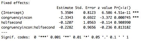
                  Part of the output of the summary call is below. Remember, this is not an ANOVA, it is a logistic regression, and since there is an interaction in the model we need to interpret the intercept and main effects given the baseline level of each variable. So the intercept is the mean (in logit space) accuracy for congruent trials (the baseline for congruency) in the first half of the experiment (the baseline for experiment half). Furthermore the effect of congruency is specific to the first half of the experiment, and the effect of experiment half is specific to congruent trials. Based on these results it appears that there is an effect of congruency where subjects are less accurate on incongruent trials (specifically in the first half of the experiment). There does not appear to be an effect of experiment half or an interaction. However, these p-values are based on the Wald z statistic which can be biased for small sample sizes, and give overly, generously low p-values. As a result in the next lesson we’ll go over a different way to compute p-values for LMEMs.

                  lesson6_screenshot3

                  In addition to getting the summary() the model we can also look at the coefficients of the random effects with the coef() call. Copy and run the code below.

                  # Get coefficients and save
                  accuracy.glmer_coef = coef(accuracy.glmer)
                  accuracy.glmer_coef

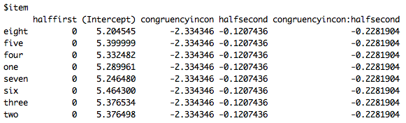
                  Below are the coefficients for item. Note, the coefficients for subjects are also available in the full call. Interpreting these can be complicated (particularly because of the structure for the random effect of subject), but one thing I want to draw your attention to is that for the intercept each item has a different value, this is because we added a random intercept of item, while there is no difference for the variables or the interactions of the variables, since no random slopes were added.

                  lesson6_screenshot4

                  Now let’s do the same thing for our analysis of reaction times. Start by going back to the top of the script at the bottom of the “ORGANIZE DATA” section and copy and run the following to make our data for the reaction time analysis.

                  # RT data
                  data_rt_stats = data_rt_clean

                  Again, I’ll start with the model with maximal random effects structure. The maximal random effects structure is the same as for the accuracy model. If you would like to double check feel free to rerun the xtabs() calls using “data_rt_stats” instead of “data_accuracy_stats”. For this model we use lmer() since our dependent variable is continuous so a linear model is appropriate; as a result we also don’t need the family = "binomial" call at the end. Also, remember we’re using log 10 reaction times as our dependent variable. Copy and run the code below when you’re ready.

                  ## BUILD MODEL FOR REACTION TIME ANALYSIS ####
                  rt_log10.lmer = lmer(rt_log10 ~ congruency * half +
                                                  (1+congruency*half|subject_id) +
                                                  (1+half|item),
                                                  data = data_rt_stats)

                  Unlike for the accuracy analysis the maximal model should have converged for you, so there’s no need to reduce the random effects structure. Copy and run the code below to get the summary of the model.

                  # Summarise model and save
                  rt_log10.lmer_sum = summary(rt_log10.lmer)
                  rt_log10.lmer_sum

                  Part of the output of the summary call is below. Unlike for the logistic regression we don’t get any p-values, all the more reason to use the method to be discussed in Part 2 of this lesson. However, a general rule of thumb is if the t-value has an absolute value of 2 or greater it will be significant at p < 0.05. Based on these results then subjects are slower on incongruent trials in the first half of the experiment (don’t forget baselines!) and faster in the second half of the experiment for congruent items. There is no interaction of congruency and half. So, while for the accuracy analysis we got an effect of congruency but no effect of experiment half, for the reaction time analysis  we get an effect of both congruency and experiment half.

                  lesson6_screenshot5

                  Finally, we can also look at the coefficients of the random effects. Copy and run the code below.

                  # Get coefficients and save
                  rt_log10.lmer_coef = coef(rt_log10.lmer)
                  rt_log10.lmer_coef

                  The coefficients for item are below. As you can see they look a little different from the other model. One reason is because we now have our random intercept and our random slope. However, it’s still the case that each item has the same values for congruency, but now also different values for experiment half.

                  lesson6_screenshot6

                  You’ve now run two LMEMs, one with logistic regression and one with linear regression, in R! Save your script in the “scripts” folder and use a name ending in “_pt1_statistics”, for example mine is called “rcourse_lesson6_pt1_statistics”. Once the file is saved commit the change to Git. My commit message will be “Made part 1 statistics script.”. Finally, push the commit up to Bitbucket. If you are done with the lesson you can go to your Projects menu and click “Close Project”.

                  Conclusion and Next Steps

                  Today you learned how to run an LMEM, giving us the power to look at multiple types of effects within a single model and not have to worry about unbalanced data. You were also introduced to the packages RColorBrewer and lme4, and as always expanded your knowledge of dplyr and ggplot2 calls. However, there are a couple concerns you may have that still makes an ANOVA more attractive. For example, our baseline issue is back, and we don’t seem to have any straightforward p-values, which, while shouldn’t be that important, would be nice to have. In the second half of this lesson both of these issues will be addressed.

                  * From here on out I’ll be using the word “subject” instead of “participant”. While “participant” is the more appropriate word to use in any kind of write-up, I’ve found people are more used to “subject” when discussing data and analyses.

                  Related Post

                  1. R for Publication by Page Piccinini: Lesson 6, Part 2 – Linear Mixed Effects Models
                  2. Cross-Validation: Estimating Prediction Error
                  3. Interactive Performance Evaluation of Binary Classifiers
                  4. Predicting wine quality using Random Forests
                  5. Bayesian regression with STAN Part 2: Beyond normality

                  Euro 2016 analytics: Who’s playing the toughest game?

                  $
                  0
                  0

                  I am really enjoying Uefa Euro 2016 Footbal Competition, even because our national team has done pretty well so far. That’s why after  browsing for a while statistics section of official EURO 2016 website I decided to do some analysis on the data they share

                  Just to be clear from the beginning: we are not talking of anything too rigourus, but just about some interesting questions with related answers gathered mainly through data visualisation.

                  We can divide following analyses into two main parts: a first part were we analyse distribution of fouls and their incidence on matches outcome ( data as at the 21th of June) and a second part where ball possession is analysed, once again looking at relationship between this stat and matches outcome (data as at 28th june). Let’s start with some specs on data import.

                  Data import and treatment

                  As usual we first need  to load required packages and our data into the R environment. We perform the task running the following lines of code:

                  # Load required packages
                  library(rio)
                  library(plyr)
                  library(dplyr)
                  library(choroplethr)
                  library(choroplethrMaps)
                  library(ggplot2)
                  library(dummies)
                  
                  #data from http://www.uefa.com/uefaeuro/season=2016/statistics/index.html
                  players_stat <- read.csv('players_stats.csv',sep = ";")
                  players_stat$Team <- tolower(players_stat$Team)
                  team_stat <- read.csv('team_stats.csv' ,sep = ";")
                  team_stat$Team <- tolower(team_stat$Team)
                  possession_stat <- read.csv('possession.csv', sep = ";")
                  possession_stat$team <- tolower(possession_stat$team)
                  

                  I am not going to spend too much time on this chunk but I would like to highlight you the use of rio package by Thomas J. Leeper, since it is a really powerfull package that can make your life really easy when talking about data import in R.

                  You can find referred .csv file within the rstudio project Rstudio project I have uploaded on Github.

                  Which team committed the  greatest number of fouls?

                  Here we are with the first question. And here it is the answer:

                  fouls

                  We obtained the plot aggregating fouls data by team and leveraging country_choropleth() function from choroplethr package

                  #sum up fouls data from player view to team view
                  by_team <- group_by(players_stat,Team)
                  team_sums <- summarise(by_team, sum(Yellow.Cards),
                  sum(Red.Cards),
                  sum(Fouls.Committed),
                  sum(Fouls.Suffered))
                  
                  # subset columns to plot only the number of fouls committed
                  fouls_data <- data.frame("region" = team_sums$Team,"value" = team_sums$`sum(Fouls.Committed)`)
                  # plot
                  fouls_plot <- country_choropleth(fouls_data,
                  title = "number of Fouls Committed by region",
                  legend = "# fouls",
                  num_colors = 1) +
                  xlim(-31.266001, 39.869301) +
                  ylim(27.636311, 81.008797) +
                  coord_map("lambert", lat0 = 27.636311, lat1 = 81.008797)
                  fouls_plot
                  

                  An important disclaimer is needed here: since country_choropleth() is not able to handle Northern Ireland, Wales and England as separate regions I decided not to populate them within map plot, given that joining related team data into one fictious United Kingdom team would have resulted in a misrepresentation of analyzed statistics.

                  Given that black countries are countries not playing the competition it seams Romania committed quite a great number of fouls. You may wonder: were them serious fouls? Let’s have a look to the number of yellow and red cards to answer that legitimate question. Let’s start from yellow cards, plotting sum(Yellow.Cards) against each team with standard barplot:

                  ggplot(team_sums,aes(x = Team,y = `sum(Yellow.Cards)`, fill = `sum(Yellow.Cards)` )) +
                    geom_bar(stat = 'identity') +
                    coord_flip()
                  

                  Here it is the plot:
                  yellow_cards

                  Well, Romania togheter with Albania is standing at the top of yellow cards ranking as well. Getting to red cards we have to underline that we dont’ have a lot of data about them, since just two of them were assigned. Guess to whom? Albania and  Austria. All that summed up we can definitely say Albania am Romania played toughest  matches overall. but was that worthing? Uhm I guess no, since both of them didn’t get trough staging phase. And this raise another interesting question:

                  Is there a correlation between number of fouls and number of wins?

                  To answer this technically silly question we can try to plot total number of fouls against number of wins by country team. Let’s have a look to the plot code:

                  # merge team data
                  total_stats <- merge(team_sums,team_stat)
                  #plot fouls committed against number of wins by country
                  ggplot(total_stats,aes(x = total_stats$`sum(Fouls.Committed)`,y = total_stats$Wins, label = Team)) + 
                    geom_point() +
                    geom_text(nudge_y = 0.2) +
                    geom_smooth(method = 'lm', formula = y~x)
                  

                  Here it is the plot:
                  fouls_vs_wins

                  We added a linear regression model to the scatter plot to investigate the hypothesis of linear relationship but nothing happened, so no, committing more fouls is not a winning strategy. Let us ask one last reasonable question about fouls:

                  Is committing more fouls at least a good strategy in order to reduce goals against?

                  Once again let’s the data speak out, plotting number of goal against togheter with number of fouls committed:

                  ggplot(total_stats,aes(x = total_stats$`sum(Fouls.Committed)`,
                                         y = total_stats$Total.goals.against, label = Team)) +
                    geom_point() +
                    geom_text(nudge_y = 0.2) +
                    geom_smooth(method = 'lm', formula = y~x)
                  

                  Here is the plot:
                  fouls_vs_goals_against

                  Ok, it could seems we can answer a sound yes, but I get a bit disturbed by that 52 romanian fouls so I am going to try to remove them and plot again:

                  total_stats_no_romania <- total_stats[-16,]
                  ggplot(total_stats_no_romania,aes(x = total_stats_no_romania$`sum(Fouls.Committed)`,
                                                    y = total_stats_no_romania$Total.goals.against, label = Team)) +
                    geom_point() +
                    geom_text(nudge_y = 0.2) +
                    geom_smooth(method = 'lm',formula = y~x)
                  

                  Here is the plot:
                  plot_fouls_goals_no_rom

                  Our first guess seems to be confirmed: number  of fouls committed is negatively correlated to the number of goals against suffered, which appears to be reasonable since we may assume a great number of fouls are committed to stop rivals from dangerous game actions.

                  Who’s keeping the ball more? ball possession stats

                  Ball possession is a key start when analysing a football match, so let’s start answering this introductory question: who’s scoring the highest possession stat within this competition? Once again we can visualise it on a europe map:
                  ball_possession_map

                  Before actually producing this plot we had to treat quite heavily raw data since they where produced in untidy format, meaning each row stored more than one observation of the attribute we are investigating: ball possession. For isntance first record was related to Northern Ireland vs Germany match played on 21/06/2016, showing a possession possession stat related to Northern Ireland on a column, and another possession stat related to Germany in a second column. We then needed to split our dataset into two separate data frames, each one storing one of two possession stat columns, and then binding those data frames togheter merging possession stats columns:

                  possession_a <- possession_stat[,-c(4,8)]
                  possession_a$win  possession_a$score_
                  possession_b <- possession_stat[,-c(3,7)]
                  possession_b$win <- possession_b$score < possession_b$score_
                  possession_a <- possession_a[,-5]
                  possession_b <- possession_b[,-4]
                  colnames(possession_b) <- colnames(possession_a)
                  possession_tidy <- rbind(possession_a,possession_b)
                  

                  Once our data are ready, we can easily produce above showed mpa leveraging once again country_choropleth() function:

                  by_team_pos <- group_by(possession_tidy,team)
                  team_means <- summarise(by_team_pos, mean(possession))
                  colnames(team_means) <- c("region","value")
                  
                  possession_plot <- country_choropleth(team_means,
                                                   title = "mean ball possession",
                                                   legend="% possession",
                                                   num_colors=1)+
                    xlim(-31.266001, 39.869301)+
                    ylim(27.636311, 81.008797) +
                    coord_map("lambert", lat0=27.636311, lat1=81.008797)
                  possession_plot
                  

                  Table: Giving a closer look to first five teams by ball possession we find a prevalence of north western europe countries:

                  Country Mean Possession
                  Germany 71%
                  ukraine 65%
                  portugal 62%
                  spain 62%

                  so here’s come the question that has always stimulated my curiosity: ball possession is always considered a relevant topic, but is it correlated with matches victory? in other words:

                  Increasing ball possession increases winning likelihood?

                  we are going to tackle this visually, plotting percentage of ball possession against a win_dummy variable, scoring 1 for win and 0 for defeat (ties were considered as defeats) , which can be easily done leveraging dummies and ggplot packages :

                  dummy_win <- as.data.frame(dummy(possession_tidy$win))
                  possession_tidy$win_dummy <- dummy_win[,2]
                  ggplot(data = possession_tidy,aes(x = possession)) +
                    geom_point(aes(y = win_dummy)) +
                    stat_smooth(aes(y = win_dummy),method = "glm")
                  

                  Here is the plot:
                  possession_truth

                  As you can see we have also added an estimated logistic regression which visually enforces the truth already visible from raw data: there is no positive correlation, or at least not a strong one, between ball possession and matches outcome. This seems to me a non obvious result, since a great number successful of football coaches have founded their success on possession ball. It is actually quite a debated topic as you can see simply googling “correlation between ball possession win”.

                  Conclusions

                  Within this post we tried to answer some questions about matches occured so far during UEFA EURO 2016 and we definitely found that being tough is not a good tactic to win your matches but at least can help you avoid suffering a great number of goals. Moreover we understood that ball possession is only weakly related to matches outcome. If you are interested in reperforming showed analyses or even further explore related raw data you can have a look to the Rstudio project I have uploaded on Github.

                  That said: may the best win!

                  Let me know if you have any comment or question.

                    Related Post

                    1. Integrating R with Apache Hadoop
                    2. Plotting App for ggplot2
                    3. Performing SQL selects on R data frames
                    4. Developing an R Tutorial shiny dashboard app
                    5. Strategies to Speedup R Code

                    What can we learn from the statistics of the EURO 2016 – Application of factor analysis

                    $
                    0
                    0

                    In this post I will try to explain how to perform a factor analysis (FA) on the statistics of the teams in the first round of Euro cup 2016. Meanwhile, I assume that you have enough background on the theory of FA and so I will just stick with the application of this technique.

                    Wikipedia defines the factor analysis as “A statistical method used to describe variability among observed, correlated variables in terms of a potentially lower number of unobserved variables called factors.” So according to this definition I can say, I will try to define some new latent variables that would compress all our information into one or two factors (I call them here as a score) and help to make better predictions for the next round.

                    So here is the dataset I obtained from the EUFA website. You can download the dataset here.

                    Load the data and packages

                    library(ggplot2)
                    library(dplyr)
                    library(corrplot)
                    library(psych)
                    library(MASS)
                    
                    dataset<-read.csv("Dataset_16.csv")
                    dataset$Standing<-as.factor(dataset$Standing)
                    d_stan = as.matrix(scale(dataset[,3:25]))
                    

                    All I do is just, first, I scale my variables (because they have different units) and then simply using psych package, I perform a FA with 3 factors and ‘quartimax' rotation (one of the main advantages of FA over PCA is the fact that you can rotate your factors and make the weightings of some variables zero or close to zero in order to create more meaningful factors). It turns out that the third factor is basically containing the same information as the second factor and it doesn't explain as much extra variability as it is supposed to. Therefore, I just repeat the same FA with two factors and compute the scores using 'factor.scores' function.

                    # Factor Analysis
                    FA<-fac(cor(d_stan),2, rotate = "promax", fm = "minres")
                    scor<-factor.scores((dataset[,3:25]), FA)
                    FA.dat<-dataset%>%mutate(score1=scor$scores[,1],score2=scor$scores[,2])
                    

                    Interestingly, by plotting the scores found from the first and the second factor we can find a meaningful pattern. Almost all the teams which they were knocked out in the group stage are all located in the SW part of the plot.

                    FA.dat%>%ggplot(aes(x=score1,y=score2))+
                      theme_classic(base_size = 15)+
                      geom_point(aes(color=Standing),size=4)+
                      geom_text(aes(label = Team,y=score2-0.1),size=6)+
                      labs(x="FA1- (Score on attempts and passes)",y="FA2-(Goal Score)")+
                      geom_vline(xintercept = 0,color="red",size=1.2)+
                      geom_hline(yintercept = 0,color="red",size=1.2)
                    

                    Here are the plot:
                    ffd99e_396eba69acda44ea97e7bb4aa73aa25d-mv2

                    In the next step I ploted the correlation between the scores (score1 and score2) found from the first two factors and the rest of the variables. It shows that the first score is highly correlated with the variables that shows the ability of the teams on making the opportunities and dominating the game. While, the second score is highly correlated with the ability of the teams on goal score. Therefor, each point in the above plot is representing a team and basically the farther right means the higher ability to dominating the game and so on.

                    corrplot(cor(FA.dat[,3:ncol(FA.dat)]), mar = c(1,0, 0, 0),tl.cex=0.9,method="square",type="lower", tl.col = "black")
                    

                    Here are the plot:
                    ffd99e_0fdd1c06db9241acb4d76c592832cab2-mv2

                    Even though this simple analysis is not enough to answer all the questions you have, but this should give you a really good idea of who should for example win the Wales VS Northern Ireland game.

                    On my Github you can find the data and R code.

                    Post a comment below if you have any suggestion or comment.

                      Related Post

                      1. Visualizing obesity across United States by using data from Wikipedia
                      2. Plotting App for ggplot2 – Part 2
                      3. Mastering R plot – Part 3: Outer margins
                      4. Interactive plotting with rbokeh
                      5. Mastering R plot – Part 2: Axis

                      Map the Life Expectancy in United States with data from Wikipedia

                      $
                      0
                      0

                      Recently, I become interested to grasp the data from webpages, such as Wikipedia, and to visualize it with R. As I did in my previous post, I use rvest package to get the data from webpage and ggplot package to visualize the data.

                      In this post, I will map the life expectancy in White and African-American in US.

                      Load the required packages.

                      ## LOAD THE PACKAGES ####
                      library(rvest)
                      library(ggplot2)
                      library(dplyr)
                      library(scales)

                      Import the data from Wikipedia.

                      ## LOAD THE DATA ####
                      le = read_html("https://en.wikipedia.org/wiki/List_of_U.S._states_by_life_expectancy")
                      
                      le = le %>%
                        html_nodes("table") %>%
                        .[[2]]%>%
                        html_table(fill=T)

                      Now I have to clean the data. Below I have explain the role of each code.

                      ## CLEAN THE DATA ####
                      # check the structure of dataset
                      str(le)
                      'data.frame':	54 obs. of  417 variables:
                       $ X1  : chr  "" "Rank\nState\nLife Expectancy, All\n(in years)\nLife Expectancy, African American\n(in years)\nLife Expectancy, Asian American\n"| __truncated__ "Rank" "1" ...
                       $ X2  : chr  NA "Rank" "State" "Hawaii" ...
                       $ X3  : chr  NA "State" "Life Expectancy, All\n(in years)" "81.3" ...
                       $ X4  : chr  NA "Life Expectancy, All\n(in years)" "Life Expectancy, African American\n(in years)" "-" ...
                       $ X5  : chr  NA "Life Expectancy, African American\n(in years)" "Life Expectancy, Asian American\n(in years)" "82.0" ...
                       $ X6  : chr  NA "Life Expectancy, Asian American\n(in years)" "Life Expectancy, Latino\n(in years)" "76.8" ...
                       $ X7  : chr  NA "Life Expectancy, Latino\n(in years)" "Life Expectancy, Native American\n(in years)" "-" ...
                      .....
                      .....
                      
                      # select only columns with data
                      le = le[c(1:8)]
                      
                      # get the names from 3rd row and add to columns
                      names(le) = le[3,]
                      
                      # delete rows and columns which I am not interested
                      le = le[-c(1:3), ]
                      le = le[, -c(5:7)]
                      
                      # rename the names of 4th and 5th column
                      names(le)[c(4,5)] = c("le_black", "le_white")
                      
                      # make variables as numeric
                      le = le %>% 
                        mutate(
                          le_black = as.numeric(le_black), 
                          le_white = as.numeric(le_white))
                      
                      # check the structure of dataset
                      str(le)
                      'data.frame':	51 obs. of  7 variables:
                       $ Rank                            : chr  "1" "2" "3" "4" ...
                       $ State                           : chr  "Hawaii" "Minnesota" "Connecticut" "California" ...
                       $ Life Expectancy, All
                      (in years): chr  "81.3" "81.1" "80.8" "80.8" ...
                       $ le_black                        : num  NA 79.7 77.8 75.1 78.8 77.4 NA NA 75.5 NA ...
                       $ le_white                        : num  80.4 81.2 81 79.8 80.4 80.5 80.4 80.1 80.3 80.1 ...
                       $ le_diff                         : num  NA 1.5 3.2 4.7 1.6 ...
                       $ region                          : chr  "hawaii" "minnesota" "connecticut" "california" ...
                      

                      Since there are some differences in life expectancy between White and African-American, I will calculate the differences and will map it.

                      le = le %>% mutate(le_diff = (le_white - le_black))

                      I will load the map data and will merge the datasets togather.

                      ## LOAD THE MAP DATA ####
                      states = map_data("state")
                      str(states)
                      'data.frame':	15537 obs. of  6 variables:
                       $ long     : num  -87.5 -87.5 -87.5 -87.5 -87.6 ...
                       $ lat      : num  30.4 30.4 30.4 30.3 30.3 ...
                       $ group    : num  1 1 1 1 1 1 1 1 1 1 ...
                       $ order    : int  1 2 3 4 5 6 7 8 9 10 ...
                       $ region   : chr  "alabama" "alabama" "alabama" "alabama" ...
                       $ subregion: chr  NA NA NA NA ...
                      
                      # create a new variable name for state
                      le$region = tolower(le$State)
                      
                      # merge the datasets
                      states = merge(states, le, by="region", all.x=T)
                      str(states)
                      'data.frame':	15537 obs. of  12 variables:
                       $ region                          : chr  "alabama" "alabama" "alabama" "alabama" ...
                       $ long                            : num  -87.5 -87.5 -87.5 -87.5 -87.6 ...
                       $ lat                             : num  30.4 30.4 30.4 30.3 30.3 ...
                       $ group                           : num  1 1 1 1 1 1 1 1 1 1 ...
                       $ order                           : int  1 2 3 4 5 6 7 8 9 10 ...
                       $ subregion                       : chr  NA NA NA NA ...
                       $ Rank                            : chr  "49" "49" "49" "49" ...
                       $ State                           : chr  "Alabama" "Alabama" "Alabama" "Alabama" ...
                       $ Life Expectancy, All
                      (in years): chr  "75.4" "75.4" "75.4" "75.4" ...
                       $ le_black                        : num  72.9 72.9 72.9 72.9 72.9 72.9 72.9 72.9 72.9 72.9 ...
                       $ le_white                        : num  76 76 76 76 76 76 76 76 76 76 ...
                       $ le_diff                         : num  3.1 3.1 3.1 3.1 3.1 ...

                      Now its time to make the plot. First I will plot the life expectancy in African-American in US. For few states we don’t have the data, and therefore I will color it in grey color.

                      ## MAKE THE PLOT ####
                      
                      # Life expectancy in African American
                      ggplot(states, aes(x = long, y = lat, group = group, fill = le_black)) + 
                        geom_polygon(color = "white") +
                        scale_fill_gradient(name = "Years", low = "#ffe8ee", high = "#c81f49", guide = "colorbar", na.value="#eeeeee", breaks = pretty_breaks(n = 5)) +
                        labs(title="Life expectancy in African American") +
                        coord_map()
                      

                      Here is the plot:
                      Le_african_american

                      The code below is for White people in US.

                      # Life expectancy in White American
                      ggplot(states, aes(x = long, y = lat, group = group, fill = le_white)) + 
                        geom_polygon(color = "white") +
                        scale_fill_gradient(name = "Years", low = "#ffe8ee", high = "#c81f49", guide = "colorbar", na.value="Gray", breaks = pretty_breaks(n = 5)) +
                        labs(title="Life expectancy in White") +
                        coord_map()

                      Here is the plot:
                      Le_white

                      Finally, I will map the differences between white and African American people in US.

                      # Differences in Life expectancy between White and African American
                      ggplot(states, aes(x = long, y = lat, group = group, fill = le_diff)) + 
                        geom_polygon(color = "white") +
                        scale_fill_gradient(name = "Years", low = "#ffe8ee", high = "#c81f49", guide = "colorbar", na.value="#eeeeee", breaks = pretty_breaks(n = 5)) +
                        labs(title="Differences in Life Expectancy between \nWhite and African Americans by States in US") +
                        coord_map()

                      Here is the plot:
                      Le_differences

                      On my previous post I got a comment to add the pop-up effect as I hover over the states. This is a simple task as Andrea exmplained in his comment. What you have to do is to install the plotly package, to create a object for ggplot, and then to use this function ggplotly(map_plot) to plot it.

                      library(plotly)
                      map_plot = ggplot(states, aes(x = long, y = lat, group = group, fill = le_black)) + 
                        geom_polygon(color = "white") +
                        scale_fill_gradient(name = "Years", low = "#ffe8ee", high = "#c81f49", guide = "colorbar", na.value="#eeeeee", breaks = pretty_breaks(n = 5)) +
                        labs(title="Life expectancy in African American") +
                        coord_map()
                      ggplotly(map_plot)

                      Here is the plot:
                      le_plotly

                      Thats all! Leave a comment below if you have any question.

                        Related Post

                        1. What can we learn from the statistics of the EURO 2016 – Application of factor analysis
                        2. Visualizing obesity across United States by using data from Wikipedia
                        3. Plotting App for ggplot2 – Part 2
                        4. Mastering R plot – Part 3: Outer margins
                        5. Interactive plotting with rbokeh
                        Viewing all 47 articles
                        Browse latest View live